The PPW Panel—which served as a command center for tens of thousands of adherents to my suggested workflow—is back.
The previous panel went through five major releases, beginning in 2011. New features were added each time, but the updates were also needed because the goalposts were constantly moving as to what types of plug-ins Photoshop would recognize. Once Apple silicon was introduced into Macintosh products, Photoshop would no longer recognize the panel at all, except in Rosetta mode. In 2018, after the release of panel v.5, we regretfully stopped development, because it was clear that the panel would have to be rewritten from scratch to comply with new requirements. By 2022 we no longer supported the product, although many diehard users found workarounds to keep it functioning.
Despite the large user base, there was little appetite to invest further time in endless updates, since all of us wanted the panel to remain freeware, which implies that the programming team does not get compensated. And this is an extremely sophisticated product—many routines are simply unavailable elsewhere. An Italian team led by Giuliana Abbiati developed the panel up to its v.5 release in 2018.
The new version, PPW 2025, hails from The Netherlands, programmed by Bart Mellenbergh, with strong support from Gerald Bakker. It has been written from scratch in compliance with Adobe’s Unified Extensibility Platform, which means that it should not be obsoleted by future versions of Photoshop.
We’ve been testing it for the past few months, as has my colortheory group. This is our first public release. There are several improvements over the 2018, including a new Color Boost 2025 script and a revised Sharpen 2025 script. We intend to release further such improvements in the future, since our objective was not to go back in time and duplicate something that was great ten years ago. And we don’t have to try to simplify things for the limited capabilities of ancient computers.
Remember that this is our first release. Although it has been tested by various users, bugs are likely. Please report any that you find here. Discussion of the panel is welcomed in our colortheory group.
UPDATE 1 FEBRUARY 2026. The link previously posted here has been deleted, because a new version 1.2.0, is available. It can be downloaded at https://groups.io/g/colortheory/files/PPW%202025, and also at https://geraldbakker.nl/PPWF/ppw2025-latest-version-and-download-info.html
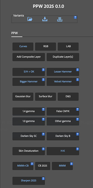
The package contents are:
• PPW 2025 0.1.0.ccx
This is the installer. If your Creative Cloud is up to date, just double-clicking the file should install the panel, which can then be accessed in the menu bar under Plugins.
• PPW_Welcome.pdf
A short summary of the panel’s history, why it’s there in the first place, where it can be obtained and other introductory information
• PPW2025_Overview_and_Options.pdf
A concise panel manual, briefly describing what each button does and which user options are available
• PPW_Overview.pdf
A step-by-step overview of the Picture Postcard Workflow itself, establishing the link between the workflow and the panel
Certain buttons are merely convenient shortcuts for moves that can be made elsewhere. The real power is in the signature scripts of the workflow, particularly those involving color enhancement and sharpening. All these scripts carry extensive PDF documentation within the panel itself; just click the question icon next to each button.
Some of this functionality could be duplicated in Photoshop’s Actions panel, but executing out of PPW 2025 carries a big advantage. The Sharpen 2025 script, for example, automates nearly 200 separate steps. If run as an Action, each would be recorded separately. Running it by mistake would completely overwrite the image history cache, making it impossible to restore an earlier version. In PPW 2025, as in previous panel versions, the entire procedure is seen as a single step, which can be canceled normally by Command-Z.
{ 10 comments }