

Last week we lost perhaps the last titan of the early digital era, a man, according to the headline on the New York Times obituary, “whose graphic designs defined an era.”
I’m unable to endorse that phrase, because, like all such great artists, George Tscherny had an individual touch that nobody could copy with complete success. Nevertheless, one can say that he used design to accept the teachings of the time when they suited him, and to defy them when they didn’t.
Berlin in the late 1930s was no place for a family of Hungarian Jews. George apparently did not wish to discuss the horrors they had to live through. His life history fast-forwards to post-war service as a German translator for the occupying U.S. forces. Thereafter he emigrated to the U.S. and began to study design; there is no indication he had ever done so previously.
His talent quickly became evident. He married, and set up business out of his residence, an upper-East-Side townhouse in Manhattan. By the late 1960s his work was well-known. He specialized in advertising, annual reports, promotional posters, and the like. He also made a huge contribution as an educator, strongly supporting what is now known as the School of Visual Arts.
I knew him as an occasional client of the prepress house I was working in in early 1990s Manhattan, but I also got to spend about a week at his townhouse office, teaching his staff about QuarkXPress. He was a gracious host, with an engaging personality not shared by so many of his egotistical colleagues of the time. Notoriously curious about the technologies of his trade, he sat in on many of my demonstrations. He never intended to work hands-on himself, but he was quicker to understand the implications of what he was seeing than his computer-literate subordinates.
An interviewer once asked him to “describe your design.” George’s answer was “Maximum meaning with minimum means.” To the extent that one can summarize a style as complex as his in five words, this is a very good one.
The longer answer would be: he had a knack for finding a single compelling graphic to wrap a design around. The results could often be described as not striking, but strikingly effective. In an age when the prevailing style was to jam text down the viewers’ throats with distorted typefaces with huge x-heights, George often set important, large text in a classic serifed italic. The message: if the graphic interests you, you’ll make the extra effort to read something more elegant if slightly less legible, and if the graphic doesn’t interest you, nothing is lost.
Three examples of this understatement. First, George’s poster for the movie version of West Side Story has to be one of the greatest film promotional designs in history. Granting the prominence of the graphic, the conventional thing would still be to print the actor’s credits in pure white. George realized that doing this would distract from the white figures on the fire escape, so he darkened the letters a bit. Less legible? Too bad. If you want to know who’s in the film, make the effort to read it, but don’t risk having your attention distracted from the poster’s main message.
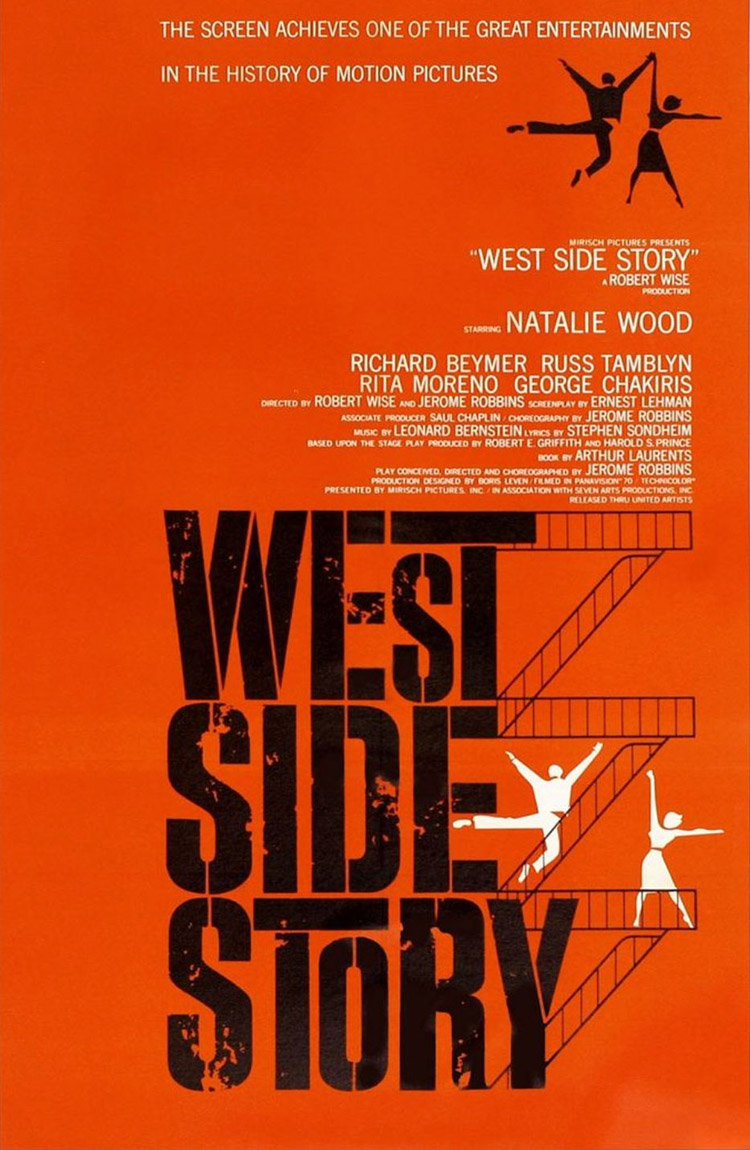
Perhaps the most effective movie poster ever.
Second, a promotional piece for SVA. This time, not only is the type seriously understated, but the average viewer might not even be able to figure out what the piece is trying to promote. That was all right with George, too. Anyone who doesn’t understand this piece is not part of the target audience.
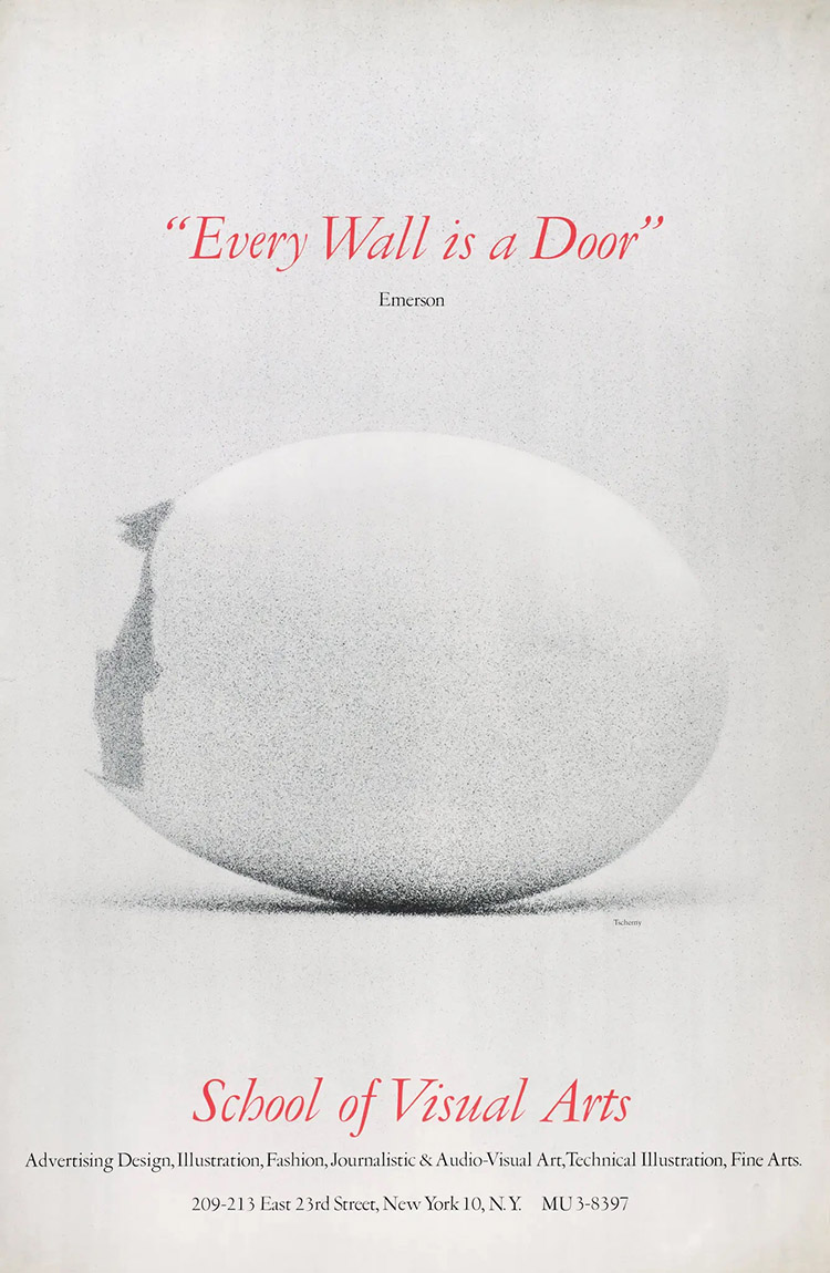
A promotional piece for the School of Visual Arts, New York City.
Finally, George created beautiful advertising material for the world’s most prestigious airline, Pan Am. Back then, traveling across an ocean was much more expensive than it is today, and Pan Am was noted for luxury. Naturally enough, they provided travelers with maps and guides to their destination city, of which I show six of George’s efforts. As clever as his graphics are, this time the type (or at least the city name) is equally important, so he makes it as legible as possible: pure white, an easy-to-read sans-serif, as large as the design permits.
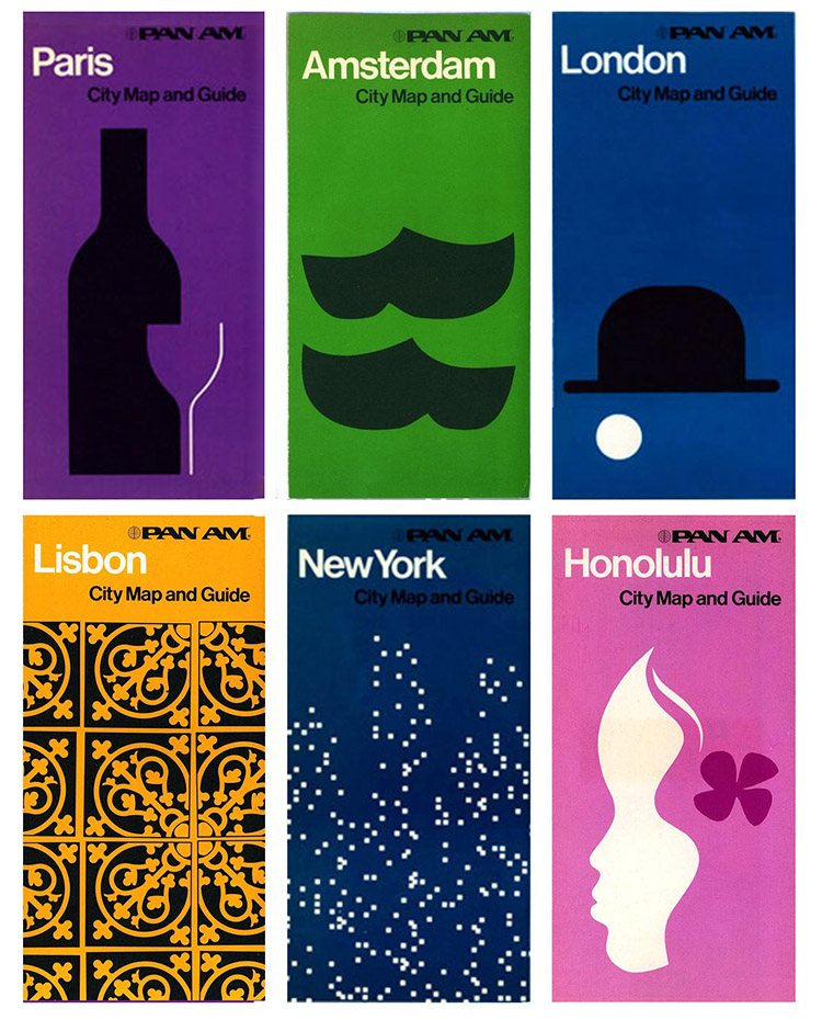
Selections from a series of travel guides to cities served by Pan American World Airways.
I got to work with the two pre-eminent designers of their time, George Tscherny and Paul Rand. I liken Rand to Mozart. Their trick was to make their work appear simple, simple, so simple that you think anybody could equal it, until you try to do it yourself.
George, OTOH, I’d liken to Brahms. A complete command of technique, but used flexibly and tastefully, not with the violence of a Beethoven.
As a rule, we say we mourn the loss of someone who has passed away, particularly if the death takes place earlier than might be expected. As George was 99 years old, I would prefer to say that we salute his contribution, his personality, and his legacy. If there is anything to mourn, George would probably remind us of how people imagined that the horrors of his youth could never happen again.
{ 0 comments… add one now }