

This is a pre-announcement of a book that is about to come on the market. You can’t order it for a few days yet, but you need to be on the lookout for the offer, because it’s going to be time-limited. After that, it will be available only on Amazon, which sometimes runs out of stock temporarily when a book is popular. This one appears to be.
What is it? Merely the finest practical work on color ever written. For once, I am not being egotistical. Rather, it is the considered judgment of history—nearly two hundred years of it.
Available for order soon!
The French chemist M.E. Chevreul has regularly appeared in my previous books. In CC2E, I appointed him an honorary beta reader, and quoted him at length fourteen times, mostly in dialogs with other beta readers. His ideas sounded very modern, which is pretty good for words written in 1839.
His classic book on color strongly influenced the development of Impressionist and subsequent painting, but he introduced philosophies that are valid for all the visual arts. So it offers sections not just on how to use color in painting, but in tapestries, carpets, furniture, mosaics, churches, museums, apartments, formal gardens, theaters, maps, typography, framing, stained glass, women’s clothing, and even military uniforms.
Not, of course, photography, for when he wrote the daguerrotype was just being perfected. Nor web design. Instead, he describes problems we rarely encounter today, and then offers proposed solutions. This is a most useful exercise. If you aren’t able to predict what colors are most useful in, say, decorating an apartment that has no electric lighting, well, you should be.
Chevreul got into color in his 40s, by royal command. The king was dissatisfied with results from the Gobelins tapestry works, and blamed them on poor dyes. He hired our author, who was arguably the leading scientist in France at the time, to straighten things out. Chevreul did his testing and found out that certain dyes indeed were weak, but that the black, a particular target of criticism, was fine. When parts of a fabric dyed with that black, however, lay next to other parts that were dyed dark blue or purple, the black seemed weak and reddish. Chevreul called this misperception simultaneous contrast. Others had hinted at the effect before, but Chevreul defined it, as well as what he thought its ramifications were.
The resulting book got worldwide acclamation but there is doubt as to how many people actually read it. Chevreul, though a great scientist and an incisive observer of the arts, was a terrible writer. Furthermore, when the book made it into English 15 years later, it got a dullard of a translator who knew nothing about color. I publish a contemporary (1855) review from a scholarly journal, which stressed the importance of the book, but added, “We cannot forbear stating that justice is not done to Chevreul in the present translation. It is awkward, inelegant, often barbarous in style, and sometimes quite unintelligible.”
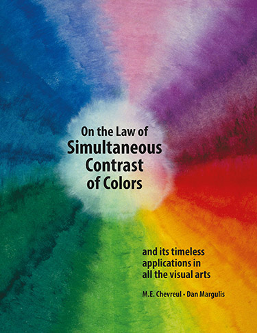
Yet this barbarous translation is the only full one we’ve had to deal with for the last 175 years, and the only one available for purchase (heavily abridged, yet) until next week or so. The best that can be said is that its title: The Principles of Harmony and Contrast of Colors, is a bit more descriptive than Chevreul’s De la Loi du Contraste Simultané des Couleurs. My new version, for better or worse, restores the original title: On the Law of Simultaneous Contrast of Colors.
I do not bill it, however, as a translation. Today books like his go through copy editing first, but his didn’t, and there are many stylistic faults and unclear sentences. I have acted as an editor to correct these deficiencies. Still, the text is recognizably his: the only stuff deleted is incontestably irrelevant today.
But his words comprise only two-thirds of the text. The rest is my commentary, needed to update what he was saying for modern needs or to point out areas where time has called his teachings into question. And naturally I have a lot of comments about the meaning for photography, although much of the time I discuss paintings, and how their lessons impact photos today.
In doing this, I revert to my customary method of showing alternate versions of images. This time, though, many of the images are paintings. I show how, Renoir, say, chose a certain color of clothing for a subject, and what would have happened if he had chosen something else. And I point out the obvious, that in many photographs it is permissible to change color of clothing, too, and I offer examples of when it makes sense.
Most of these comparisons show that the famous painter made the right choice, but not always. In a book like this, color graphics are crucial. Chevreul knew this, of course, and tried desperately to get them included. Those few he got in were primitive by our standards and cost a fortune, given the limitations of 1830s technology. I’ve added quite a collection, as follows (note: when there are, say, four variants of a given image, it counts as one image, not four)
Art that itself demonstrates a point about color usage:
Paintings: 40
Photographs: 42
Corporate Logos: 2
Weavings (tapestry, furniture covering): 4
Digital paintings: 2
Posters: 3
Stained glass: 2
Wallpaper: 2
Map: 1
Other artwork:
Artificial graphics to show points about human vision: 28
Photos, paintings, and linework used as illustrations only (no point being made about their own use of color): 41
To further aid in your decision of whether to get this book, here are some interesting pop-up links:
*The book’s front and back cover
*The Synopsis of Contents
*My Foreword
And two more, in response to those wanting more details on which artists were getting coverage:
*Dramatis personae: as Chevreul and I are both big name-droppers, this gives biographical information on the 172 artists, scientists, engineers, politicians, etc. who populate the pages, with an explanation of where they are discussed.
*Born at a time when the human life expectancy was about 40, Chevreul lived almost to 103. He therefore was alive before the French Revolution, and after the births of Franklin Roosevelt and Winston Churchill. I offer a timeline of his lifetime with respect to politics, science, culture, and his amazing career.
*And, if you want to download a zipped package of all five of the above, here it is.
My normal readership can’t be expected to have much interest in a book in which the word Photoshop never appears. On the other hand, my previous books require a certain computer proficiency, whereas this one is accessible to anyone who likes color, whether they know how to pick up a mouse or not.
So we launched a trial balloon. I announced the book in my discussion group a few weeks ago and offered to take orders for immediate shipment from the printer as soon as the books were bound. This resulted in more than five times as many orders as we anticipated, many for multiple copies. The rest of the books are now on their way across the country.
Anyhow, here’s hoping you find the project as interesting as I did. Keep your eyes open for the sales announcement!
{ 28 comments… read them below or add one }
Thanks for the information.
Good afternoon. Is a translation in Russian planned?
Alexander, we are not planning translations into any other language, sorry. It is too bad, because according to my Russian friends, the quality of previous translations by my friend Valery Pogorely was quite high.
We can ship to the Russian Federation via registered mail if needed.
Ordered on January 21, 2016 Order# 002-7577615-2284249 Item(s) Subtotal:
$130.54
Modern Photoshop Color Workflow The Quartertone Quandary, the PPW, and Other Ideas for Speedy Image Enhancement Dan Margulis
Sold by: Modern Color Workflow Return window closed on Feb 22, 2016 $74.95
Purchased this book – but last year 2019 was a terrible year of deaths and illness – as you might see I shut my photography business down until now. I am beginning over with Photoshop LAB Color, second edition. I would like to look at your resource videos again – but cannot locate the Modern Photoshop Color book to find out how to access them. Can you help me out? – Amazon order info above. I appreciate your help. I want to do better work. Thank you Christina Freeman christina@happinessphotographer.com.
Fortunately found my book – looking at page4 Supported Materials – don’t see a way to get to the videos at http://www.moderncolorworkflow.com/private-resources – but maybe the videos have been taken down from the website. I have looked at them several times over the years (book purchased in 2016) – but now I am more serious about my work rather than dabbling. Are they still available anywhere? Thank you for your answer. Christina Freeman, Tucson, AZ
Christina, the videos are currently offline. They’re going to move to youtube. They’re already posted, in fact, but not searchable, I need time to check for any errors. Watch the resources page for updates.
Hi. Is the book out?
Ana,
Yes, see my subsequent post, it became available here at the end of February.
Dear Dan Margulis,
I living in the Netherlands and try to order your new book “on the law Simulations of Contrast of Colors” , but Amazon.com refused to deliver to my address.
Books from “BooksfromUSA” I can order without problems to the same address.
When I look to the limitations for delivery (Amazone) , Teacher’s editions of textbooks in any format are called.
Can you tell how I can order your book ?
Thanks in advanced !
Yours sincerely
Gerard Zwiers
Hi Dan,
I understand that I have to use the Paypal for Europe link on your site for delivery the books when amazone doesn’t deliver.
The paypal link is for the book “Modern Photoshop Color Workflow”
Can you send me a paypal-link for the book “On the Law of Simultaneous Contrast of Colors”
Thanks in advance !
Gerard
Gerard, I very much appreciate your interest but I have no solution at this time. In ordinary times we have been able to ship to certain areas that Amazon does not serve. However at this moment it appears that the international postal system is no longer reliable. We made many such shipments from the pressrun in the western United States. While the large majority reached their destination (including a couple to the Netherlands), one package was held by Belgian customs for more than six weeks, one was returned by the Australian postal service for no apparent reason, and another one with Netherlands destination kicked around the postal system for around eight weeks and was eventually returned to us, again for no obvious reason. We lost hundreds of dollars in books and refunds, not to mention tens of hours responding to complaints and trying to track shipments.
UPS is currently not an option either: first of all they would charge EUR 130 for the delivery only, but more important, they have suspended all guarantees of delivery worldwide. One pays the EUR 130 at their own risk.
I hope in happier times these obstacles will vanish.
Gerard,
Updating my previous reply, a Dutch friend reports that Amazon now will deliver in the Netherlands. The specifics aren’t visible on the U.S. site (although he sees them) so I don’t know what they are charging.
Dan,
Thank you! I I checked several times the amazone site and 9 May it was possible to order.
Last week a recieved the book.
extra costs: shipping and handling $12.98 + tax $8.12.
I start reading now, really interesting!
Gerard, thanks for letting me know. I am surprised that they charge so little, maybe they are charging a higher price for the book itself? In the US it’s $70, but I cannot see what price they charge in €.
If you enjoy the book please post a review!
Dan,
The price for the book is €66.03 ( $69.95) total price €85.94 ($91.05) both currency are specified on the order.
I start reading and enjoy the book, the structure is really good your explanation between Chevreul text.
I shall post a review !
Gerard
Hello,
Please can you tell mw how many illustrations there are in this book? I m specifically interested in examples of the complimentary and contrasting colourways –
Many thanks
Katherine
Katherine,
Many of the illustrations in this book have several versions, e.g. an original Renoir plus altered versions to show how a different choice of color on his part would have worked (or not). In the listing below, such multiple-version illustrations are counted as a single illustration only.
Art that itself demonstrates a point about color usage:
Paintings: 40
Photographs: 42
Corporate Logos: 2
Weavings (tapestry, furniture covering): 4
Digital paintings: 2
Posters: 3
Stained glass: 2
Wallpaper: 2
Map: 1
Other artwork:
Artificial graphics to make points about human vision: 28
Photos, paintings, and linework used as illustrations only (no point being made about their own use of color, e.g. a photo that explains a style of architecture): 41
Hi. I have the fifth version of Professional Photoshop. The book came with a CD, but I don’t have any way to read it. Is there download site for CD material?
Thank you, Bruce
Bruce,
The resources are broken into three downloads for size reasons. Here are the links.
First download
Second download
Third download
Hello Dan!
Silly question over here. I want to cite your foreword for the book in my Masters thesis on Van Gogh by I cannot find the city of edition to include it in the bibliographic reference. If you could provide me with that information, I would very much appreciate it.
Thank you in advance.
Fernando,
There is indeed quite a lot of van Gogh in the book. Our headquarters is Atlanta, so that would be the city of publication, although in today’s world we don’t find the tradition of explicitly stating a publication city particularly useful.
Good luck with the thesis, it’s a difficult topic!
Hi, Dan. I have your Photoshop LAB color book and Professional Photoshop Fifth Edition. I’m an aspiring fine art photographer, with two solo shows and participation in numerous juried exhibits. could you please tell me how I might best learn to get the most/best color in an image. For example, is there a newer book of yours I should purchase? What about the PPW panel? I’m using the basic LAB techniques, mostly using the approach Lee Varis provides in his 10-channel workflow class. I feel like I’m just scratching the surface, though. I’d love to take a workshop, but the $2K is more than I can spend. Thanks, Bruce
Ok – scratch my previous comment. I purchased your Modern Photoshop Color Workflow book, and think it’s great. I’m up to Chapter 3. I’m wondering why you don’t mention ACR / LR white balance adjustments (via color temperature and the tint slider or selecting a neutral point) in that chapter or give those adjustments more attention later in the book. Is it because it’s a blunt instrument that changes everything at once, not allowing adjustments for different tones?
Bruce,
Getting the book is commendable, however there’s another opportunity. With so many of us stuck at home, our discussion group just finished (this week) a series of ten case studies, one a week. Everybody gets the same image to work on, we get between 25 and 40 entries from all over the world, and then we compare and suggest improvements. Plan on spending up to an hour on your version and then 2-3 hours following the discussions and seeing what others have done. Good way to find out where you stand because some of the entries come from top professionals. If you do it, of course you’d want to avoid looking at anyone else’s work before you were finished.
The text messages are publicly viewable, including a thumbnail of the original, but to access the source files you have to join the group, which is painless. The instructions for the first of the ten, which is one of the easiest, are here, and you can get an idea of the others here. But if you want to put in the time, do the exercises in order.
Dan,
Thanks very much! I joined the Color Theory Group. I’m not sure about working the 10 images, but for now I’ll follow the posts and see if the group is a good fit. thank you for telling me about it.
Bruce
Hi Dan, I have two of your books and have watched several videos on another site. As much as I am in awe of your knowledge, the problem I’m having is that many of the moves produce a gamut warning (Command-shift-Y on a Mac). Is this something I need to worry about? Am prepping files for print. Thanks for any help.
Philip,
The gamut warning itself is neither significant nor particularly accurate. The question is whether important detail is being lost.
Sure, it’s easy to produce colors in LAB that are impossible to achieve in print. When you do, either you’ll get something that’s as bright as you can hope for under the circumstances, or you’ll get that plus a loss of detail. If you do lose detail you may not care, depending on the image.
Instead of looking at the gamut warning, then, you should be looking at the brightest parts of the image as you convert it, trying to detect if you’re losing anything of value.
Chapter 7 of Photoshop LAB Color 2E shows a strong technique for getting the brightest possible colors in CMYK while retaining control of how much detail gets lost. It offers a shot of brightly colored motorcycles as the example.
Dan,
Thanks, this is a relief to know. I did notice that after converting to CMYK, the gamut warnings vamoosed, with very little – if any – loss of detail and/or color. Also, in some images the warnings were present before any color corrections were applied. Cheers.
Phil