

“HINT: It’s inspired by the natural world’s ability to adapt and regenerate.”
That was a major paint manufacturer, announcing that it would shortly name its 2022 Color of the Year.
We tend to associate the term Color of the Year with Pantone, but many companies offer competing nominees, trying to predict the trends of the forthcoming year. Some of these companies are thinking primarily of wall covering, others of furniture, still others of fashion and advertising, but as usual a color that is trendy in one of these areas is likely to be so in the others.
The predictions sometimes turn out wrong but more often they are at least somewhat correct. So I thought it useful to take a look at what’s being forecast for our tastes in this most challenging of years. I’ve looked for all the 2022 Colors of the Year I could find—eleven of them—and how the companies choosing them explained their decisions.
So, what do you think the choices were? Would it be substantially different than in any other year?
Answer: yes, absolutely, both in how many companies chose almost the same thing, and in the class of colors chosen.
in this unhappy year, nobody has picked anything warm, which I suspect is unprecedented. 9 of the 11 choices are ambiguous, in the sense that one of the AB channels is positive and the other negative, as opposed to an optimistic red or a warm yellow where both are positive, or a cool aqua/teal where both are negative. Only one, perhaps two, of the colors would be considered assertive.
I’ll let these pandemic colors, and their advocates, speak for themselves, but here’s the summary: six greens, two magentas, one purplish blue, one light blue, and one near-neutral. I can only show ten samples, because the eleventh was described by its advocate, Etsy, only in words: “Symbolizing harmony and growth, along with royalty and refinement, emerald green is the perfect color to remind us to find balance this year.”
Your guess is as good as mine for what emerald green means, but we don’t have to guess at the other five greens shown below. They’re all quite similar: dull, yellowish, not reminding us of vegetation at all. Definitely not the hues one would consider uplifting; in my days as a retoucher my colleagues might have referred to any of them as puke green.
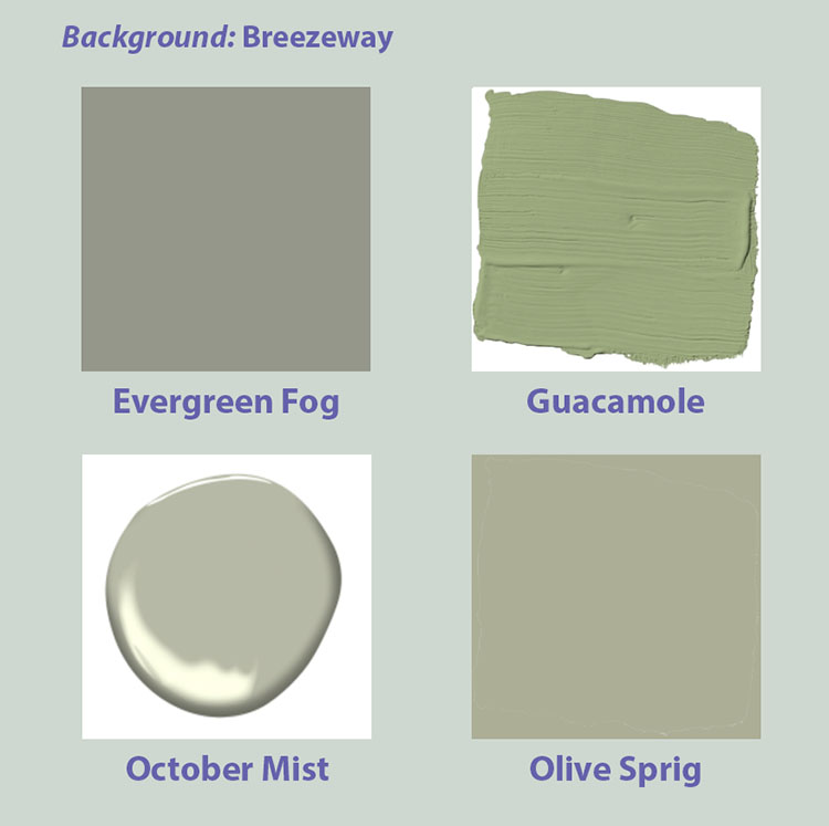
Five vendors chose closely similar greens as Color of the Year.
Here’s what the vendors have to say about them.
Breezeway, from the paint company Behr: “A relaxed and uplifting sea glass green expressing peace and tranquility for forward movement.”
Evergreen Fog, from paint company Sherwin-Williams: “The pandemic certainly influenced where we are with colors. Consumers were seeking nourishing, meaningful, reassuring, and healing…organic, nature-inspired palettes like warm brown and cool green tones are essential to achieving a restorative state and satisfying a need for energizing positivity.”
Guacamole, from paint company Glidden: “This spirited yet soothing green brings an organic energy to any space, which is needed because we all know you’ve probably killed at least three plants this year.”
October Mist, from paint company Benjamin Moore: “This gently shaded sage quietly anchors a space, while encouraging individual expression through color.”
Olive Sprig, from paint company PPG: “A midtone, neutral, lush green with an organic green undertone.”
On to the non-greens, the vendor descriptions of which break new ground in pomposity. Be warned. I return the floor to them.
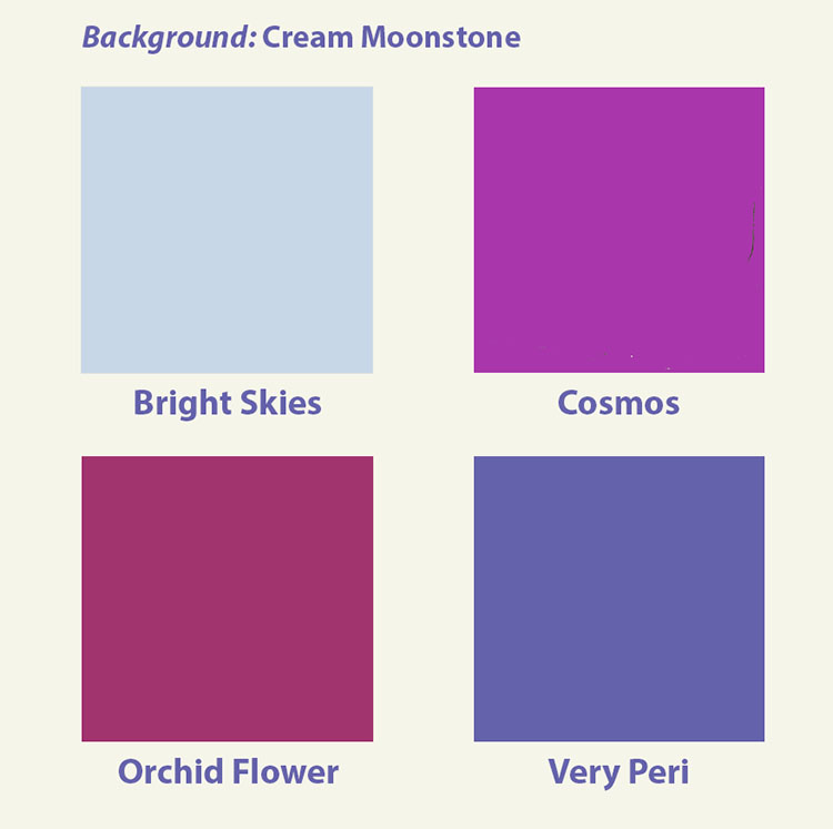
The five non-green choices, still without a single warm color.
Cream Moonstone, from Roommates Decor, which specializes in colorful wallpaper, but here offers us something completely bland, at odds with their reputation: “This is a color that provides a restorative calm, while also offering a refreshing sense of energy and optimism to lead the way in 2022. It’s a versatile hue that can be both the gentle hero of a space–with a stylish neutral palette throughout–or something that plays a supportive role to complement other colors. It’s also unexpected–people often associate us with our bold, bright patterns, and we’re excited to show that peel and stick wallpaper can also yield spaces that promote calm and relaxation.”
Bright Skies, from AkzoNobel, a Dutch paint and coatings firm: “The airy, light blue feels like the breath of fresh air we all need. After a spell of feeling shut in, people are craving expansion. Extensive global trend research conducted by a team of in-house paints and coatings color experts and international design professionals reveals that we want open air, connections to the great outdoors and a fresh approach to everything.”
Cosmos, from Robert Kaufman Fabrics: “This extraplanetary purple embodies the majesty and mystery of the universe.” Wow.
Orchid Flower, from WGSN, a London-based consumer trend forecast firm: “Has an intense, hyper-real and energizing quality that will stand out in both real-life and digital settings. It is also versatile enough to work across seasons and continents. In a challenging time, this saturated magenta tone will be a great way to create a sense of positivity and escapism.”
Very Peri, (short for Periwinkle, from the most well-known authority of all): “A new Pantone color whose courageous presence encourages personal inventiveness and creativity.”
And there you have vendor ideas of what constitutes courageous, intense, energizing, extraplanetary, organic. uplifting, relaxed, and soothing in this challenging year. Maybe so, but I find them depressing and at best, ambiguous. We’ll soon see whether they are, in fact, the colors of the year.
{ 1 comment… read it below or add one }
I’ll go with Very Peri as we go into 2022, not least because it’s the color of the year promoted by my employer, the Product Identification group at Danaher.
In Judaism purple stands for redemption, as is written “All of the women who were wise hearted did spin with their hands, and brought that which they had spun, both of blue, and of purple, and of scarlet, and of fine linen.” (Ex. 35:25)
And in the 1980’s book, movie – The Color Purple; Shug says, “I think it pisses God off if you walk by the color purple in a field somewhere and don’t notice it.”