

The previous entry described giving each of five independently corrected versions 20% weight to create a new, “par” version. This can be called a “stupid” blend, in that no notice is taken of the merits of any of the five. Nevertheless, it appears that this average is better than all five of its parents in a surprisingly high minority of cases. The apparent illogic of this finding gave rise to discussion on the colortheory list and prompts this supplemental post.
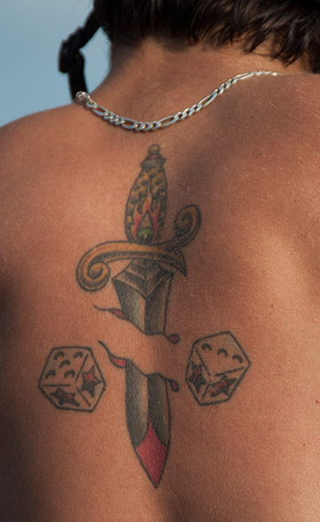
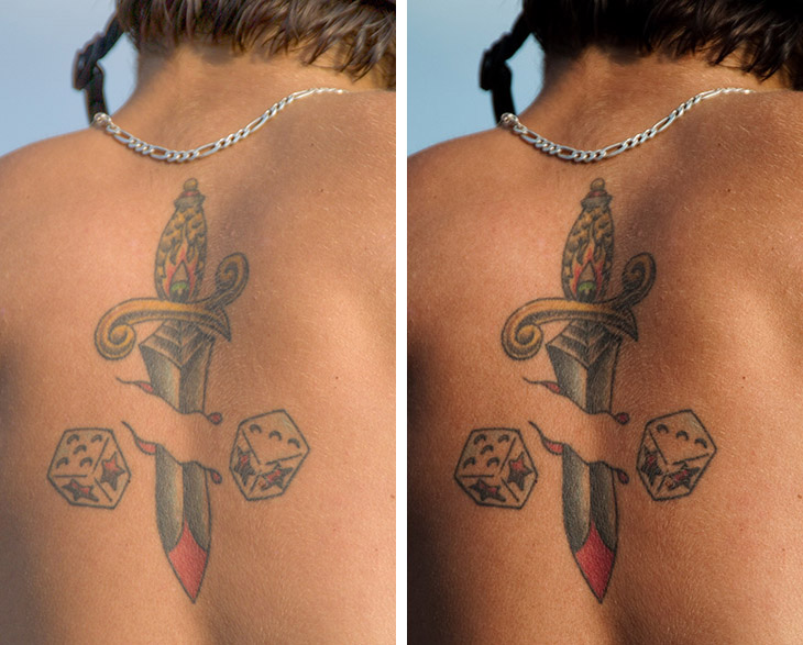
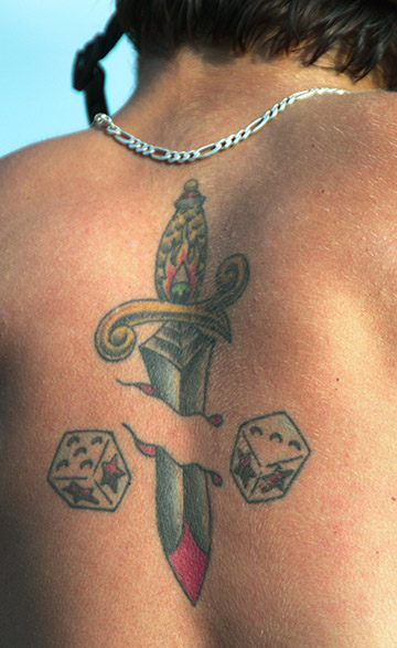
#1859: a large tattoo on a person’s back.
Recapping: in a well-funded study, scientists from MIT and Adobe gathered 5,000 images and hired five knowledgeable students to correct each one of them, using Lightroom. All the originals, in DNG format, and the corrected versions have been made freely available. I chose 100 of these images at random and corrected them myself using PPW principles and restricting myself to procedures that could be automated. Also, for each of these 100 images I created a “par” version, the “stupid” average of the five student corrections.
This post will examine three very different images, starting with the originals as given to the retouching group.
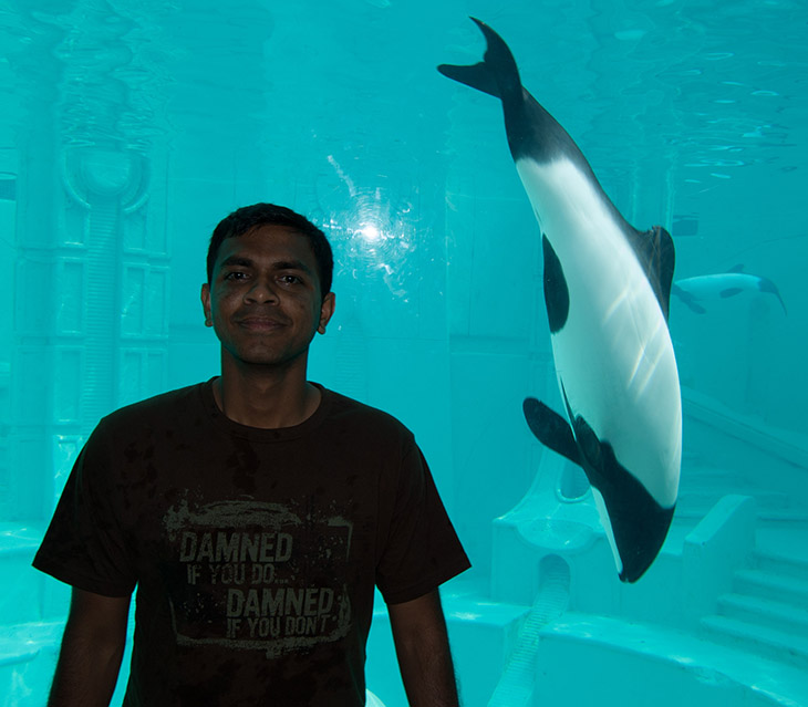
#4976: This original would challenge even very experienced image technicians.
#0002: Unlike the other two originals, this one starts out in reasonable shape.
*The tattoo image, #1859, is not as hard as the desert exercise shown in the previous post. Viewers, however, are notoriously finicky about fleshtones. The retouchers are likely to concentrate more on making the tattoo stand out and may have varied ideas of how to present the skin. The par version will arrive at a consensus. I think that this may be one of those where the par version is better than any of the five. I expect that my own version will win decisively, because PPW’s MMM action can introduce color variation in skintones in a way that does not exist in Lightroom.
*I am also planning to win decisively in the aquarium nightmare of #4976, but for a different reason. I believe that PPW has somewhat effective tools to attack this mess. Whether Lightroom has anything like them is irrelevant, because giving this original to a nonprofessional group is a form of sadism. Chances are that the five corrected versions will go in every possible direction and none of them will be acceptable. I therefore think it’s a sound bet that the par version will be better than all five parents.
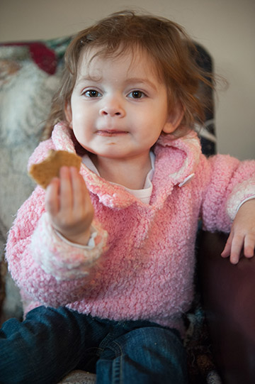
*The girl in the pink sweater, #0002, is a nearly total opposite. For a change, the original version is not bad; I wonder how many of these five retouchers, in an attempt to justify their own existence, will make it worse. It doesn’t have features that make it particularly appropriate for PPW, although I hope to get by on my good looks and personality. There probably won’t be too much variation among the work of the five retouchers so it is questionable how the par version can be much better.
We commence hostilities with the tattoo image.
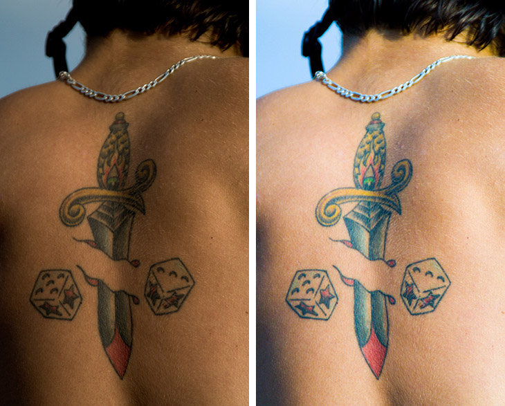
1859-A&C: two retouchers with extremely different opinions of how dark the skin should be.
Those who read the previous post recognize the similarity. The first two versions shown have drastically different ideas about image weight. I have no clue what retoucher A was thinking, his work is worse than the original. What retoucher C did makes more sense, in lightening the skin the tattoo stands out more, but he went quite a ways too far in my opinion.
Naturally, when averaged, these two errors will to some extent cancel each other.
1859-E&D: one version lightens the skin but the tattoo as well. The other darkens the tattoo for emphasis.
Again like the previous posts, two better versions that still tend to even each other out. Like retoucher C, retoucher E lightened the skin but in doing so weakened the tattoo. Retoucher D took a different tack. He somehow darkened the tattoo itself. In doing so, a certain amount of color was lost. Not a bad concept, but I prefer the PPW approach, which would be to move all colors in the tattoo away from orange, to better differentiate them from the skin. So, instead of making the red parts darker as in 1176-D, they should become rosier.
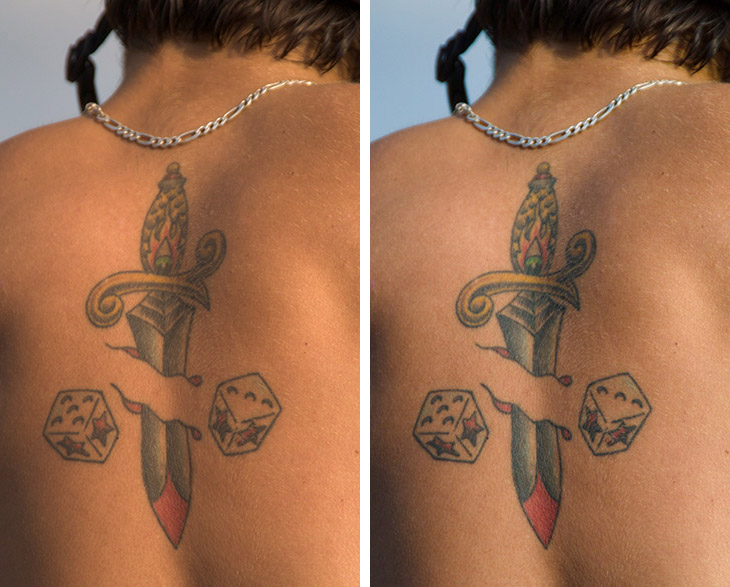
1859-B&par: The final retoucher version is closer to the consensus of the other four, but the actual average, right, is strengthened by its exposure to them.
1859-PPW: The MMM script causes great variation in the skintone–but is that really what is wanted here?
On, now, to my boneheaded prediction that my version would be much better than anyone else’s. This kind of blunder is what happens when one sees only one part of an image and forgets the objective. When I looked at the original I saw a lot of skin. My experience is that whenever there is so much skin PPW always does better than any alternative approach, because it adds attractive and believable variation. As I will show in future posts, PPW has a massive advantage in portraits. And in fact, if this person had no tattoo, I believe my version of the back would be considered decisively better than the others, which would seem totally boring by comparison.
Unfortunately, the image does feature a tattoo, which is going to be focus of the viewer’s attention. Putting this much action in the skin does make it look more natural but it is also a distraction from the whole point of the image.
A previous post outlines how I report the results of comparisons of my versions against the par. Here, it wouldn’t matter how a vote went. The question is, would everyone agree that a straight 50-50 blend of the two would be better than either parent. In this case, I think that the answer is clearly yes. This competition is therefore a tie. We move on to the group’s efforts to grapple with a greased pig.
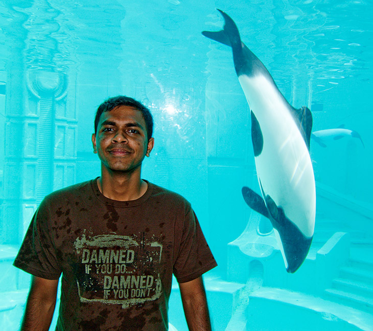
4976-A: The contrast in the face makes the man look like he came out of a horror movie.
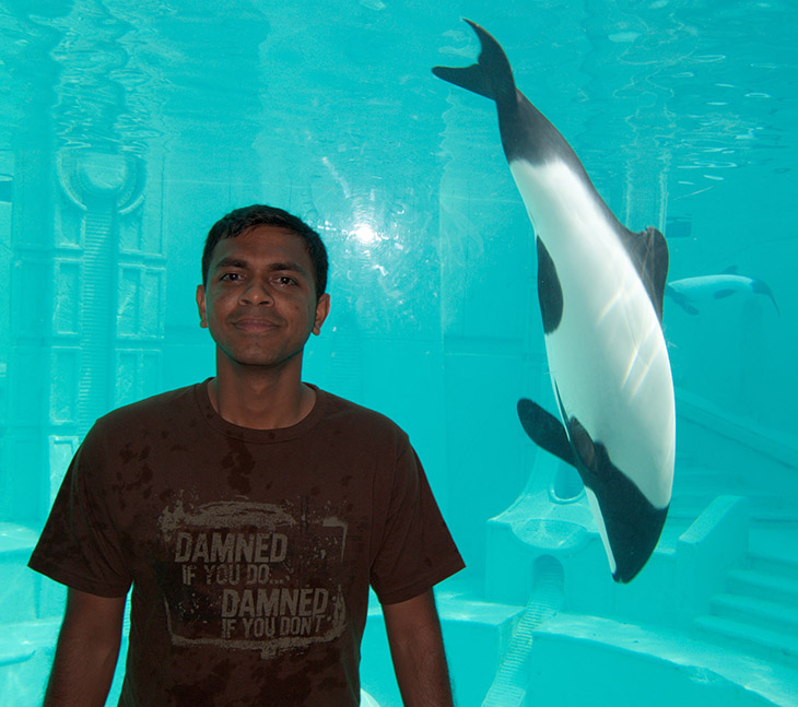
4976-B: The man is much too dark.
4976-C: Ditto.
4976-D: A step in the right direction for weight, but the fleshtone is quite orange.
4976-E: A reasonable treatment of the foreground subject, on the assumption that the aquarium in the background is totally irrelevant.
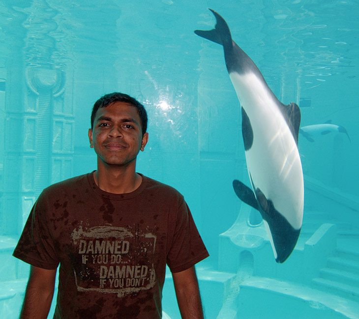
4796-par: Averaging the five versions seen above creates the best one seen yet.
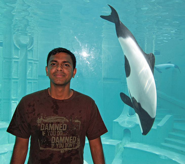
4976-PPW: PPW blending principles create a superior version.
Little discussion is needed. The exercise was too difficult for the retouching group. Nevertheless, the par version, the average of their terrible work, is much better than any of the five parents. The PPW version, though, rates as a “decisive win” over the par version. By definition this means that it would be almost universally preferred at a glance.
Averaging minimizes the effect of mistakes. Be aware, though, that it also minimizes the effect of really good work.
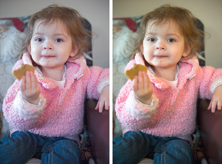
0002-PPW-A: Left, the PPW version. Right, Retoucher A did better.
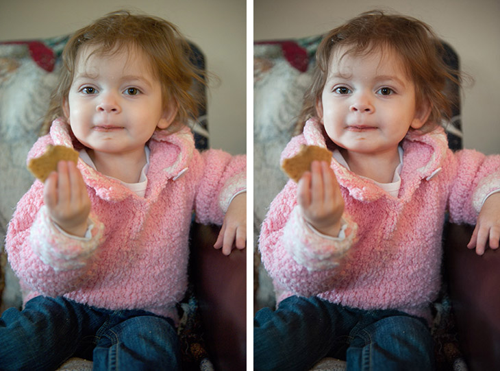
0002-par&default: Left, the par version. Right, repeated for convenience, is the start point, the default version.
So be it here. The par version is shown beneath the two, along with a repeat of the default version for reference. I can scarcely tell the difference between the par and the default, the par made the girl’s hair slightly lighter, a good thing. But clearly the other four retouchers, whose work we haven’t seen, dragged the average down. In fact, some or all of them must have made the original worse, a bad idea in color correction.
How do we score this? Well, 0002-par and 0002-a obviously have the best shape. The standard when comparing my work to that of an individual is whether mine is “significantly better,” which it is not. There is no need to inquire whether it is significantly worse.
The more careful comparison is between mine and each par version. I prefer mine here, because I don’t object to very pink skin in children. I also prefer mine to a 50-50 blend of the two. However, the rules also provide that when 100% of the color of one version is married to 100% of the luminosity of the other and the result is better than either parent, then the contest is a tie. And that is the case here.
Summing up the lessons of these two posts.
*We have not considered “intelligent” blending where the goal is to combine the best parts of two or more versions rather than a mathematical average that takes no account of their good and bad features. Such intelligent blending is very powerful, but somewhat difficult. I have provided examples of it here and here.
*Nevertheless, “stupid” blending is unexpectedly effective. It tends to even out color issues; its handling of detail is not so impressive. But in this study of 100 images it was really striking how frequently the par version had better color than my own even when the color of each of its five parents was bad.
*If you’re baffled as to how to proceed with a difficult image, try several careful versions. None of them may be any good by themselves, but to the extent that they agree they will create a better final result. The aquarium shot above is an example. Nobody got a good result, yet the averaged version is acceptable.
*An averaged version is conservative by definition. This makes it valuable to PPW practitioners, who often create files that are too loud. In the desert image of the previous post, in the tattoo at the top of this one, and in the little girl we just saw: in all three of these, if I had had access to the par versions when I finalized my own, I would have made use of them, by blending in some of their color (not luminosity).
*For all these reasons, I reiterate my recommendation that people should routinely make extra versions, even if it means spending less time on the primary version. These extra versions should be done as quickly as possible. We have seen in these two posts that the versions don’t have to be very good in order to be useful. You should be able to rattle them off in a minute or so. The potential loss is one minute in case the version is a complete bust. The potential gain is considerable.
{ 29 comments… read them below or add one }
Dear Dan,
regarding the mandatory steps about locating and forcing the lightest and darkest significant parts; can that be done in two different moments in the workflow? For instance (from start to finish): take care of the cast if any (curve in color mode) – Conservative Shadows/Highlights to pull detail in shadows. Set highlight point with luminosity blends – Hammers et al – Color boost and first sharpening in LAB. Covert to CMYK with light GCR to set Shadow point and final sharpening.
I see highlight and shadow points more of a tonal thing rather then a color move. So, as far as the previous example is concerned, I set Highlight point with a luminosity move at the beginning and the Shadow point later on in cmyk. The conservative Shadows/Highlights move is there to compress the range before going into cmyk.
Thanks ever so much.
Gaetano,
Although it is traditional to set highlight and shadow immediately, there is no technical reason not to finalize it until later in the process. (It is a bad idea to leave the image extremely flat at the beginning of the process, as this will give deceptively dull-looking colors, but it is not necessary to achieve perfect endpoints at that time).
My current practice is to have the endpoints approximately correct when I enter LAB. If the file’s ultimate destination is LAB or RGB, then I finalize both endpoints in LAB. If the ultimate destination is CMYK then I finalize only the highlight in LAB, deliberately moving into CMYK with a shadow that is too light. This gives maximum flexibility in adjusting the black channel, depending on whether you want to emphasize shadow detail.
One more question; when I want to generate a custom cmyk profile with ultra-low maximum black ink (70%) and low total ink limit (250%) how should I set dot gain (curves)? Default is 50% point to 54% on the cyan curve and 50% on the magenta, yellow and black.
I remember in your book PP5E a profile with custom ink colors and dot gain is shown in Figure 20.7
Thanks
Gaetano, From these settings I am assuming you are creating a CMYK not because you intend to print from it but because you are intending to take advantage of the CMYK structure to correct a file that will end in some other colorspace. If so, the dot gain setting is irrelevant as long as you don’t change it along the way. That is, at the moment you return the file into RGB or LAB, the Custom Color dot gain setting should be the same as it was when you moved the file into the artificial CMYK.
Ok. Although the original (s)RGB lacks saturation or sharpening, the problem I am having with this ultra-low custom profile is dirty channels upon conversion. I try relcol or perceptual (no dither) in both 8/16 bit. Could it be quantization or whatever. Skin tones get saturated a lot. I can play blending moves to restore proper tones but CMY channels are gone by then. Maybe this is part of the game.
Thanks
On a separate note; sometimes I hear retouchers say their CMYK days were “long time ago”. And yet, I think about a good marketing campaign would allow for CMYK limitations so their brand is identical across multiple media as well as clients insisting that the final products match. The best way I can think of to ensure this happens is to finalize the CMYK (and then convert to RGB) – unless one never intend to print via offset.
Thanks
Gaetano, I do not know what “dirty channels” means. If you are saying that the skintones are becoming more saturated during the move from RGB to CMYK I am not sure how this is possible. The question would be whether immediately after the RGB>false CMYK conversion the file has not changed appearance. If it hasn’t, the channel structure isn’t relevant because there won’t be any issue reconverting to RGB.
If it does look different then there must be some colors in the RGB that are outside of the gamut of this artificial CMYK. Most probably this is in the deep neutrals and shadows because the way you have constructed the CMYK it does not support anything very dark. The solution, if you are trying to exploit CMYK capabilities, is to keep the shadows light while you are still in RGB, understanding that once you enter CMYK and do whatever you had in mind, you will have to reestablish the shadow once you return to RGB.
I made a mess trying to experiment with rendering intents. AFAIK Custom CMYK profiles generated in PS (I’m on CS5) do not support rendering intents. I made two profiles 255% Total Ink and 50% Black Ink (Dot Gain is 60%c 60%m 58%y and 62%k) swop inks. One is Light GCR the other is UCR.
I tried perceptual anyway just to see and the Light GCR profile will convert very bad while UCR is for some reason quite fine. RelCol is of course way better with both (UCR slightly better).
Thanks
By the way, what really is Rich black in the prepress world?
I tend to have separation where total black limit is 70-80% but some say that a light skeleton rich black would be something like 30c 20m 20y 90k with mostly black in the file, while my idea of light skeleton is 70k at least (and stronger CMY).
Thanks
Gaetano,
“Rich black” does not pertain to photographs. It is when the designer wants a large black element on the page and feels that a simple 100k is too light, so he adds some other inks to it. There is no standard formulation but probably the most common is 40c100k, which gives an attractive coolness to the black.
Dan: I bought your book Modern Photoshop Color Workflow and I devoured it in a few days, particularly interested in its content since I has been working with your PPW actions for a long time. In this second detailed reading (I’m taking notes of those Photoshop “secrets” relevant to me) I came across an affirmation of yours that said something like ‘in every RGB image there are two good channels (red and green)…’, but I did not leave a reference on which page. After a while, I recalled the expression and searched for it unsuccessfully; my search has been so tough for that affirmation that I am about to convince myself that I imagined it. Could you give me a clue where to locate it or if it does not exist in the book at all?
Another issue that may be of interest to you, in “Review and Exercises” for chapter 4, it is included the question “Why should we be cautious about blending the red and blue into the green?” On page 432, respective response does not exist for this particular query, but for all the others.
Dan,
I’d love to hear your take about the exposure the original file should have to allow good retouching. Film is said to have a non-linear response to light. Also, I believe a good picture should have longer midtones. In an interview, a NYC reteoucher says:
“With digital cameras, we recommend to always underexpose the images by nearly a stop […] It is much easier to recover shadows than to recover highlights […] If you capture at a perfectly even exposure on a sunny day, you’ve pretty much just locked in the contrast and likely lost a lot of information in your highlights. We advise photographers swithing from film to digital to use this technique to obtain the rich color and depth that they had previously achieved by shooting with film.”
I understand that information in the red channel will blow easily if image is overexposed.
Thanks
Dan,
in addition to the previous message, could you comment on this version of the Hammer? It seems to remove contrast in the image in a pleasing way:
– Duplicate background
– Invert background copy and set opacity to 50%
– Run Surface Blur (Radius:2, Threshold:35)
(so far we get the “high pass” look)
– Change overlay blend to overlay
– Desaturate
This move is opening the image in a slightly different way than Hammers and Highlights/Shadows and the colors are well preserved.
Thanks
Sergio,
First of all, thanks for the kind words about the book. I am glad you are getting good use out of it.
I don’t know specifically what part of the book you refer to. Often, though, the blue channel is a poor choice for blending out of because a) it is commonly rather noisy and b) if the image happens to contain yellow objects, the blend will make them turn a very disagreeable color.
We’re aware of the missing copy. We maintain an errata page that lists known errors in both MPCW and CC2E.
Gaetano,
My field, color correction, assumes that the photograph already exists. We work with whatever the photographer gives us, whether we agree with how it was shot or not. I offer advice to photographers on how to correct what they have, but not on how to shoot.
Gaetano,
The method of blurring alters how any of the Hammer actions work. Any method is going to work better on certain images than others. We studied the results of all the blur methods before we released any of the Hammer actions and the results were somewhat surprising. We did not expect that we would be using Smart Blur, for example, yet it appeared to give superior outcomes.
Dan,
Thanks for providing me with an answer, I do appreciate it.
Dan,
Excuse me if I submit to your consideration, through this way, the following query, which I consider closely associated with your area of work.
There are three recognized ways to obtain the opposite or complementary color of a certain color:
• Vía RGB
Base color 0R242G187B difference to value 255 Complementary color 255R13G68B
• Vía Lab
Base color 81L-97A7B (0R242G187B) Constant L, a & b inverses Complementary color 81L97A-7B (255R92G215B)
• Vía HSB
Base color 166H100S95B (0R242G187B) Constant G y B, H difference from 180º Complementary color 346H100S95B (242R0G57B)
It is clear that each method has a different result, but the strange thing is that in web sites about the color wheel (cases of http://www.sessions.edu/color-calculator/ or color.adobe.com and others) you can get still different results, not conforming to any of the three previous methods. Do you know if they use particular algorithm (clearly not specified)?
Your opinion would be of great help,
Sergio,
There is no generally accepted formula for computing a complementary, so the exact algorithm being used is of little consequence. Artists have used their own eyeballs to compute complementaries for several centuries and it is questionable whether they were at all hurt by not knowing how we compute them today.
My experience in using complementaries to enhance images is that any of these formulae can be improved by adding a significant amount of warmth, say 2a8b, to the computed complementary.
Dan,
Thanks again for your prompt and very tight response on complementary colors.
I take advantage of this opportunity to request your definition for the term “overall weight” used in your book on more than one occasion (case of Bottom line of Chapter 5). English dictionaries and Google have not provided me with lights of what is meant by “weight” when talking about images.
Cheers,
Sergio,
“Weight” in this sense is roughly interpreted as “more darkness” but it must not be understood as darkening either the highlights or the shadows. If you and I separately correct the same image and compare the results, probably our highlight and shadow settings will be the same, and both will be attractive, yet one version may seem significantly darker than the other. We would then say that the darker one has more overall weight. With curves we can add weight to the midtones, to the quartertones, etc.
Dan,
Thanks, I recognize your standards of responsibilities with your readers through your responses and I sincerely appreciate it.
Dan,
Heavens knows I tried hard to find out in Internet an answer to my following concern, but I found the faintest good clue; please, give me help with this matter:
I want to replicate the appearance of an image with the interaction of 4 layers (all above a layer with the image, but not active): at top one with content of red channel, following one with content of green channel, third one with content of blue channel and lastly a solid color layer as base to provide sustenance. What percentages of opacity do I should give to each channel/layer and what color to use as a background layer in order to obtain as result the same appearance of original image?
Sergio,
To do this you must first go into Color Settings and be sure that your grayscale gamma matches that of your RGB. If you are using sRGB or Adobe RGB the grayscale gamma must be 2.2.
Having done this,
1) Duplicate the background layer four times making a total of five layers. I assume that you will want to retain a real copy of the original image in addition to your four demonstration layers.
2) Fill the second layer with whatever you like, 50% gray is as good a choice as any.
3) Activate the top layer. With all three RGB channels available, Image: Apply Image, Source=Background, Channel=Red, Mode=Normal, Opacity=100%. You have just made all three of the channels into copies of the red, so that you appear to have a grayscale image because all three RGB channels are equal.
4) Activate the fourth layer and do the same thing with the green channel; activate the third layer and do the same thing with the blue channel.
5) Re-activate the top (red) layer and call up Blending Options. In the Layer Style dialog, under Advanced Blending, there are checkboxes for each of the three channels. By default all three are checked. Uncheck G and B so that the layer only affects the red channel.
6) On the fourth layer, by the same process, uncheck everything but G, and on the third layer, uncheck everything but B.
You now are able to demonstrate every possible combination of channels by making one or more layers invisible. I’d suggest starting with all three of the top layers invisible so that only 50% gray is available. Then expose the layers one by one to demonstrate the impact of adding each real channel.
Dan,
In my life I have always valued people who give themselves seriously and consistently to their responsibilities, this brings to my memory the book The Little Prince, from the French writer Antoine de Saint-Exupéry, where the main character is concerned about keeping alive his rose, it is that feeling that I observe in your response, observing myself as the object of your responsibility by providing irrigation water to satisfy the needs of preserving life through your explanations ( I hope my analogy be properly understood). I deeply appreciate your response and I value your dedication to provide it in the best possible way.
Sincerely,
Complementing my previous message of yesterday:
In the wait for receiving your answer, I kept trying to find the right way and through a handmade course I finally achieved success, which I expose below in case it would be of your interest.
Your method uses a simple but profound knowledge of the operations in Photoshop, since it makes each new layer have the RGB content of each original channel and then in each layer it turns off, with advanced fusion, the components of channels other than the channel that was the source of each layer. This way drives Photoshop to generate a general composition with the interaction of those three layers that is identical to the appearance of the base layer.
My approach has also been to duplicate the base layer, three times, one for each channel and in each of those layers I have black colored channels other than the selected channel to represent that layer. This path does not generate interaction between the active layers; only the top layer prevails, as a solution I have provided the two top layers with ‘Screen’ blending mode and so achieving the desired success.
Best regards,
Dan,
On 5th reading of your book, and had to buy new version at Amazon because I have beat the old one up so much. Continue to be shocked about how damn good this book and your methods are. Your book is “lightning” and the 1000’s of others are “lightning bugs.”
My question is about the book’s workflow suggestions regarding raw modules, specifically Camera Raw and Lightroom. In the book, you say to adjust the tone curve with your preset, consider using the highlights recovery, and turn off default sharpening. In recent days, Adobe has added a new profile capability and an optional “neutral” profile that supposedly is better for “further processing”.
Do you have any different ideas (now vs the book) about how to go from, say, Lightroom/Camera Raw to PPW?
Bill
PS. Again hoping your have plans for updating this book and/or new book. Will preorder 2 if a new book of yours shows up on Amazon.
Bill,
First of all, thanks for the very kind words.
I don’t keep track of what Camera Raw is up to but can answer the question nevertheless. As you see I’ve been finding more and more use for averaging, where multiple good-faith efforts to improve the image, even if incompetently done, can be averaged to produce something better than any of the parent versions.
What I am about to say applies only to color, and not what is referred to variously as tonality/luminosity/detailing. In those areas, the chance of any raw module being competitive with PPW are poor. But PPW doesn’t have much of an inherent advantage in correcting color deficiencies. I would like to think that if I am careful with curves I should be able to do better than a mindless automatic correction in a raw module. And in fact that is true most of the time but not always. What is true most of the time is that my own work is improved if I blend in, say, 20% of the color produced by the automatic correction. The reasons for this unlikely result are suggested in this and some other posts.
Therefore if I am about to work on several raw images I batch-acquire them in several different ways. My preferred start-point is a dull, flat version, but I also acquire with Camera Raw’s Auto feature, and if there is some new automated correction available I’d acquire that way, too. Batch-acquiring takes zero time and comparing the extra versions at the end of the process is well worth the few seconds that it takes. If they can’t improve my color, then I feel good because I am so clever, and if they can improve it then I feel good because nobody will know that my work wasn’t that great beforehand.
Dan,
Thanks much, and follow.
Also thanks much for your exhaustive analysis of the database of variously retouched images. The results were very informative.
No new or updated book, I guess. Sigh.