

“And yet,” I wrote in my first book 25 years ago, “most color correction could be handled by monkeys…a numerical, curve-based approach calling for little artistic judgment…all the advanced techniques are inevitably based on these surpassingly simple ones. The by-the-numbers rules can be stated in a single sentence: Use the full range of available tones every time, and don’t give the viewers any colors that they will know better than to believe.”
Today’s “advanced techniques”, such as PPW, could not have been dreamed of back then. The lesson remains. Without those basics, neither PPW nor any other system works. The failure of some of the MIT retouchers to keep this in mind is a warning to the rest of us. This post will discuss the most basic of the basic things: the importance of setting proper endpoints, a/k/a setting highlight and shadow.
Like any other system, PPW offers advantages on certain types of image, but few or none on others. The temptation is always to call attention to the ones on which it does well. And, it is easy to show what seems to be impressive results on certain images, but usually know way to prove that people couldn’t have done it just as well another way.
The MIT study solves both these problems. It samples a wide variety of images, not chosen to favor any system over another. And for each one, they have commissioned five different corrections, so that we know what others find possible.
As described previously, I created a sixth “par” version, in which each of the five parents was weighted 20 percent, of each of 100 randomly chosen images. I also did a PPW correction myself, limited to methods that could be automated. I then compared the PPW versions to the others. Because the par version was often better than any of its parents, the key comparison was between it and mine. I rated these, according to rules laid out here, as either a decisive win, a win, a tie, a loss, or a decisive loss.
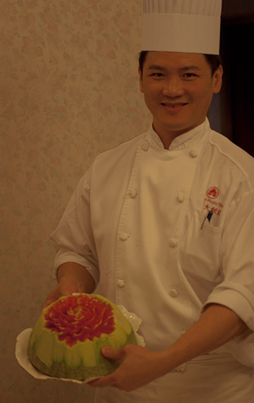
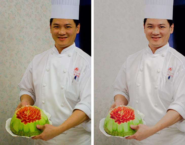
#1828: Although the cast seems ominous, there is little difficulty in correcting this because the uniform’s color is known.
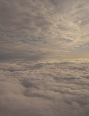
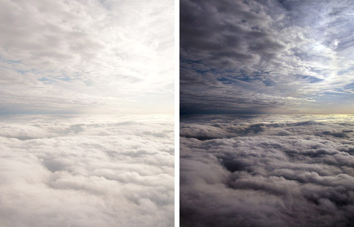
#2082: The original is extremely flat, but the clouds have more than enough detail for a retoucher to exploit.
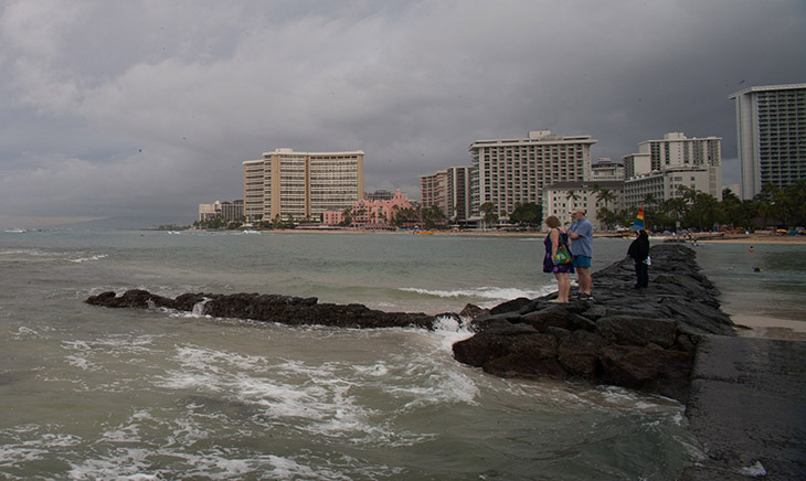
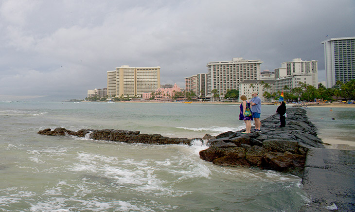
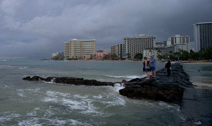
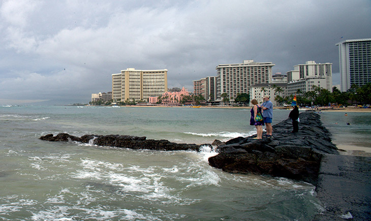
#0091: This Hawaii scene should be ideal for PPW, which can add variation in the water.
If the PPW version scores a decisive win against par, it may indicate a superior method. It may also indicate that the retouching group found the exercise too difficult—or that it was not too difficult, but they made silly mistakes, such as failure to set a proper highlight and shadow.
On the other hand, I occasionally made silly mistakes that prevented PPW from winning more decisively. The big difference, though, between someone with a mountain of experience, and people like the five retouchers, is that experienced people make far fewer mistakes.
When we see that the PPW version is clearly superior to the par, we must ask (to use an old sports analogy) did I win, or did they lose? We will now look at three images where they did worse than they should have. Here are the three original files as given to the five retouchers. How would you think their work will compare with mine, if they do a competent job?
The first two originals seem at first glance to be much worse than the third. I have surely had to correct more such horrors in my career than the five retouchers have. Someone inexperienced might infer that I would therefore be likely to do much better than they would on these two. Indeed, that would be a good argument in many similar-looking situations. But in these two, the apparent difficulty is illusory. The chef’s uniform in #1828 obviously should be be white. His hair, judging by his ethnicity, must be black. It is easy, even for beginners and even when the color of the original is this far off, to make the necessary corrections. PPW’s hammers may add texture to the uniform and the skin, which may cause the viewer to prefer it, but it’s hard to visualize a decisive win.
The clouds image, #2082, is only scary because it’s so flat. Clouds don’t need to be as impeccably white as the chef’s uniform but white does have to be their basic color. The hammer actions aren’t needed to build highlight detail because there’s more than enough of that already. There seems to be sunlight coming in from the right and patches of blue where the sky peeks through the clouds. PPW may be able to exploit those, in which case it becomes a slight favorite. Otherwise, I predict a tie, maybe even a loss if somebody finds a creative solution.
The Waikiki image of #0091, now that ought be a decisive win for PPW, which can put attractive color variation in the water in a way that Lightroom can’t. And it should be able to present the high-rises as a more attractive rosy-orange.
How did these predictions pan out? The chef first.
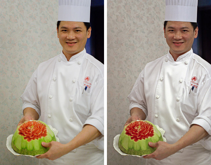
1828-par & PPW: The par version looks flat because it has no highlight (white point).
Believe it or not, the par version, which as usual has decent color, beats all five of its parents. Let’s have a look at three of them, plus a modest suggestion.
1828-C & D: One version can’t handle the color cast; the other is even flatter than par.
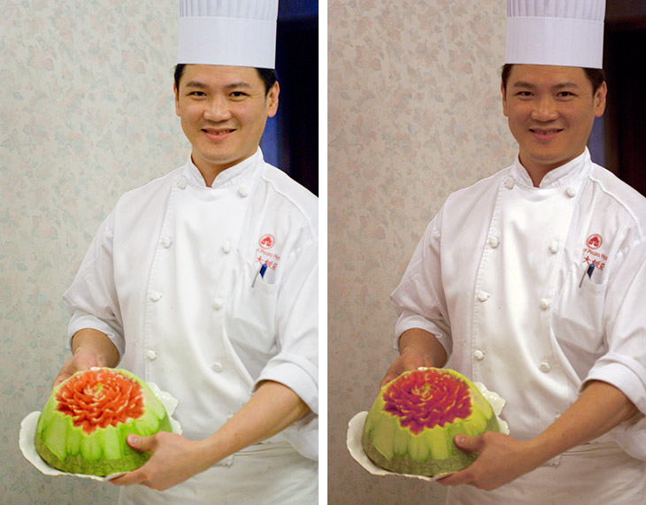
1828-E & Auto Tone: another failed retoucher version, plus a suggestion: merely establishing a white and a black point, which the Auto Tone command does with one click.
1) Locate the lightest significant part of the image.
2) Decide whether it should be made white.
3) Locate the darkest significant part of the image.
4) Decide whether it will be acceptable if made black.
5) Force the lightest and darkest significant parts as far apart as reasonable, while honoring the decision you made about whiteness/blackness.
These items are not always obvious. What if the lightest significant point is not the lightest literal point? And should it be forced to a true white, or some type of off-white? The same considerations apply in reverse to the choice of dark point.
This chef image has no such issue. The lightest literal point is in the uniform; it is also the lightest significant point, and it is emphatically supposed to be white. The hair, similarly, is both the darkest literal point and the darkest significant one, and it is emphatically supposed to be black.
The simplest of all Photoshop commands, Image: Adjustments>Auto Tone, establishes correct white and black points, on the assumption that literal=significant and that the endpoints are supposed to be neutral, both of which happen to be true in this case. Compare the Auto Tone version, prepared from the default with one click, to any of the three retouched versions, or even the par. The color is acceptable and the detail much better.
My suspicion is that Auto Tone is thought of as an amateur method, to be avoided by those in the know. But why not use it here, as least as a start point for something better?
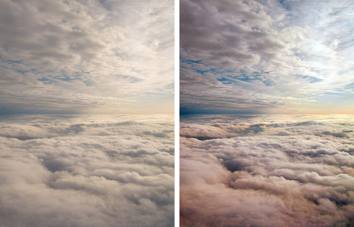
2082 par & PPW: the failure to establish a white point in the clouds at right dooms the par version.
Despite this flaw, the par version, with its predictably reasonable color, once again beats all five individual efforts. Here are three of the competitors, plus a ringer.
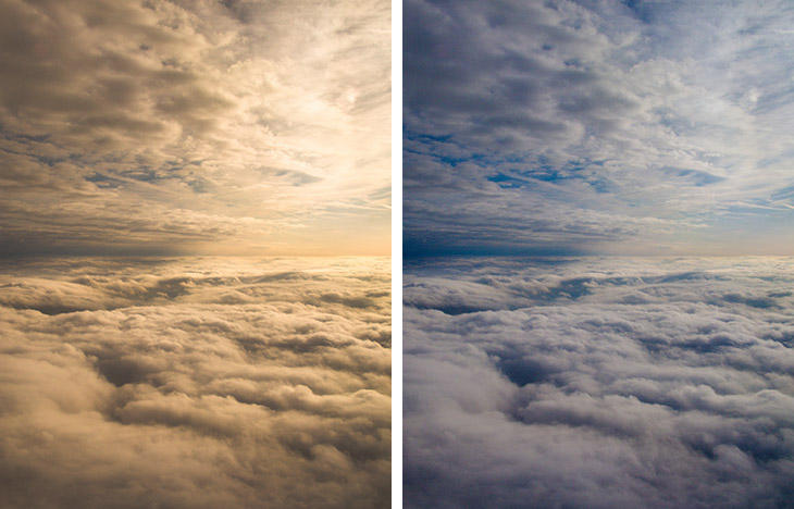
2081-A & C: These two efforts have reasonable detail but major color problems.
2082-D & Auto Tone: Left, the clouds are white, at a huge cost. Right, Auto Tone applied to the default forces a white and a black point.
Why do we have to choose one or the other, when one click with Auto Tone puts us on the right track? Sure, we can’t accept black clouds, but already the Auto Tone version is arguably the best other than the PPW one, and it is easy enough to make it much better:
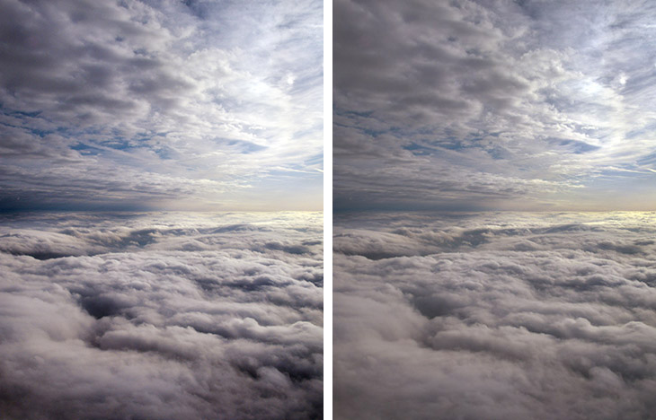
2082-AT curve & AT smart blend: Left, a two-second master-curve correction of the Auto Tone version. Right, instead, an intelligent blend of Auto Tone with 2082-D to soften the shadows.
How do the two images we’ve looked at differ? Well, you can’t ask for a more perfect target for Auto Tone than that chef shot of #1828. PPW methods generally work better with flatter originals, but Auto Tone moves so obviously in the correct direction that I used it myself, fading it back to 80% opacity to allow easier later adjustments.
This cloud image is another story. Auto Tone sets an excellent highlight, and knocks out most of the cast. We have other ways of doing these things, so Auto Tone would not be on my agenda here. But not everybody knows these other ways. Apparently the student retouchers did not. Auto Tone is much better than nothing.
Traditionally, retouchers set highlight and shadow points immediately. PPW does not require this, but it and every other rational system does require that they be set eventually. The following example shows that Auto Tone can come in handy even late in the process.
0091-E: The best of the retoucher corrections of this original.
0091-PPW: The Modern Man From Mars action creates desirable variation in the water, sky, and highrises.
You may ask why the comparison is to one of the retoucher versions and not to the par, which is not shown. It turns out that three others came up with renditions similar to that of Retoucher E. As for the fifth retoucher, well, this exercise is the only one out of 150 I’ve looked at so far that one version was atrocious enough to bring down the average so much that four of the five retouchers beat par. How bad can that be?
0091-A: The worst of the retoucher versions, which brought down the average result so far that the other four retouchers beat par.
My guess is that this retoucher got tired of spinning his wheels and eventually threw up his hands in despair and went on to the next image. If so, he acted too soon. The lightest literal and significant point in this shot is in what we call the whitewater. The name doesn’t prove that it should actually be set to white; a slight green or cyan might be better. The darkest literal and significant point is in the lava, which should probably be a dull dark brown rather than black. So Auto Tone is not an ideal solution, but if the alternative is 0091-A, the choice is easy.
0091-A-Auto Tone: The Auto Tone command is applied to 0091-A, forcing a white and black point.
Better even than 0091-E, no? And 0091-E was the best of the other four.
It is correct that Lightroom, which the five retouchers were using, doesn’t have an explicit Auto Tone command, but it has plenty of ways to achieve the same thing quickly. This post, I hope, will be an eyeopener to those who don’t accept that proper highlight and shadow selection is critical.
Color correction takes practice. Nobody should be ashamed of a poor result when the image was too difficult for them. When the poor result comes because the image was too easy, that’s harder to swallow.