

Those interested in quality have always been willing to spend time to get what they considered the best possible results. For some years now I have been suggesting that this is not the best approach in our field. Instead, I have been preaching that it is a better use of time to do the initial correction more quickly and then do an even quicker second version that can be used for blending. I claim that this gives better results in the same time. After working with this dataset, I have a better idea as to why.
Proving such a concept is difficult, particularly since the way I have presented it requires a flexible approach. I say that you should evaluate your initial version and if you suspect certain weaknesses, engineer the second version not to have them. I showed an example of that approach here.
Of course, it’s easy to say that I picked an unusual image for that post. Or that the many blending modes and masks that are available are too confusing. As against that, what if there’s something magical about blending two versions? What if it’s somehow more likely that a blended version is unexpectedly going to be better than its parents?
This is the first of several posts analyzing the lessons that this extensive study offers for our workflow. With 5,000 images each corrected by five different retouchers, we can’t be accused of cherrypicking ones that prove a point. We don’t need 5,000, but the subset has to be chosen at random. I chose 100 images for the testing and selection process, which is described here.
Subsequent posts will discuss more directly how PPW compares to the work of those who don’t have access to it. Now, however, we are just going to look at how the five corrected versions compare to each other.
Suppose that we expanded the competition to include you on these hundred images as a sixth retoucher. Your work would then be compared with each of the five others. Suppose, also, that you are about as skillful as they are.
Of the 500 head-to-head comparisons, how often would your version be decidedly better? I’d say maybe 200. In 200 others you would lose, and in 100 there would be no preference. Or try this one: assuming again that everyone is equally skillful, how often would you expect your version to be the best of the six? That’s harder to quantify: your chances of beating the first opponent are still 40 percent or so, but if you do it your chances of beating the next one increase, and if your version has already beaten four, the chances are very high that it will also beat the fifth. So, my guess is that you could expect to score a clean sweep on perhaps five of the 100 image sets.
The sixth contestant, however, is not you. It is an average of the other five. It is not an “intelligent” blend, either, such as the one I described in my other post. Instead, it weights each version 20 percent, regardless of how good or bad that version is. It also varies from the blend I described, where I deliberately made a second version that would compensate for what I saw as weaknesses in the first. Here, the five retouchers were all trying to accomplish the same thing and did not know what the others were doing.
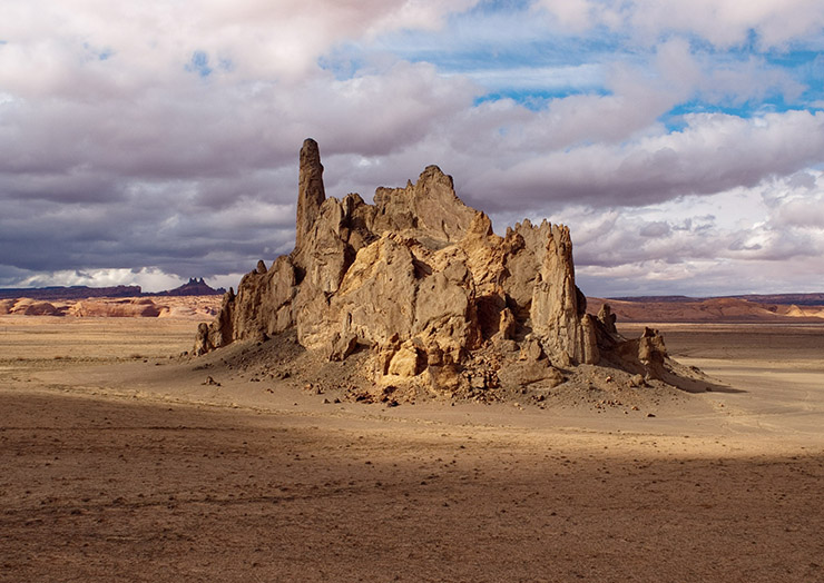
How well did this “stupid” blend work? Instead of 200 wins over 500 comparisons, it won 382. Instead of five clean sweeps over 100 competitions, it had 26. We’re about to see one, to help understand both why blending and averaging has such an advantage, and under what circumstances it does not. Here’s what was handed to the five retouchers in DNG format.
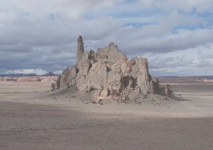
#4177, as received by the five retouchers, seems too cold and also has contrast issues.
The original is technically challenging, in that it starts with a cold cast, but also lacks depth. As usual, each of the five student retouchers made a distinct improvement, but as usual, the results were inconsistent. We’ll start with the worst first. NOTE: I am using the study’s own naming system here. It gave each image a number and then identified each of the five corrections by a letter.
4177-A: The first retoucher’s work is quite dark.
4177-E: This version seems too weak overall.
Retouchers A and E both got reasonable color, but not weight. In 4177-E the overall image looks washed out because the shadow areas are too light; 4177-A has the opposite problem of making the sunny areas too dark.
Already, you may (and should) be thinking: a 50-50 blend of these two would obviously be much better than either parent. We’ll find out in a bit, but first a variation on this theme with two much better efforts.
4177-B: Warming up the image is the right approach, but the clouds should not have turned orange.

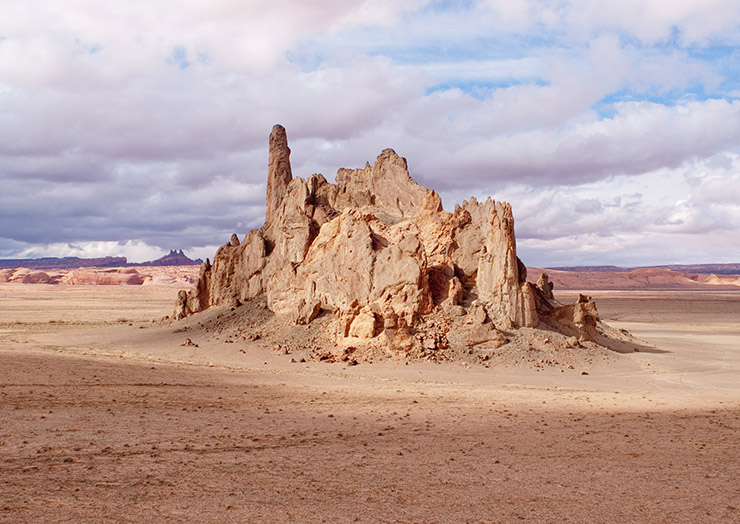
4177-C: The best version so far, but the clouds transition to blue too quickly.
Retouchers B and C’s work illustrates the difficulty of cast reduction. 4177-B went too far in warming things up, leaving the clouds yellow-orange. 4177-C, the best of the four seen so far, didn’t quite go far enough. The clouds are too blue. Looking at the other versions suggests that the rock formation is as well.
A blend of the two might be better than either parent, because the two mini-casts might cancel each other, just as the two incorrect weights did when we compared 4177-A to 4177-E. My guess would be that the blend should favor the bluish 4177-C, which seems to me the better of the two. In real life, where intelligent blending is allowed, I’d guess that blending 25-35% of 4177-B’s color into 4177-C, while leaving 4177-C’s luminosity unchanged, should work well. This posting, however, is about “stupid” blending, so we should limit it to a straight 50-50 blend, which I’ll now show along with the one discussed earlier.
4177-A&E, straight 50-50 blend: With one parent too light and the other too dark, the child comes out just right.

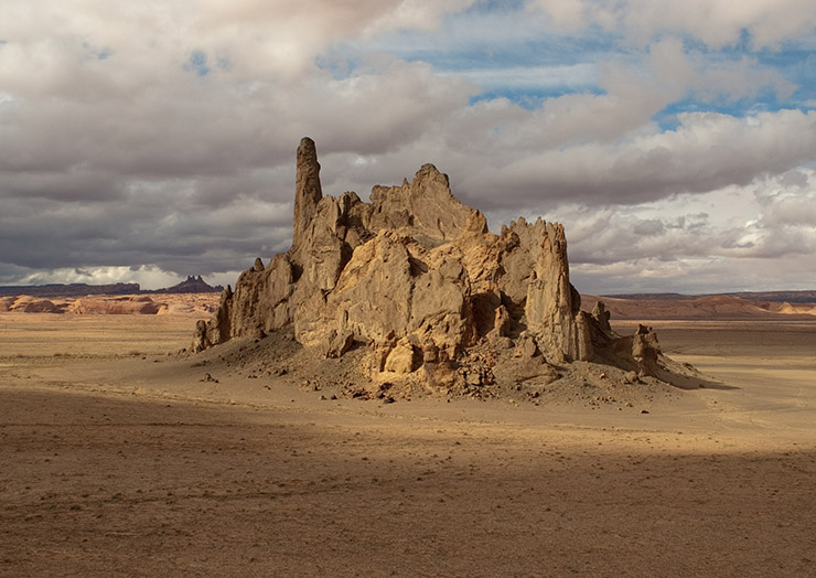
4177-B&C, straight 50-50 blend: One parent has an orange cast, while the other is slightly blue. The child version is more neutral than either.
Well, I’d have to say that the B-C blend is indeed better than its parents. It’s lost some of the desirable color variation in the rocks that C offered, but the added realism in the sky more than makes up for it. The surprise is, the A-E blend, which is a combination of two images worse than B and C, is competitive with B-C. And both are better than any of the four parents.
The only retoucher version we haven’t yet seen is D. It’s the least objectionable of the five, in my view, although I’m not sure I would rate it better than C. Yet it isn’t quite as good as the par version shown below it, which is a “stupid” blend of all five retoucher versions, each one given 20% weight.

4177-D: The final retoucher has avoided the problems of the other four.
4177-par: A “stupid” blend of the five previous versions, with each weighted 20%.
Here’s how I rate what we’ve seen so far.
*Each of the five retouchers improved the original.
*The two 50-50 blends (4177-A&E and 4177-B&C) are better than any of their four parents. Whether they are also better than 4177-par is of no concern to me.
*4177-par rates as significantly better than the version above it (4177-D) in that I believe a jury that was able to toggle back and forth between the two would give it at least a two-thirds vote.
*Possibly similar kinds of toggling would be needed to determine that 4177-par is better than 4177-C. The other three retoucher versions don’t need a moment’s consideration.
What accounts for this phenomenal rate of success for a “stupid” blend? And when might it not be appropriate? And what if the versions were prepared not by students but by top professional retouchers?
With multiple versions, errors can cancel one another out. In 4177-A&E, an overly light and an overly dark version did so. In 4177-B&C two contrary casts did the same thing. Even if it had no direct opponent, however, a poor version like 4177-a could still be usable in a blend with four more reasonable efforts.
In addition to minimizing the impact of errors, averaging unfortunately also minimizes cleverness. Only Retoucher C, for example, got attractive color variation in the rocks. That variation is wiped out in the averaged version. Is 4177-par a better image than 4177-c? Yes, but it isn’t a free lunch, and if Retoucher C had done slightly better at knocking out the cold cast then he would have beaten par.
A subtler and more universal factor turns out to be the bigger gain in blending multiple versions. All five of the retouchers presumably agreed that the rocks are more important than the background sky. And they certainly all realized that the original had an undesirable cast.
Understandably, though, they had different ideas about how to do that. One might add orange, another subtract green, still another add cyan and then boost the color. Whatever the approach, the goal is to bring the rocks to a desirable warmth, a point on which they all probably agree fairly closely. The background is a secondary consideration, but it probably offers hints on the method used to warm the rocks.
Whenever an original can be seen as having both important and unimportant areas, multiple attempts to correct will always be more similar in the important areas than elsewhere. The five retouchers here agreed far more closely about the rock color than about the sky.
The critical lesson for why this type of blending is so successful: if you decide to blend a second version with your own, the biggest change will be found in unimportant areas. The effect of the change will be that the important areas stand out more clearly. Why? Because in each version the unimportant areas are affected by the method chosen to correct the initial cast. If somebody else corrected the cast just as effectively, but with a different method, the unimportant areas will move the corresponding areas in your version away from the important object(s), which will not change very much.
Two corollaries of this striking rule:
*The main advantage of the blend is in color, not detailing. Each retoucher tries for the best detail in the important zones, paying less attention elsewhere. There may well be a change in the unimportant zones due to the blend, and it will improve your version, but it will probably not be as big a deal as a color change.
*The big gain comes when the original file has a color issue. If, instead, its color is basically right then no corrected version will be much different from another.
Would we still see such overall favorable results if the five retouchers were more experienced? That’s hard to say. On the one hand the more experienced team would be less prone to make big mistakes, so we wouldn’t get huge swings like the difference between 4157-A&E and its two parents. For professionals, on one hand the impact may be less because the mistakes aren’t as big. On the other, a professional team would be unlikely to create horrors that might make the par version unusable. This actually happened in several of the dataset’s images.
PPW users can exploit another advantage. Averaged versions are by their nature conservative. PPW efforts are by their nature extravagant, extroverted. As part of this study, for each of the hundred images I prepared my own version. The purpose was to examine how often PPW is actually useful in real life. On certain images, of which this is one, it has a tremendous advantage. On others it’s no big deal.
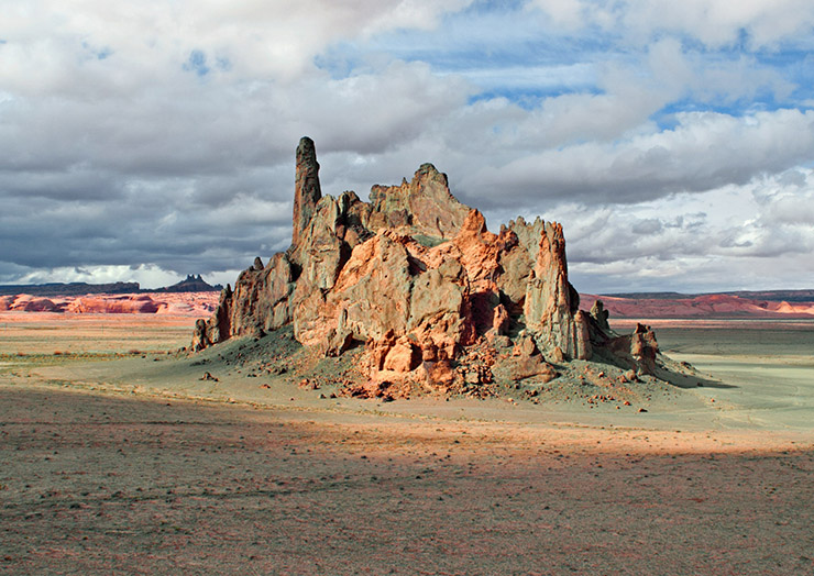
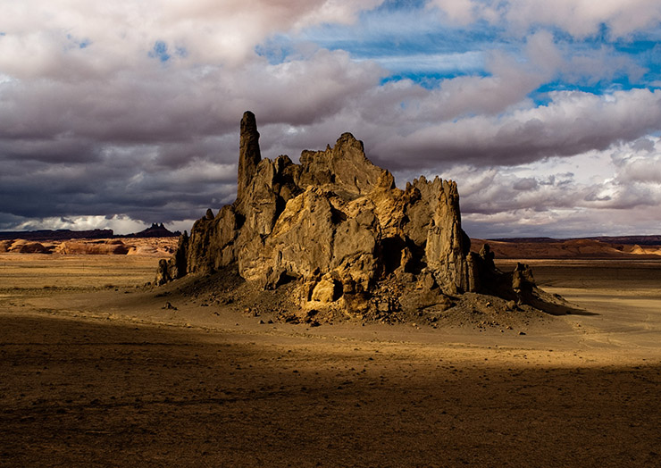
4157-PPW: The retouching group had no access to the MMM action, which is responsible for the color variation in the rocks here.
Obviously we want a certain amount of variation in the rocks, but there’s no unanimity as to what that amount is. Also, people fall in love with their own ideas. Work long enough with a file of this nature and the eye can become desensitized, whereupon we can save a version today that will seem too loud tomorrow. Or, even if you don’t think it’s gone too far, perhaps someone else will.
If you find yourself in that position, an averaged version can be just what’s needed. 4177-par may be boring, but it has no obvious defect. It can soften 4177-PPW without any problem. The same cannot be said of any of the alternate versions in this post.
Going through this exercise over a hundred images reinforces much of what was already known. That PPW was going to do well on this particular one was a foregone conclusion, because it has an action that drives colors apart.
That blending competitive images would give better results in a very large number of samples was also a foregone conclusion, because I’ve seen how often it has worked in the past. This time, however, although I predicted the result, I did not understand why it would happen. I hope I’ve now been able to explain the reason in this post.
In short, I expected a good result for PPW in this image, and I knew why; I expected good results for blending generally, but I had a poor grasp of why. There’s also a third category, where my preconceptions about what would happen proved false. I’ll show examples of all three categories in subsequent posts.
{ 2 comments… read them below or add one }
Thanks for this extremely interesting blog. You have convinced me of the value of blending. Although the images are small jpgs I downloaded them and then did my own version, this exercise afforded me an opportunity to a) compare my work with other people’s and b) an opportunity to compare my work to the Master himself. So how did I fare, using PPW I did better than any of the 5 and even the par image. I did not achieve the same colors as Dan did, but then I thought his were a bit over the top especially red and green. My sky was better than any other image and I would say I had more detail in the rocks than even Dan.
Obviously a blend came to mind and I blended my image with Dan’s at equal rates, this gave me the best result where I found the background rocks had a red color but were not seemingly on steriods. Thanks again Kirk
Kirk, This is a good use of blending. Before PPW it wasn’t unheard of for people to force too much color into an image but it wasn’t that common either. With PPW it happens all the time. So, it is nice to have the blending option available to move toward a more conservative look if desired.