

The basic PPW concept is to separate color and contrast moves almost completely. That concept works no matter how much time you have allotted to work on the image. As a rule, however, it’s faster than previous methods, and it can be made much faster.
The text’s emphasis on speed has been controversial with some readers, who say that they are willing to spend as long on their images as required. The criticism misses two points. First, my books are heavily read by professionals, who nowadays often have to process a lot of files on tight deadlines. What workflow to use when the average speed has to be five minutes an image, or three minutes, or one minutes is very relevant to them.
How to work fast is relevant to everyone, however, and this is the second issue. If you take more time considering each decision, probably you will make better decisions. However, my recommendation is that you not take this time, because you are better off hurrying up and then doing a second version (and a third, or a fourth, if you like) from scratch, then blending as appropriate. Doing so offers the possibility of huge gains, which making marginally better decisions in a single-pass approach doesn’t.
The PPW tools make it easy to overdo things. People commonly produce images that look vivid on the screen at the time, but on later consideration seem too loud. I therefore have always recommended having a conservative version in reserve, perhaps a copy of the original with all obvious defects removed. The idea is to use it, if needed, to tone down a version that you have, upon reconsideration, decided is too intense.
It’s even better to have an alternate version that isn’t so conservative. A version today is usually very different from one prepared tomorrow, because by then we’ll have forgotten the steps we took the day before. So both will be good, but good in different ways, and a profitable blend may be possible.
Currently my procedure is to assume that my second try at an image will be the winner. I force myself to make a first immediate try, two to three minutes on average. I draw a basic conclusion of how good it looks, and then set it aside as a resource. I don’t look at it again when I try for the second version, but I do recollect what my impression was. If the picture is important I will also do a third, very simple version: one-minute workflow, using things like Auto Tone if necessary. Finally, I look at various ways of blending the two images.
Those readers who’ve looked at my Chapter 2 video where I merged eight different versions of a swan know some of the options. Here’s another variation, from a recent ACT class. Like most of the exercises in such a class, this one is real-world, furnished by a serious amateur photographer using excellent equipment. The scene is Banff National Park in Alberta, Canada; the particular area is known as Vermilion Lakes, which should hint that the color of the water may be unexpected.
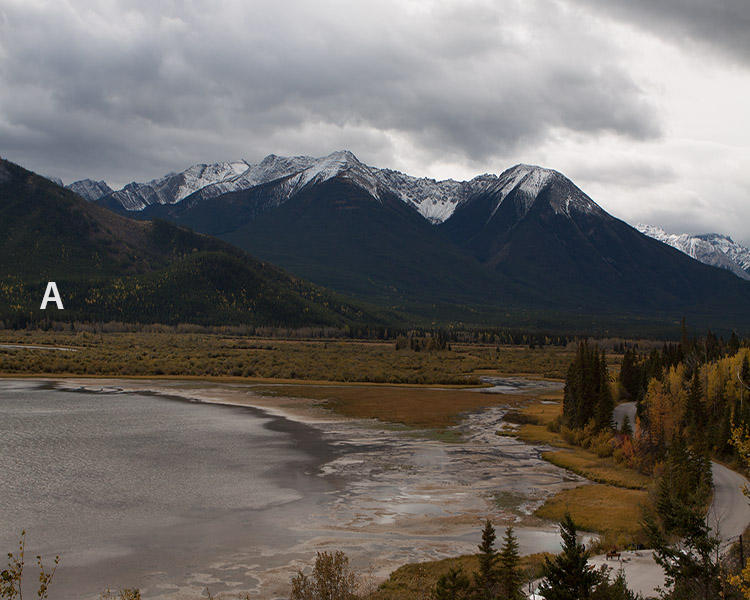
The original image (Camera Raw defaults)
The photographer took a liking to the image but wasn’t that happy with his own work. He contacted me offline asking that I evaluate what he had done and to offer suggestions for how to improve it. As always in situations like this, I got a permission to use it for further educational purposes such as classes, books, and stuff like this post.
Version A, then, is a default open in Camera Raw. Version B is the photographer’s version, complete with retouching out things in the lower left foreground. Form your own opinion of it before I give you mine.
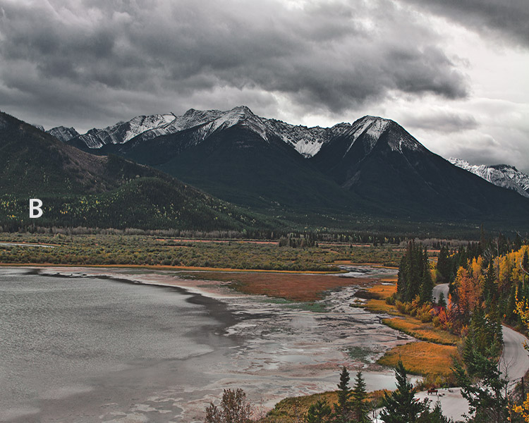
As corrected by the photographer.
The most striking part of B is the treatment of the clouds. It establishes that the weather is unpleasant. Accordingly, the look is gloomy, quite neutral overall although the autumn colors are bright enough. Personally I would have liked to see a bit more color, but “personally” means just that—the photographer’s interpretation is logically consistent and can’t be called wrong. I told him I’d probably run it as a class exercise to see what other views might arise. Meanwhile, I said that given the way he had decided to handle it, there wasn’t enough variation in the background hills.
The concept is tricky, because the hills can’t take much color without starting to compete with the foreground. However, they don’t have to be completely boring. Starting with the photographer’s B, I produced C by selecting the hills, running the MMM + CB action to add variation to them, and then using a layer mask to restrict the move to the darkest zones of the image. The photographer replied, “I like your subtle but significant change”.
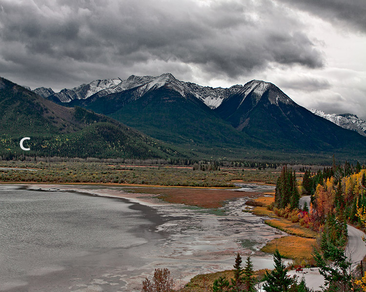
Variation in the background is added to B.
On to the classroom, where I would start from scratch instead of from the photographer’s version. As discussed above, my strategy is that the first runthrough should be quick. I did not consult the photographer’s version before beginning, but I certainly remembered that I had liked his exaggerated clouds.
When starting with a raw I acquire in at least two different ways, for maximum flexibility later. I chose to begin with one that had slightly enhanced highlights, in keeping with my recollection about the importance of the clouds. Since I was trying to work rapidly and certainly wasn’t thinking of a blog post about the process, I’m not sure what happened next, except that the result is D. I remember doing an initial color correction in RGB. Then it looks like I did some channel blending in Luminosity mode, followed by multiplication through a blurred layer mask, and possibly a touch of the H-K action, prior to boosting color with the MMM + CB action. At the end of the process, I remember doing a separate MMM + CB, as I had earlier done with the photographer’s version, to bring out variation in darker areas.
(NOTE: this classroom exercise was at a much higher resolution than shown here, and the final file had to be in CMYK. For purposes of this post, I’ve converted CMYK to RGB in all cases. This makes for a slightly flatter look; also the sharpening seems too soft here because it was optimized for a much bigger file.)
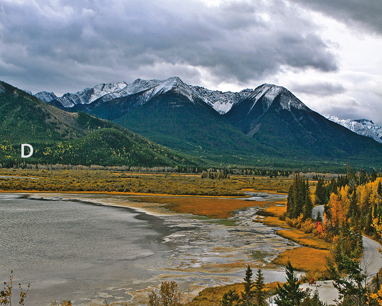
Dan’s first attempt, done in three minutes.
Time to take stock. I am basically OK with this. The clouds and overall darkness seem reasonable, as does the color. The background hills work well IMHO. I see one definite and one possible problem.
The definite problem, to me, is the autumn foliage in the lower right. It’s not interesting; I think it’s too light, suggesting the sunniness that the clouds deny, and it may have a greenish tinge as well. And the *possible* problem? I went into the exercise with the idea of emphasizing the clouds. Being human, at least according to some, I am prone to fall in love with my own conception, and desensitize myself to its faults. Therefore, I must be alive to the possibility that I will not like these clouds as much later as I do at the moment.
Now, what would taking more time have gotten me? With respect to the clouds, nothing: my aesthetic judgment would have been just as, er, clouded by preconceptions as if I had worked as fast as possible. The foliage would probably have been somewhat better. The lack of detail was probably caused by careless channel blending; if I had thought longer about what to do, I might have gotten a slightly superior result. Making it darker would have been more difficult.
I prefer to spend the extra time in doing a complete second version from scratch. I recommend not doing this second version immediately, but to occupy yourself with other things for a little while until you can no longer remember the precise steps you previously used.
That’s what I did here. The second version was executed more than an hour after the first one. Again, I did not refer to the first one in preparing the second, but I did remember that I was basically satisfied with the color and the clouds, and dissatisfied with the foliage. These ideas formed the basis of my strategy.
Since I already had good clouds in the first version, I decided not to worry about them overly this time. Since I was satisfied with the first color, more or less, I felt I could go for broke by doing the initial color correction in LAB, trying to get a pleasing warm cast into the lighter half of the picture. Chances are, this will be worse than the first version’s color, but what do I have to lose? And it may be possible to split the difference, colorwise, between the two.
For bringing out detail in the foliage, I used the Bigger Hammer action, choosing the green channel as source to try to ensure it affected light green objects. As I recall, the effect was so strong that I had to reduce its opacity. After everything else, the result was E.
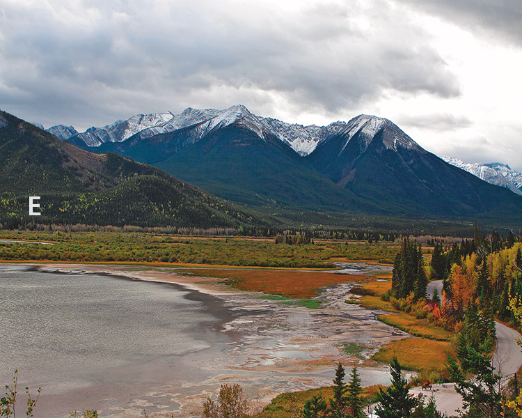
Dan’s second classroom try, emphasizing variation in the foliage at lower right.
Now, along with D, I had two valid images to play with and combine. Let’s look side by side. As commonly happens in PPW, the two aren’t much alike, as if they were photographed at different times of day, E is darker in the autumn colors, but lighter in the clouds and in large parts of the lake and background. Its reddish cast is somewhat helpful in the foliage but problematic elsewhere.
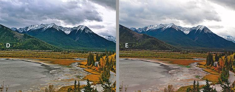
Dan’s two versions side by side.
The danger is to concentrate on which version is better overall. Instead, we should look at the strengths and weaknesses of each, to see whether there is a profitable combination. We can blend the two, say, 50-50. We can use the luminosity of one and the color of the other, fully or partially. We can use masks based on almost any channel to merge certain parts of one undetectably into the other. If any of these moves hit the jackpot, you’ve achieved something that probably could not have been achieved if working on one version only.
A good way to start the experiment is by putting the second version as a layer on top of the first, then changing its mode to Color, retaining the contrast of the bottom version, and adjusting the layer’s opacity if needed. If that works, copy the Color layer to a new layer, changing this new layer’s mode to Luminosity, and go through the same procedure.
When I did this, the results were disappointing. When I used E’s color at 100% opacity, I had a mild preference for what it did to the foliage, but I disliked everything else, especially the background hills. So, I gave up that idea, and changed mode to Luminosity to see if there was anything to be gained that way. The answer was, very little. I again preferred the foliage, but disapproved of everything else. I thought the clouds in Version D were very slightly too dark, so perhaps I could use E in Luminosity mode at, say, 10% opacity to lighten them. The foliage would also darken, which is desirable in principle, but at that low of an opacity it’s unlikely that anyone would notice. So far, therefore, the second version hasn’t been worth the effort to make it.
But the blending options aren’t exhausted. Next, I changed the top layer to Darken mode, so that the those parts of each version that were darker than the other were chosen. Better! The foliage is improved, the clouds untouched, the background a bit worse.
Next, another experiment: change the mode from Darken to Darker Color. The difference: Darken works channel by channel, always choosing the darkest one, so that any pixel might have two channels from one version and one from the other. Darker Color is all or nothing; either all three channels from one version, or all three from the other. Often one can’t tell the difference at all; sometimes, it can make a subtle difference. Darken mode can make certain colors grayer, which it was doing in parts of the lake and background. For my purposes, Darker Color was infinitesimally better. At full resolution it can be seen; at the lower resolutions of this posting it isn’t worth showing.
Now, since the Darker Color layer is doing bad things to the background hills, I needed a layer mask. Knowledge of channel structure is helpful here, because there are twelve choices immediately available, forgetting about making something more complex. They are the red, green, blue, and RGB composite channels on each of three layers: Version D, Version E, and the merged version with Darker Color. We would want the one with the biggest difference between the foliage and the dark background. That rules out any blue channel, because the yellow foliage would be too dark. A green channel would permit more of the greener areas to darken, while a red channel would permit more of the autumn reds to appear. To me, the red is the winner. And the best choice for source would be version D, in which all the foliage is lighter than E, while the background is at least as dark. The mask needs to be blurred substantially, because the two layers vary in luminosity.
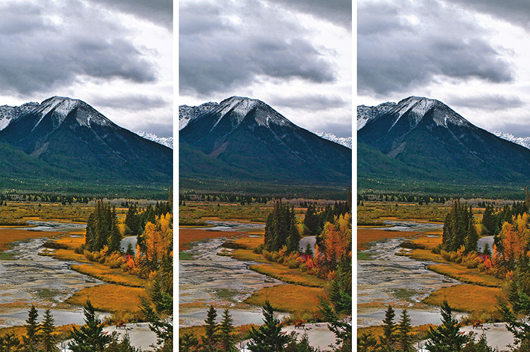
The progress of the correction. Left, version D. Center, version E is placed above it on a layer set to Darker Color mode. Right, a blurred layer mask based on the red channel of D is added.
Finally, I decided to lighten the clouds of D very slightly. To do so, I added a third layer, a copy of E, set to either Lighten or Lighter Color mode (for a move this small, the difference is invisible). To avoid lightening the background hills, this one needed to be masked by the channel with the lightest sky (the foliage is irrelevant because if anything, this layer is darker than what’s beneath it; the background and lake may lighten a tiny bit but the big difference will be in the clouds). And the lightest channel, as far as the sky is concerned, is the blue channel of E.
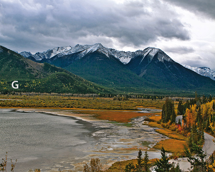
The final merge. The clouds have been lightened by a masked blend with version E.
I hope that this lengthy exercise shows why spending a short time on two versions and blending them intelligently is better than spending the same or more time trying to finalize one version. If I had spent five minutes extra in my preparation of D I could have gotten something slightly better–but G, IMHO, is a lot better.
|
|
{ 3 comments… read them below or add one }
Thanks for this practical example, while it illustrated just how far I have come since getting the book and having learnt how to apply the workflow, at the same time it showed me just how much I still have to learn. Fortunately to me it has become not only an adventure but an exciting learning experience virtually on a daily basis. Every time I reread a chapter I understand more and start applying things I previously ignored. The lesson of blending different versions I understand and use, however to blend individual channels such as in the example is new, easily I would say the book has been the best value for money I have ever got. Thanks again. Kirk
Amazing results in just some minutes. I’ve tried it myself and it works like a charm.
Regards,
Aleksander T. Eriksen
Norway
Your post(s) is a treasure, thank you very much. What i love about the ppw is the continuous implement of technique.
Regards
Antonio