

Most people who try out the PPW eventually come to the conclusion that it is better to do two or more quick versions than one slow one—even if each quick version has to be somewhat sloppier than it would be if we were more careful.
The principle can go further: if we are making versions for blending, then they don’t have to be good images in and of themselves.
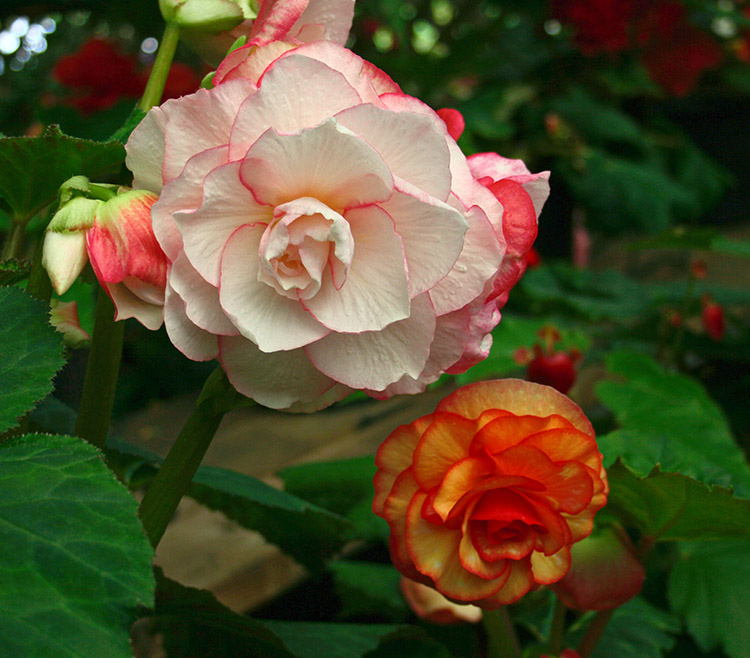
Here’s an interesting example of how to make use of that kind of multiple-version strategy in correcting a flower image.
The original image is quite dark.
The original file is too dark overall because even the brightest parts of the begonias are not close to being white. But just lightening those parts won’t quite be satisfactory. The flowers are the focus and should get more attention than the background. PPW has various ways of bringing out detail but first we need a plan for the background, because there are two somewhat conflicting possibilities.
The flowers stand out more when they contrast with the background, but the contrast could in darkness, color, or both. Since the flowers are light, a dark background is helpful. We also might want to play up the greenness of the background leaves, which contrasts with the orange-pink of the flowers. But we can’t do both of these things at once. The brightest greens that we can reproduce are in the midtone range. If these leaves are considerably darker than that, it will be impossible to make them very green.
My instinct is that the first option, a dark background, is correct. But since I am not sure, I plan already to do a lighter version that will allow more color.
My first attempt looks like this:
A first quick attempt at a correction, with the objective of keeping the background fairly dark.
To get there,
*I established a white point in the flowers.
*I ran the Velvet Hammer action to add detail, but I disabled the layer that would also have lightened the background.
*I moved into LAB and did the usual color things, also adding a curve to darken the quartertone
According to me, this is a satisfactory result. The lighter flower has a lot of detail and the overall feeling is moody. Is it too dark? Possibly, but I never worried about that, because it was always the plan to make a much lighter version to get more color into the leaves.
The advantage of having a satisfactory result on the first one is that we can go for broke on the second. Since I would be willing to accept this dark image as is, I do not have to try for a great result on the second: I can always trash it if I don’t like it. Here’s what I got, by applying a false profile to the original, then multiplying through a blurred layer mask and some color moves in LAB. I’m not a big fan of how it came out if you consider it by itself, but it’s quite suitable for blending.
A second quick correction from scratch, this time trying for strong greens in the background.
Now comes the fun part. We compare the two versions. On the reasonable assumption that neither one is absolutely and totally better than the other in every single respect, some kind of blending will offer the best result. It’s up to us to figure out what kind that is, because the options are almost infinite.
I do like the darker background of the first version but I’m not sure that all that detail in the lighter flower is needed. In the second, lighter version, I definitely prefer the darker of the two flowers because color variation that I didn’t realize existed has been emphasized.
So here would be three of the things that I would try, all starting by putting the lighter (second) version as a layer on top of the darker first one.
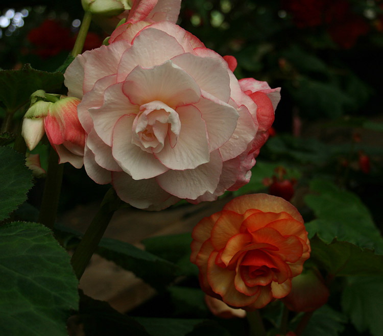
First variation: I loaded the composite RGB as a layer mask. This emphasizes the lighter flowers while retaining most of the darker background.

First Variation: a layer mask based on the RGB composite marries the lighter parts of the light correction to the dark parts of the darker one.
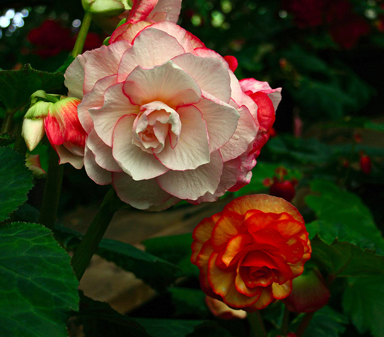
Second variation: same setup, but I replaced the layer mask with a copy of the red channel. Since both flowers are light in the red channel, this allowed more of the top version to show than in the first variation.
Second variation: This time, the layer mask is a copy of the red channel, permitting more of the flowers from the light version to show through.
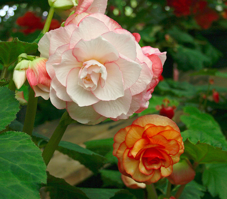
Third variation: I discarded the layer mask. This is a straight 50-50 blend between the two versions.
Third variation: instead of using a layer mask, the two original corrections are simply blended 50-50.
I have my favorite of these three and presumably you have yours. Now, ask yourself: would you have known that the one you chose was what you wanted, when you first looked at the original? And if not, how would you have gotten there without a two-version approach?
Think of it as an exercise in time management. I started with the preconception that a rather dark version was what I wanted, something along the lines of my first correction. Could I have come up with something better if I were more careful, if I took twice as long to produce that first version? I certainly hope so. But I am quite sure that it wouldn’t have been better than one produced out of two different versions, each done quickly.
{ 1 comment… read it below or add one }
splendide et efficace, bravo Maestro!