Russian Translation Released
by Dan Margulis on May 20, 2015
The Russian edition of Modern Photoshop Color Workflow is now available here (site is in Russian language only), in limited quantities at first with more in a few months. I received my copy last week (note in the lower right corner of the cover, that this is my “personal” copy!) and the printing looks good.
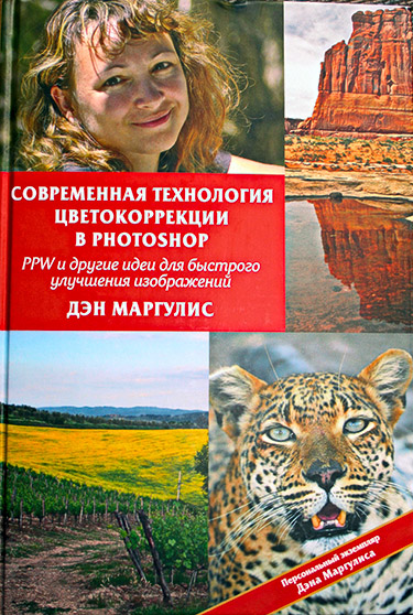
The Russian edition of Modern Photoshop Color Workflow
All of my recent books have been translated by Valery Pogorely, who is exceedingly conscientious. I can’t speak to his skills myself, but my Russian-speaking friends say that the translations are very good indeed. This is more than can be said for the translations of my books into any other language, except perhaps German. And, having translated my own works into other languages, and others’ into English, I can assure you that it is not an easy business at all.


{ 28 comments… read them below or add one }
Dear Dan!
Sorry for offtopic, but I didn’t find you e-mail in the web. I want to give you my book about color digital photography.
http://www.pavelkosenko.com/book/en
It has been translated into English two months ago. How I can do it? I will be very glad if you write me an email and I’ll send you a gift code.
Yours,
Pavel Kosenko
Hello,
I upgraded using the new Beta PPW panel for CC2015 and CC2014, per the instructions. The PPW panel now does not work in EITHER CC2014 or CC2015. It always says “Exception: TypeError: undefined is not an object”.
Any ideas? Thanks.
As a follow up…by reinstalling the cc2014 version using the extension manager, I got the panel working in cc2014 again. Still does not work in cc2015, but the actions work…
Thanks for any help.
Doug, this does not give us enough information to be of assistance. Please go over the suggestions on the CC2015 troubleshooting page and if need be add a report there, giving particulars of your setup and what it happening.
Dear Dan Margulis,
I love your work, and learnt so much by following your guide. I’ve only now seen you have a new edition to your fabulous Photoshop LAB Color, and I am looking forward to read it (I am ordering it now). Hence, it is possible that my next comment is redundant.
In your first version of the book, regarding Fig. 14.5, you wrote: “Casts that vary as the image gets darker, as this yellow one does, aren’t handled well in LAB. The better way is to convert to RGB and kill the cast there.”
You dealt with that by working with Channel Mixer in RGB, and I wondered why not doing what seems to be an obvious simple work in Lab, i.e., a curve on b using an inversed b channel as a mask. Doesn’t it work exactly opposite the gradually changing yellow cast? I did that, with the same operation on a but with a smaller curve effect, and it looks great (adding some curve on L). Am I missing something?
All the best,
Oren
Or, alternatively, perhaps more precise in this case, using an inverted L channel as a mask on a b curve, controlling it with opacity and CTRL-M.
Oren,
The drawbacks of trying to correct casts in LAB are first that a mask is always required, second that LAB is so volatile that precision is impossible. For some of us dropping in a mask is easier than it is for others. Also, the mask often needs to be adjusted manually afterward.
For these reasons correcting in RGB is in principle easier and more accurate, as no mask is required and the points can be adjusted more precisely. However, in the new LAB book there is an entire chapter on making such corrections in LAB. This is intended as a secondary approach on the assumption that a first try was made in RGB. Although the chances are that the RGB version is better, the LAB version will improve things as well; it’s possible that it might be outright superior if the RGB version was executed poorly, and even more likely that it can be used to blend in some manner with the RGB version to get a result better than either.
Yep, I agree with everything you say. Although for some actions differences maybe minute – as you had pointed out numerous times in the book, techniques are often different for RGB and Lab. I find it enjoyable to understand the different options and experiment to have a better control.
I am looking forward to read the book’s new edition. Your first edition book is inspiring as it is, mostly inspiring creativity, and I am certain the second edition will feel the same.
All the best,
Oren
I received the second edition of Photoshop Lab Color a few days ago. I did not know about the English version of Modern Color Workflow book until I started reading the LAB book. Amazon lists only three copies (one for about $70 and two more for about $300) for the workflow book. Is there a new edition of the book coming out, or a reprinting of the original English edition?
Howard, This is the original edition of MPCW, there is no need to reprint it as it is still completely valid for today’s work. That Amazon only shows one copy is a quirk of their system; they have plenty on hand and they are the folks who would fill the order. It’s just a slightly different interface from that used by books from big publishing houses.
Hi Dan!
Color exaggerations followed by cutting back lead me to an idea for color correction:
What do you think about using your color boost BEFORE the white-balance, just to be able to spot wrong colors easier. If the sky is “microscopicly” slightly to green and you almost can’t see this by evaluating the sky in LAB (perhaps because you just pick by chance the wrong pixels when doing so), any kind of exaggerating the colors generally and linearly, should show you a wrong balance better, than looking at the (duller) original.
I am no expert at all, so I don’t know what exaggeration would do that job the best and for an action, the color exaggeration should automatically be trashed afterwards etc.
Sorry, if this idea is in the wrong place here, but I see people posting different subjects and there seems to be no place for general discussions.
Thanks for your opinion! – Mathias from Switzerland
Grützi Mathias,
This excellent idea also occurred to me shortly after the publication of MPCW. So, it is featured in Chapter 4 of the new edition of Photoshop LAB Color.
Interestingly, this came up as my advice to someone inexperienced with color, but as I found out later to my embarrassment in the second half of Chapter 5, even relatively experienced people can benefit from it.
I assume that by checking the white balance in this way that you would be checking something that you believe to be correct; there is no point in doing this to tell you about a problem that you already know exists. So I perform this step on the original file if I see no color error, otherwise after my first RGB curve correction.
Greetings,
I am certainly enjoying the Color Workflow book and instruction. Although I don’t consider myself a Photoshop guru, I know enough to consider myself a reasonably intelligent user. That said, Chapter 4 was very difficult to understand. I felt there was a lot of missing background and just moved into the workflow without enough explanation. Of course, I will admit to being new to “apply image”, so my ignorance on that topic didn’t help my cause. Unfortunately, the video was even worse. Not sure what the video was for since it didn’t really help enforce instruction from Chapter 4.
So, is there another video you have made or another resource to make Chapter 4 a bit more understandable?
Thanks,
Ken
Ken,
Thanks for the kind comments. Chapter 4 is a rather long chapter and “a lot of missing background” isn’t specific enough for me to comment on. The concept is extremely simple: alter channels individually for better contrast, ignoring the effect on color. Figuring out how to do it can admittedly be difficult.
The video you refer to is around half an hour of instruction on how the Apply Image command works. You’re right, it’s not about the workflow as such. The reason we included it is that many, like you, have little experience with that command.
Since I don’t know the nature of the problem you are finding it is hard to say where to go next. The concept of contrast changes in Luminosity mode, unlike much of the book, has been around for more than a decade, so any one of my other books will cover it. There’s also a lot more on it in subsequent chapters. If you are a KelbyOne subscriber my videos on PPW are dated with respect to color, but the ones on the first steps of the workflow are still applicable. And at the Makeready archive page there are several columns on channel blending and/or preparation of B/W files that might be useful.
Dear Dan,
I read the Russian version of your book. The translation is good but the book print is awful. It seems that the polygraphists haven’t ever read your books and don’t know how to prepare books with very sensitive photos for printing. In the other words – most of the images at the book looks like completely identical (I mean the examples where thin difference should be noticed).
I’m planning to publish a review of this book (the translated) at my resource http://blog.kvv213.com in the middle of January 2016.
But I have a question that is not mentioned in the book. Most of the people use smartphones as their main camera. And these devices can provide you with great pictures just from the camera. These photos are great but not excellent. They could be transformed into excellent shots with PPW but there is a small problem. They are too good to be processed with PPW. The shots directly from smartphones are with good colors, the black and white points are installed well, they are sharped and have enough contrast.
I looked through your blog and could find only one recipe how to treat smartphones (this one http://www.moderncolorworkflow.com/blog/beauty-iphone-workflow-change) and nothing more. But from my point of view this is a very important questions. Because people more and more use smartphones and if we use PPW in order to improve our pictures we receive something ugly but not a good picture postcard photo. For example, this photo (https://drive.google.com/open?id=1K1VNpyp_pxOgcq1F2vRwE-K-BfhOR0CVgQ) it was taken by Samsung Galaxy S5. It is good enough just from camera. But it could be better with PPW.
So, I’ll be happy if you recommend what to do with such colorful and sharp shots from smartphones in order to process them with PPW. Thank you in advance.
Anyway thank you for the book and PPW! They are great!
Vladislav,
Of course we would prefer to have a photograph from a modern professional digital camera. But if you cannot have it, which of the following would you think would be most similar from the standpoint of color correction only?
*Something from a modern smartphone such as an iPhone 6.
*Something shot on film in the last century and later scanned.
*Something shot on a consumer-level digital camera purchased in 2005.
Remember, you cannot take into account that certain techniques are impossible with a phone. You also cannot take into account that the person who operates the phone is much more likely to be a fool than the person with the expensive camera, so that the shot is more likely to be worthless. We can speak only about the characteristics of the data. And of the three choices listed above, certainly the smartphone is the most similar to a good modern digicam.
What we get from a smartphone is similar (though perhaps more drastic) than certain JPEGs shot with consumer cameras, which are also set up to deliver bright colors. Or, maybe it is like a raw file shot by someone else, who refuses to give us the raw file because he wants to add more color and sharpen, but then asks us to fix what he has done. None of these situations invalidate PPW.
Obviously if someone has already sharpened the picture we cannot sharpen it as much as if he hadn’t. Obviously if the image is already very colorful we cannot force as much more color into it as if it had been a dull image. But these factors have nothing to do with whether the file comes from a smartphone.
The file that you posted is easily correctable. It is too dark but that can be fixed in many ways with or without PPW. The original greens are very boring because they lack any variation. This calls for MMM, however it is difficult to apply it because they are also very colorful. The easy solution is to use LAB curves to reduce saturation and *then* apply MMM + CB.
But again, this is exactly what we would do if it was a JPEG from a real camera that happens to use an aggressive algorithm, or if it were a file gotten from some photographer who forced a lot of color into it because he was afraid we wouldn’t.
Dear Dan!
I’ve just tested your recommendation (reduction of saturation with a&b curves) with around a dozen smartphone shots. It works well. I used 25&75 percents of reduction for each side of a&b. As I understand it is the opposite operation to CB. Because after reduction and using only CB action I receive the same shot
Anyway this works well with MMM. Thank you!
I find it fairly simple:
As long as we deal with numbers (RGB-values), we can use the PPW or instruments like Photoshop in general, to BEND these values at will.
Dan teaches us to make a yellow train go blue or to increase the otherwise small color variations. This is a matter of values and not of devices. We event wouldn’t need Photoshop but a simple tool to change RGB-values. Any software that can change a 5/28/110 into a 14/14/14 or whatever.
And we never achieve a technical increase of the picture, but a subjective / aestetic increase. If we like the train being blue, we don’ t have to care about whether the yellow train was photographed with a cell-phone, or whether some artist drew it by hand in Corel Paint. Dan teaches us HOW to bend the numbers and values. And we learn about reading those values and what I like the most: We learn from Dan, what “pleasing” can mean (e.g. skintones). How “good” values should look like. What “poor” means, if it comes to contrast or color variation. This all has nothing to do with devices.
And Dan always includes a primar analysis of the photograph. In this analysis, most cell-phone pictures will probably tend to be TOO saturated, or more precisely: too EQUALLY saturated. The skintones are saturated by the same value as brown leaves are. We would prefer to saturate them differently. Theoretically, software can do this already in the phone, but not all taste-matters are as easy as the recognition and lesser saturation of skintones.
Changing the subject: Dan, I was working on a postcard of Taormina (Sicily): The view from the roman theatre to Aetna. But that day, Aetna was behind thick clouds. Thisfor, I took a picture of Aetna ONLY at another day. Your book about LAB helped me, to paste the volcano into the background of the “bad” picture with clouds only. It was the LAB-values I needed to paint the volcano in the same colors, that it would have had the day, when only some 1% of it was visible. The 1% was suffice to check the color values and to adapt the curve of the entire volcano. It’s now unremarkably pasted in and I have a great view from the theatre to Aetna 😉 – Thanks for your knowledge! I love your books!
Mathias, I fully agree youur position but the original question was about a little different thing. The photos from smartphones are pretty good and if we apply PPW straightforward then we receve ugly picture at the end. The “quality” of smartphone picture should be doungraded in order the picture to be processed with PPW.
Dan helped with downgrading of the colors. If we do reduction of saturation then we can apply MMM and receive more color variations. And that is amazing.
But should we try to do something else to reduce smartphone effect? Unfortunately we can’t make these things inside smarphones because their camera applications are very simple and don’t allow to change photos towards reduction of “picture postcard” effects.
Now I’m thinking about not only color reduction before MMM and CB but also about contrast reduction before increasing of contrast at stage 2 (increasing contrast per channel). The same way as we do it for RAW files (it is described at the book). I think that this will be easy.
But I have one more concern. That is about “sharpeness” of smartphone photos. It is not easy to apply PPW Sharpening set of actions to already shaprened picture. The result looks disgusting. I’m trying to reduce this problem with decreasing size of the picture with “Smooth gradients” option. That eleminates 50% of the problem. After that I switch off some sharpening layers or increase their transparency. That helps for another 25%. But I don’t know what to do with the rest 25%.
So I’ll be thankfull for any other suggestions or approved practises.
Sharpness:
Do the pictures really need additional sharpening? – If yes, then the question would be: WHY and WHERE. If you whish additional sharpening for e.g. the eyes of a human face. Run the PPW sharpening and limit it just to the eyes. One way would be a fully black layer mask, where you brush in (with white at low opacity and high softness) the eyes at will. Anything else won’t get the sharpening. You can change the action details after the mask or before the mask – doesn’t matter. I even use MULTIPLE sharpening actions for different regions in the picture. Some regions get NO sharpening (or get softened), others get strong sharpening for small details, other regions get medium sharpenings for edges…. and so on. Because I like to treat each significant region of the picture with its own treatment. I even use multiple contrasts for different regions within one picture. E.g. if I want to draw the attention of viewers at one region, I emphasize only that region by brighten it, strenghten its contrast, etc. while as I do the opposite for other regions. That’s what famous painters did in their oil canvases. Certainly, that will take some extra 5-10 minutes per picture (if well routined), but to me it’s worth it.
Vladislav,
I agree with the angles you chose, this is what I commonly use when working in this way.
It is similar to being the inverse of Color Boost, but if you are using the CB defaults, it is not *exactly* the inverse because the (user-changeable) default is to emphasize the A channel more than the B.
Of course, you would never desaturate the image if you wanted only to apply CB, that would be like traveling from Moscow to St. Petersburg via Vladivostok. You desaturate because you wish to use MMM in some form.
Mathias,
Your comments on numbers are quite correct. Also, I am happy you had this success with the volcanic shot. It is always difficult when weather conditions interfere with a lovely composition. LAB is often the solution.
Vladislav, Mathias,
The PPW Sharpen action is very complicated and also very flexible, so it’s worth reading the documentation carefully. One of the reasons for its development was that I was confronted with cleaning up the mess when others had already sharpened the image, usually badly. So it can indeed be configured to un-sharpen parts of an image.
I am no expert on how individual smartphones sharpen their output but I’d be surprised if it was anything more than a simple low-radius, dark and light halos treated equally, kind of thing. So you could turn the two corresponding layers off entirely in the PPW sharpen action and still get benefit from the other three.
Also, I agree with Mathias that custom-sharpening local areas of an image is time-consuming and generally to be avoided, but that sometimes the image is valuable enough that we wish to do it. This is why the layers are in the form of editable halo maps. Rather than work with layer masks, I prefer to edit the maps directly. It has no advantage if you are just trying to reduce or eliminate the sharpening in certain areas. But if you don’t really wish to eliminate the sharpen totally, but only the apparent grain that it produces, you can curve the halo map to eliminate its lightest areas. Also, in the event you want *more* sharpening in a certain area, lassoing the appropriate part of the map and increasing its contrast will do that.
Thank you Dan,
I’ll try to execute some tests with my smartphone and hope that there will be some results. If you don’t mind I’ll share the results here briefly.
PS. If it is more or less clear with color and sharpness but I need to check my ideas with contrast. To date I don’t understand worth it to reduce it before increasing or not If yes then when….
Hello everyone,
As I had promised I did a test with reduction of saturation, reduction of contrast and selective sharpening.
Desaturation – works well. With it I can do MMM and CB after it. And the result usually better than it was at the original photo.
Decontrast – doesn’t work at every single picture (I tried several options for decontrast – ACR Filter (RGB), Curves in LAB, Curves layer in LAB). The result is almost the same after the all corrections. That can work in a case when you have difficult picture where you have to do a lot apply image operations. There is a sample picture in the book with the canyon.
Selective sharpening – works well if it is combined with image reduction with Bicubic (Smooth gradients) algo.
That is all
Vladislav,
Thanks for the update. These results are as expected, but it is good to have confirmation.
Hi Dan!
Please forgive me in advance, I could not find your e-mail address.
I decided to write here.
I thank you for the excellent work that has greatly affected me.
I want to share my thoughts about the tip, that came to me during a seminar in Moscow in 2006, it is easy to remember and visualize where LAB what color to be. Developing your formula matching RGB and CMY channels.
RGB
↓ ↓
CMY
↓ ↓
LAB
Follow the arrows to get the channel A, the top Green, bottom Magenta.
The channel B, the top Blue, Yellow bottom.
Hopefully this will be helpful.
Sergei, thanks for the kind words, I hope you continue to get good results.
The shortcut may be helpful for some people. Thanks!