

This post is nominally about a certain application of the Picture Postcard Workflow, but really it is about change for the better, change for the worse, resistance to change, and willingness to change. It features the old, the new, and even the hackneyed.
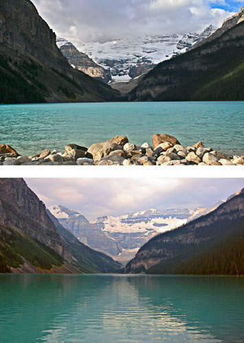
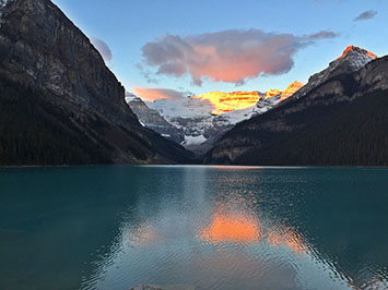
Iconic shots of Lake Louise, taken in 2008 and 2010.
Before getting to the main event, here are efforts from my last two visits. The top one, taken and corrected in 2008, is by me. The lower one, from 2010, is by a friend but corrected by me. Each gives a general idea of what the scene should look like. Each is excellent by the standards of the turn of the century but not so excellent today. That’s to be expected. The Picture Postcard Workflow was young in 2008. It was outstanding for its time, but it got better by 2010, and is considerably better today. In short, change for the better.
Another change for the better showed up a few weeks ago when another friend sent his version of the classic scene. It’s uncorrected, so it isn’t fair to compare it to the other two. But certainly it could be, although I don’t intend to do it, and it would likely IMHO turn out to be the best of the bunch.
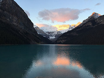
An uncorrected 2014 original, shot with an iPhone 6.
This one is not. The photographer remarked that he liked it better than his similar efforts with far more expensive and specialized equipment. He might not have felt that way had the subject been different, because these phones are biased in favor of brighter colors, so they do well in subdued scenes like this one. And the uncorrected output of a professional-quality camera would doubtless look better for the time being. But if the resolution of this particular image (3264×2448 pixels) is satisfactory, it’s hard to believe that one needs anything better as a starting point.
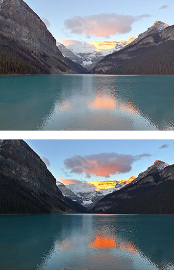
Two methods that existed when the 2008 image was shot, applied to the 2014 image. Top, a false profile to lighten, followed by multiplication through a blurred layer mask. Bottom, the Bigger Hammer.
Since Modern Photoshop Color Workflow was published the most common complaint concerns its stress on speed. The critics always say something like, “My work deserves better than a slapdash approach. I am willing to spend as much time as it takes.”
This Lake Louise picture is likely to provoke such a response. After all, it captures perhaps the most beautiful sight the photographer has ever seen. Plus, the knowledge that several million similar shots exist cranks up the competitive instinct and the desire to produce something really special.
My normal answer is that you’re better off doing three slapdash versions and then trying to blend them together than taking three times as long to produce something with meticulous care. Now, with the advent of new tools in the PPW panel that make it possible, I offer a variation.
Variation is a useful word, too. Back before the 2008 shot was taken, Photoshop had a command called Variations, which was unfortunately not as useful as it could have been, and hence is no longer part of the program. The idea was that beginners often have serious issues with color casts, wherefore Photoshop offered up half a dozen ham-handed corrections that the user could choose instead.
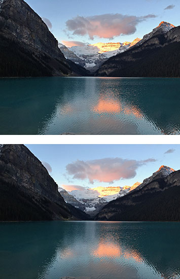
The two new actions in the PPW panel, v4. Top, the Lesser Hammer, bottom, the Velvet Hammer.
The idea is only workable IMHO if these half dozen variants can be produced very quickly. Fortunately, with today’s changes for the better, they can.
We’ll start with two variants that I could have had back in 2008, when custom Photoshop panels were not possible and actions ran slowly. But these two techniques were already known and haven’t changed since then. On top is what was then (and now, see MPCW Chapter 12) described as the major weapon against images with sharp divisions between well-lit and shadowy areas, of which this is clearly one. A false profile was applied to lighten the image, followed by a multiplication through a heavily blurred layer mask.
Beneath it is the opposite extreme. This is the Bigger Hammer action, which was then advertised as being for those images in which we are so desperate for highlight detail that we are willing to chance a violent action that may foul up other areas. I’d agree that what it did here was way over the top, but it would be easy enough to cut back its opacity, among other things.
An alternate Bigger Hammer version, using a different channel as the base for the overlay.
For v4, which is currently in the final stages of beta and which you can download in our Resources section, we added two completely new actions, the Lesser Hammer and the Velvet Hammer. As the names suggest, they are similar in concept to the Bigger Hammer, but the algorithms are different. They are less risky, particularly the Velvet Hammer; on the other hand they are less prone to spectacular improvements. They didn’t exist until now, because even if I had had the inspiration that they were needed and even if I could have figured out how to write the necessary actions, they would have run too slowly on older computers. But now, the two versions you see here can be produced in seconds.
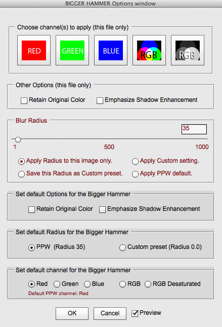
The Bigger Hammer Options window, accessed by Option-clicking the action in the PPW panel.
If I were now going to complete the correction, I’d start from scratch rather than using any of these five variations, which were produced in about a minute. I certainly don’t advocate running five trials on every image, because in the large majority we know approximately what we would like to achieve. But in a case like this Lake Louise shot, it’s not so obvious. These five variants may help us understand what is and is not possible, and they may change our mind as to how to proceed. If they do, then it will have been a minute well spent.
{ 2 comments… read them below or add one }
I find sky in my photo is vulnerable, especially in night. Any modification may cause heavy colour separation and noise. And when I try to apply some blur tools, the sky just turn into several streaks. They even can not be blured! Is there any method to prevent the sky being hurt or reduce it?
Optimo, generally the sky can be selected through Blend If, restricted to blues, and in this way can be insulated from the effect of any action. Another possibility is to run one of the two Darken Sky actions, which will give you a mask. Normally it is used to darken the sky but it can also be inverted and loaded as a selection or mask to prevent you from altering the sky.