

My friend and fellow author Russ Brown sent me an image of an Amazon milk frog, which he grabbed from the web somewhere. The interior of the mouth is a very unusual cyan. Whether this image portrays it accurately is unknown to either of us, as we have never seen this particular amphibian in person. To judge by the greens, this image has already had its color enhanced, so my supposition is that the cyan is probably less intense in real life.
At about the same time, another friend, Bob Baldassano, sent me the red train that’s next to it. The two men sent these particular images for reasons having to do with the distribution of color in nature, some nagging questions about how best to get it into a printable form, and why presses and inkjets sometimes get similar results and sometimes aren’t even close to one another.
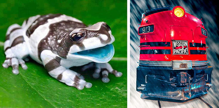
Bright colors aren’t evenly distributed in nature. The cyan interior of the frog’s mouth is unusual. Objects as red as the train are much more common.
The two are different in that one is of a highly unusual color and the other of a color that is seen frequently. They are alike in that there may (or may not) be an issue in getting the color we expect when we print them, granted what we are seeing on the monitor. These points are worth considering, and are applicable no matter what kind of printing we’re doing.
Russ sent his frog because of an old war about color management. Bob’s train was to support his idea about why PPW does well with reds (and peripherally, with flowers). Both can help us understand the distribution of colors in nature, and also some of the problems of colorspace conversions.
The images here (at least if you are viewing them online) are RGB, and more specifically, the variant known as sRGB. To print them, they will have to go into some variety of CMYK, maybe with some other colorants thrown in. Perhaps we will make this conversion, and perhaps whatever device we are printing on will do it for us. The potential issues are two: 1) that the monitor may show certain colors that can’t be printed; 2) that we may be able to achieve certain colors in print that can’t be duplicated on the monitor.
The first of these mismatches occurs in pastel colors. It is inevitable, and is greatly affected by the quality of the paper used. Lighter colors, in print, depend on exposing a certain amount of paper, which is never an absolutely pure white. Therefore, even under the best printing conditions, it will be impossible to achieve the same light magenta that a monitor can–although the better the paper, the closer the match will be.
The second mismatch, in dark, rich colors, is not inevitable. A single ink, printed solidly, may produce a color outside of the sRGB gamut, and hence can’t be displayed here. Much more has been made of this than should have been. The argument has been that since it is possible to avoid the second mismatch by defining a more inclusive RGB, we should do so. As I have always pointed out, this is a flawed argument, because the second mismatch is only for colors that are almost never found in photos, hence irrelevant, and that widening the RGB gamut simply makes the first mismatch worse without a corresponding benefit.
Admittedly, certain colors that can be printed, at least under good conditions, can’t be portrayed in sRGB. (If the color doesn’t exist in sRGB, but can’t be printed either, we generally don’t care.) But if we run across something that *can* be printed, yet can’t be made to exist in our sRGB file, nasty consequences can ensue–at least in theory.
In real life, it doesn’t work that way. Any printing device uses a yellow ink or other yellow colorant, the purpose of which is to prevent blue light from reflecting from the print. It does this so effectively that, if a maximum amount of yellow ink is laid down, sRGB can’t match the yellowness. Similarly, a maximum amount of magenta ink creates a color not found in sRGB.
To construct Bob’s reds requires nearly a maximum amount of both yellow and magenta. It might be supposed, then, that since sRGB can’t match either of these colors (in isolation, that is) it can’t match their combination, the red, either.
That theory would only be true if the two inks were absolutely, completely, totally, and utterly transparent. That is, if the ability of yellow ink to prevent reflection of blue were totally unaffected by being covered by a huge amount of magenta ink. Indeed, ink manufacturers try very hard to get that complete transparency, but they never quite succeed.
Consequently, bright reds are always within even the limited gamut of sRGB–that is, if the reds are printable by any known device. If they aren’t, what’s the difference?
The potential problem areas are not reds, greens, and blues, but cyans, magentas, and yellows. That problem exists almost independently of the printing process: when a paper is completely covered with ink the quality of the paper is less important. Frequently, you will see some theoretician produce a chart showing that sRGB is incapable of portraying a massive number of printable colors, which is true. The questions are, how useful are these potential problem colors, and how big would the corresponding chart be, the one that shows colors that sRGB contains but that aren’t printable.
Here is a graphic of what we’re up against: the six colors based on maximum amounts of the three red, green, and blue primaries, shown in three groups. The top row is the sRGB maximum: the yellow is 255r255g0b, for example.
The second row shows how close one can get to these six colors in print. Or at least, on an offset press using medium-quality paper with CMYK inks. If it were an inkjet printer with good paper and/or additional inks, the difference between rows one and two might be cut in half, but it would still be there.
The third row is less trustworthy. It is the maximum color obtainable in print, which doesn’t vary much with the quality of the print process. However, to place it in this file it has to be converted to sRGB. So, in the event that the print color is more intense than sRGB can handle, we see here a weaker version that isn’t an accurate representation of the print.
One footnote the term “green” to describe the final color in the bottom row is deceptive. Using maximum amounts of yellow and cyan inks/colorants produces something distinctly bluer than found in any vegetation, hence it is a very uncommon color. I will use the term “teal-green” to describe it.
Unsurprisingly, the sRGB maximum colors are much lighter than their print counterparts. RGB colors are created with light; the more light, the more potential color. But print colors are created with ink, the more ink, the more potential color—but also the darker the result.
So a mismatch has to exist. The questions are, how big, how bad, and where located. You might start by asking yourself, how many of the six “print” swatches shown in line three are inaccurate because in reality they are significantly more intense (answer: three) versus how many of the six sRGB swatches shown in line one are unprintable without a significant shift (answer: five).
Next, ask yourself how important all of these pictured colors are to you in your daily work, and especially, how often you will want something midway between the sRGB and print versions. And “these pictured colors” means what it says, not desaturated relatives. For instance, no vegetation is anything near as vivid as the pictured yellows and greens. It never is a problem.
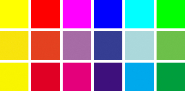
Top row, maximum color in sRGB. Middle, CMYK equivalents of the top row. Bottom, sRGB equivalents of the most colorful CMYK variants.
Since the third-row versions pictured here are unreliable, I’ll try to quantify the mismatches, and discuss the meaning of each. The simplest way is to quote four sets of LAB numbers for each color.
First, we’ll look at how colorful the maximum sRGB (top row) and print colors (borrom row) are. This is measured by the sum of the absolute values of the A and B channels, in other words, how far they vary from a neutral zero.
Then, we’ll see how bad the mismatch is when going from sRGB to print (middle row), and also vice versa (impossible to display in an sRGB file). The mismatch is measured by comparing the before-and-after LAB values in each of the three channels, and adding up the differences. For colors this close to the edge of the gamut, I’d say anything up to about a miss of 6 points is acceptable.
Two notes: the LAB method is appropriate because, in principle, LAB is linear, meaning that a difference of 20 should appear about twice as obvious as a difference of 10, and so on. However, the reading for sRGB to print is less reliable than from print to sRGB. For my conversions, I am using the default conversion to CMYK in Photoshop. When we are talking about full coverage of ink, that should give fairly accurate results for any type of printing. When discussing something lighter—and trying to match a bright sRGB color qualifies—then the quality of the paper and the type of printing can make a substantial difference. Particularly this is true if the printer has light cyan and light magenta inks available, as many inkjets do. So I would say that under good inkjet conditions, the differences might be only half as high as indicated.
With that, let’s look at the scorecard.
YELLOWS:
How colorful? sRGB (row one) 109, CMYK (row three) 114.
Magnitude of the miss: sRGB to CMYK 27 (row two compared to row one), CMYK to sRGB 9
Comment: This is the closest match of all, and the one that gives us the least to worry about, in spite of the fact that bright yellows are common. It is correct that CMYK can produce a brighter one than sRGB can, but we don’t have good perception in such yellows. Meanwhile, the ones that can’t be reproduced in CMYK are light greenish yellows, a color that is rarely seen, as we almost aways want warmer yellows than that.
REDS:
How colorful? sRGB 151, CMYK 124.
Magnitude of the miss: sRGB to CMYK 35, CMYK to sRGB 4
Comment: The numbers say that the match is the second best out of the six, yet reds cause more problems than the other five put together. Why? Because unlike the other five, intensely colored reds are common, both near the fringes of the sRGB gamut and the CMYK. Unlike yellow, we can easily perceive when reds lack detail. Better detailing in the reds is one of the things that distinguishes the color expert from the non-expert. The PPW, with its ability to add color and luminosity variation, shines in this area. It would do just as well if there were other common colors just as deep and saturated as these reds—but there aren’t, except maybe in some flowers. And that’s the answer to Bob’s comment that PPW works such magic with reds and with flowers.
MAGENTAS:
How colorful? sRGB 154, CMYK 86.
Magnitude of the miss: sRGB to CMYK 108, CMYK to sRGB 11
Comment: sRGB’s failure to encompass all possible magentas gets the attention, but the real nightmare is the opposite situation: that big number for the sRGB to CMYK miss, in combination with the very different gamuts among printing devices.
sRGB can’t handle magentas deeper and richer than the swatch pictured in row three above. That’s a very unusual color. In the last ten years, I’ve seen exactly one image containing such, a rare Asian flower that is unusually deeply colored.
On the other hand, many flowers are light enough to get close to the sRGB maximum. When that happens, disaster awaits.
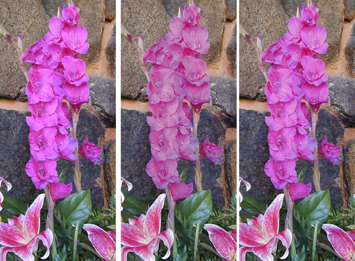
Left, the original magentas are close to the edge of the sRGB gamut. Center, a conversion to press CMYK comes nowhere close to the original. Right, as it might come out on a high-quality inkjet.
On the left is the sRGB original, in the center, a direct conversion into a CMYK designed for commercial printing on inexpensive coated paper, reconverted into sRGB for display in this file. Obviously, anyone expecting something like the version on the left will be disappointed.
Worse, this effect often causes proofing problems. Remember, the ability to produce a dark, rich magenta doesn’t vary much by printing condition, but a light pastel like this one does—it is especially affected by the quality of the paper. So with high-quality paper, we might get something that splits the difference between the two versions, and with a good inkjet printer we might do even better. I’ve tried to emulate this on the right. The problem is that some might consider the right-hand version acceptable, but not the one in the center. So, if we use such a printer/paper combination to try to proof commercial printing, even though it might work well for 99% of all images, it would fail badly on this one.
BLUES:
How colorful? sRGB 178, CMYK 91.
Magnitude of the miss: sRGB to CMYK 162, CMYK to sRGB 0
Comment: This result is no secret: saturated blues are difficult to impossible in all print conditions. Such blues aren’t especially common but they do exist, and then a workaround is needed. But it has nothing to do with the insufficiency of sRGB, which, as the miss numbers above show, is more than adequate to encompass all printable blues.
CYANS:
How colorful? sRGB 66, CMYK 79.
Magnitude of the miss: sRGB to CMYK 53, CMYK to sRGB 17
Comment: Now we start to see a major mismatch. That 17 for CMYK to sRGB indicates a large range of printable, yet not displayable, colors. We must ask, however, how often we encounter such things. My answer is, once every five years or so. I doubt that the frog qualifies.

Sèvres porcelain features cyans more intense than can be portrayed here, due to limitations of sRGB.
In the eighteenth and early nineteenth centuries, the Sèvres porcelain refinery in France was noted for its extravagant, expensive designs. One of their strategies for keeping their product expensive enough to be patronized by monarchs was to use the most costly colorants. Cyan was a specialty. Here is something I grabbed off the web. It isn’t accurate because this file itself is sRGB, which prevents the full richness of the color. But I’ve seen these pieces in museums, and can assure you that the cyan is printable, yet not contained in sRGB.
I’ve also seen some Chinese precious stone from more than a thousand years ago that also would be at least partially printable, yet not achievable in sRGB. But if you’re not dealing with such antiquities, or with Sèvres porcelain, I don’t know when you would ever find the sRGB limitation a problem.
TEAL-GREENS:
How colorful? sRGB 160, CMYK 115.
Magnitude of the miss: sRGB to CMYK 58, CMYK to sRGB 32
Comment: The biggest supposed defect in sRGB proves to be vapor. The miss number for CMYK to RGB, twice as high as the next worse, shows that the swatch shown above isn’t even close to what can be achieved in print. You would have to assume something deeper, richer, and significantly more blue. The next step would be to imagine an object that might possibly need to access that color, and you could think about that for a very long time–I’ve never seen an object that falls in this area. Meanwhile, “real” greens, which are less saturated and have a big yellow component, are no problem.
SUMMARY
The above discussion is interesting to those who need to understand what colors we are likely to work with. Ten years ago, it would have been considered much more significant than it is today. Back then, the choice of RGB workspace was politically charged; today we know it makes little difference in the overall scheme of things.
Today, when we start with a raw capture, the recommended settings in Modern Photoshop Color Workflow produce a flat-looking original that is certainly within the sRGB gamut, even if the user outputs it into some other RGB. Accordingly, assuming that we’ve decided to stick with a widely-used RGB, sRGB theoretically fits the workflow better than the wider gamut RGB. Even if the starting point, whether raw or JPEG, is full range, there is a strong theoretical case for sRGB, because any colors it doesn’t contain are irrelevant.
Accordingly, in preparing Modern Photoshop Color Workflow, I spent a lot of testing time trying to demonstrate that using something as wide-gamut as Adobe RGB isn’t a good idea. I was not able to do this; the theoretical disadvantage may be there but it’s inconsequential in real life. Something ultra-wide-gamut, like ProPhoto RGB, has no merit IMHO.
Colors that are printable but not displayable are very, very rare. Because this was controversial in the early part of the century, for the last ten years I’ve been on the lookout for them. And, as you may have gathered, if all Sèvres porcelain is considered as one item, then I could count the images on my fingers: a few yellows, a couple of cyans, one magenta, and zero in the huge teal-green range. The yellows are of no consequence as nobody could tell the difference. The three others, yes, I believe quality would be noticeably damaged if sRGB was the only correction space.
Note also that the type of printer in use makes no difference. A high-quality printer doesn’t increase gamut very much in these ranges, and even if it did there still would be essentially no objects that we want to reproduce.
But what if there is? In that case we’d hope that the printer might be able to accept a CMYK file, or an LAB file. And, we don’t need to know for sure that the object is out of gamut. I don’t know that the frog is, in fact I suspect it isn’t, but why take a chance? If I had to work on it, I’d do it in ProPhoto RGB.
The reason I would do this, of course, is that I would have taken one look at this rich cyan and realized that there was a potential case of being able to print something better than what’s seen on the screen. That’s a fine skill to have, but as I hope this article has shown, an even better one is the ability to recognize instinctively the sorts of vivid pastels, like the magenta flowers shown above, that look great on the monitor but print unpredictably.
{ 11 comments… read them below or add one }
This post reminded me of a discussion, Pure Color Green, which happened on the list some nine years ago. In my case the problem was the light greenish-yellows (e.g., 18,0,56,0, often labeled chartreuse) which, while perhaps being rare in nature, are a familiar component of certain dyed fly-tying materials.
Paul, yes, this is another example of a color portrayable in sRGB that is far outside of the range of any printing device. A pink flower like the one shown in the article is more common, but these chartreuses do occur in products even if they don’t in nature. I use a similar example in class demonstrations, an emergency flashlight/flare whose body is an almost luminous yellow-green. These situations (RGB contains unprintable colors) are, as indicated, vastly more of a problem than the contrary (printable CMYK colors that can’t be accessed because they aren’t definable in RGB).
Dan, the one thing you haven’t touched on in your color correction books, is how you go about setting up to output your digital pics to an inkjet printer. Is there anything in your procedure that might differ in any significant way from the conventional methods used by professional photographers and photoshop users? I ask because many people might get great colorful images on their monitor screen following your color correction techniques, but may be in for a let down when the print version seems to pale by comparison. Thanks for any advise.
Robert, the good news is that an inkjet can be considered as just another kind of CMYK, except that ordinarily we can expect a better gamut than on press, which eliminates certain headaches.
The bad news comes in three pieces:
1) Often our options are limited in that we are not permitted to convert to CMYK, as the printer needs to do that itself (and definitely needs to do that if extra inks are in use);
2) The capabilities of individual inkjets vary enormously, so generalizations as to specific settings are useless;
3) The canned settings provided by the vendors are often, shall we say, not up to professional standards.
There’s not much alternative except to print various samples–including something like the swatches shown in this file–to see to what extent you’re getting screen-to-print agreement, and to adjust your workflow as needed.
I’ve tried several time to add the PPW extension to CC2014 and it doesn’t seem to work. I’ve tried updating the Extension Mgr. Does PPW work in CC2014? (yet).
Thanks,
Mike
Mike,
Unfortunately at this time the panel is not compatible with Photoshop CC 2014. When a compatible version is available we will announce it here.
I use a similar example in class demonstrations, an emergency flashlight/flare whose body is an almost luminous yellow-green.
I wanted to bring to your attention that the Shadows and Highlight S/H button does not work on the latest PPW panel for PS 2107. Thanks.
Matt,
This does not provide enough information for us to be able to assist. Please go to
http://www.moderncolorworkflow.com/troubleshooting-ppw-panel-for-cc2015-v-4-0-6
and give us the answers about the specifics of your system and an exact description of the problems you are having. The questions we need responded to are found under
“If you have what appears to be a successful installation and can open the panel, but certain features aren’t working properly,”
Hi Dan,
I would love to purchase your book modern color workflow but, I can only find it used for $130. Do you know where I might but it for face value?
Thank you,
Chris
Chris, amazon, which is the source of new purchases, occasionally runs out of stock unexpectedly, leaving the used market temporarily the only thing available. Everything is back to normal now.