

It’s always hard to find distinctions between procedures that yield the same results most of the time. The blending modes Darken and Darker Color (and their cousins, Lighten and Lighter Color) often are indistinguishable. In view of the importance of blending separate versions in the PPW, I’ll show a case where they differ.
The theoretical difference is that Darken (or Lighten) work channel by channel. The result can therefore be a mix of channels from the two different sources. Darker Color and Lighter Color replace all or nothing.
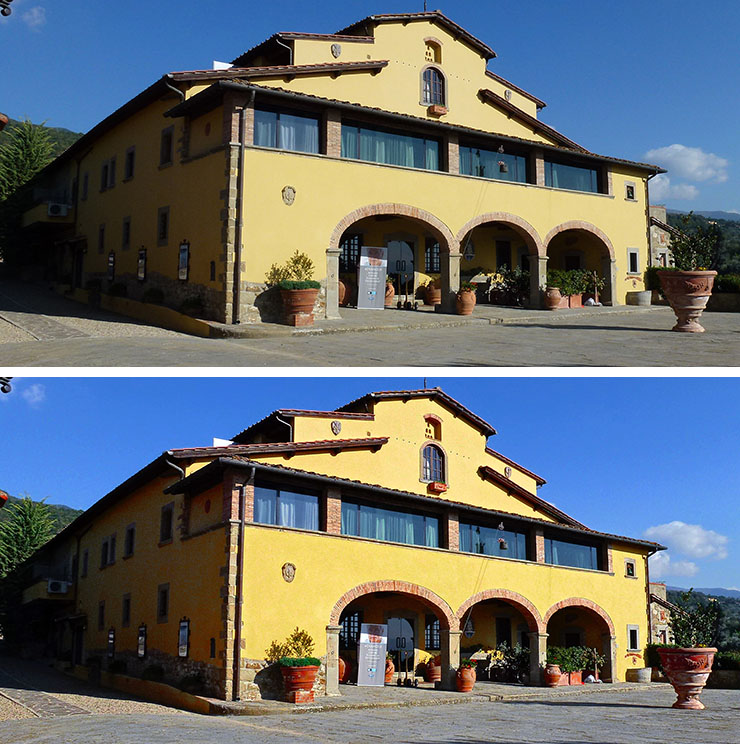
I recently taught an Advanced ACT class in Reggello, Italy. We will discuss an image of the building in which the class was held. I would like to have an attractive result that suggests the warmth of the Italian countryside, but this is not a high-value image, so time will be a factor. First, an overview of the original plus my first attempt using PPW, done in about three minutes with the help of the new Velvet Hammer action.
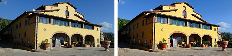
The original, and a corrected version produced quickly in PPW.
Granted how quickly it was done, if this were a more important image I would now make a second try, starting from scratch. Under the circumstances, I decided to cut corners. I was basically satisfied with what I had, however I was concerned that the image was too warm in the darker areas, such as the side of the building and the shadowy areas above the doors. I also thought that perhaps the building was too dark or too yellow, but I wasn’t sure.
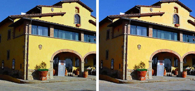
I wanted to blend with the uncorrected original, which is quite flat among other problems, about as much as I want to hear from a telemarketer. So just to make something slightly more palatable, I applied Image: Auto Tone to the original. Let’s go to a larger size and compare my first correction to the Auto Tone version.
Top, the correction previously shown; bottom, the original after Auto Tone has been applied.
Auto Tone forces neutrality into the shadow, which is what I was after. I thought it might also be usable to alter the building, but was disappointed. The corrected version seems clearly better in all light areas. This is not just a matter of color: note, for example, the better definition of the clouds at right.
The apparently obvious solution is to blend these two through a layer mask that leaves the lighter half of my image alone but substitutes, to some extent, the darker half of the Auto Tone version. It seemed to me, though, that I could take advantage of the fact that most of the shadow in the Auto Tone version is darker than in my correction, without necessarily damaging the lighter areas. So I put the Auto Tone version on a new layer on top of mine, and changed the blending mode. And here is a case where Darken and Darker Color get clearly different results.
The same two sourcefiles create both versions above. Yet the Darken version (left) seems greener than the Darker Color version (right). Why? Going back to the two parents, my corrected version has the building as a strong yellow. The formula for this in RGB is a strong blue channel, a moderate green one to add warmth, and a weak red one. The Auto Tone version, being more neutral, has less variation between channels. Comparing the two, the Auto Tone’s red is darker than mine. It therefore replaces it in the Darken version, but the green and blue remain as they were. It’s the equivalent of adding cyan ink to the building. The result, IMHO, is disagreeable.
The pavement also varies. Overall, the Auto Tone version has darker pavement than mine. Therefore, in Darker Color mode the Auto Tone version wins. But in Darken mode, only the red, and possibly the green channels, are darker in the Auto Tone version. The blue channel from mine remains. The three possibilities: my version alone makes the pavement warm. Darken mode makes it yellow. Darker Color, or Auto Tone alone, makes it neutral.
Darker Color can create its own problems. Check out the weird effect in the top front of the building, just below the window. PPW didn’t just put more yellow into the building, it added contrast. Generally its building is darker than the Auto Tone version, but in certain small areas it’s lighter, and is being replaced in Darker Color mode. Disturbing!
Time now for some aesthetic decisions. Do I want to cut the color of the building? If so, I should use some of the Darken version, which doesn’t have the aforementioned defect of the Darker Color. My decision was to go with the building as is, but to use the Darker Color version to neutralize much of the shadowy parts.
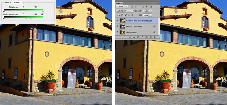
Left, a Blend If setting prevents using the Auto Tone image where the first correction’s green channel is light. Right, the same color as on the left, but the luminosity of the corrected version has been restored for better detailing in the shadows.
Above left, applying the Blend If settings shown to the Darker Color version wipes out the problem in the top areas of the building. It establishes a transition zone that neutralizes the pavement somewhat while still retaining a touch of warmth. And it does take the warmth out of the shadows, which was my original goal.
At this point everything is a matter of taste. The Blend If can be adjusted to alter the treatment of the pavement. The opacity of the Darker Color layer can be reduced to leave the shadows slightly warm. I decided not to do either of these things. I did, however, feel that the shadows in the left-hand version above, although properly colored, are too heavy. So I added a third layer, a copy of my own correction. Setting it to Luminosity mode retains the color of the left-hand version while restoring some shadow detail. I left the opacity of this new layer at 100%, but I could have reduced it to split the difference between the left- and right-hand versions above.
The entire exercise is typical PPW. A quick first version, then an even quicker second one, followed by merging the best of the two. This requires a knowledge of channels and also, as here, of blending modes. If you have that, things become easy. Remember, my second version was created by applying a single command, Auto Tone, to the original. Time elapsed: two seconds, perhaps. And yet that second version played an important role in cooling down an overheated first correction.
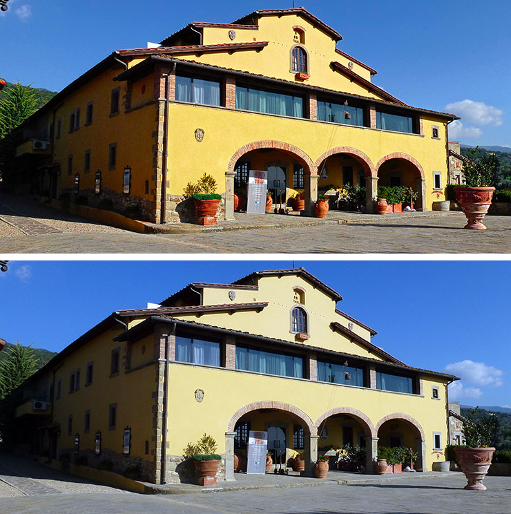
The original, and the final version (expanded from the right-hand version above) are shown below.
Color Mode (2)
{ 2 comments… read them below or add one }
Dan, this blog may not be the best place for this question, but. You’ve probably heard the story, so — what color is the dress on that Tumbl pic? The whole internet is discussing it all the week)
Vsevolod, it is green and orange. Anyone who thinks otherwise is blind.
Try saying this to people and see how many accept it as true.