

The arsenal of weapons that we can deploy against recalcitrant images is powerful and impressive. When used prudently, that is. Assuming that because you have them you are guaranteed to create stunning imagery tempts you to try too hard to make it so. When this happens, as we’re about to see, the weapons, including PPW, are worse than useless. This post will talk about how to identify the images on which PPW is no better than alternate methods.
I have been posting PPW comparisons with a series of 150 images from the MIT 5k dataset. The opponents are five hired student retouchers, plus a sixth “par” version in which each of the five is worth 20%.
Because the images were taken at random, some will surely favor PPW over conventional methods. I wrote about those categories in the previous post, trying to suggest how you could identify images where you would expect good results. For example, pictures of deserts and canyons showed a great superiority for PPW.
The list of images where PPW has only a limited advantage or none at all starts with those whose main issue is incorrect color, such as an unpleasant cast. Other methods have tools just as powerful as PPW’s to correct these, although skill is required to use them properly. My own corrections on such images have a high win rate against the paid retouchers, but that’s experience, not system. If even one out of the five retouchers gets color as good as mine it suggests a limited superiority at best for PPW. More frequently, the par version, the average of the five corrections, turns out to be of good quality. Out of 150 comparisons between PPW and par, 17 were rated ties. Normally this was because the PPW version clearly had better contrast/detailing but the par version clearly had better color. We saw an example of this in an image of a young girl in this post.
4180-default: This image, although it might well be found in an advertisement, offers little chance for creative improvement. There is no reason to suppose that PPW would do better with it than any other method.
The obvious category for which there is no advantage is the simple kind of picture with no technical issue and little room for creativity. Here’s one original, as received by the retouching team.
You’d never find so boring an image in a color correction class, but they do pop up from time to time in advertising work. Consequently its presence in the set, which is supposed to showcase typical images that a professional might encounter, is appropriate. I see no point in showing any of the corrected versions. I am losing little sleep over the fact that my entry did not win.
PPW has a big advantage when colors are subtle, as they are in images of canyons. It also does well when colors need to be intensified but not across the board. If neither factor applies we get to the hardest category to diagnose: when the scene contains many brightly colored objects and there is no reason to pay more attention to one than another. The four default images that follow invite the retouchers to create several strong colors. I invite you to predict which one(s) PPW will do better on. Getting the answer right is important, because I’m about to show, trying to force an advantage can backfire. I’ll show my versions next to the best of the rest, and explain how I would have answered the question before and after working on each.
2083-default and 2834-default: Both shots feature intense colors. Do you expect PPW to have an advantage in one, neither, or both?
4182-default and 4199-default: Two more scenes featuring bright colors. How will PPW do?
We should agree at the outset that any reasonable workflow can produce bright colors on demand. If that’s all that’s needed there should be no advantage to PPW, unless one of the following things occur:
*The strongly colored objects are of similar hues that compete with one another.
*The strongly colored objects need to display more detail.
*The entire picture is so colorful that it is helpful to force more neutrality somewhere.
*Certain other colors need to be toned down to avoid competing with the strong colors.
*Certain colors need to be protected from getting more intense.
I wasn’t too clear on these rules when I started these exercises. but I did know enough to predict what would happen on the surfboard shot we’re about to look at.
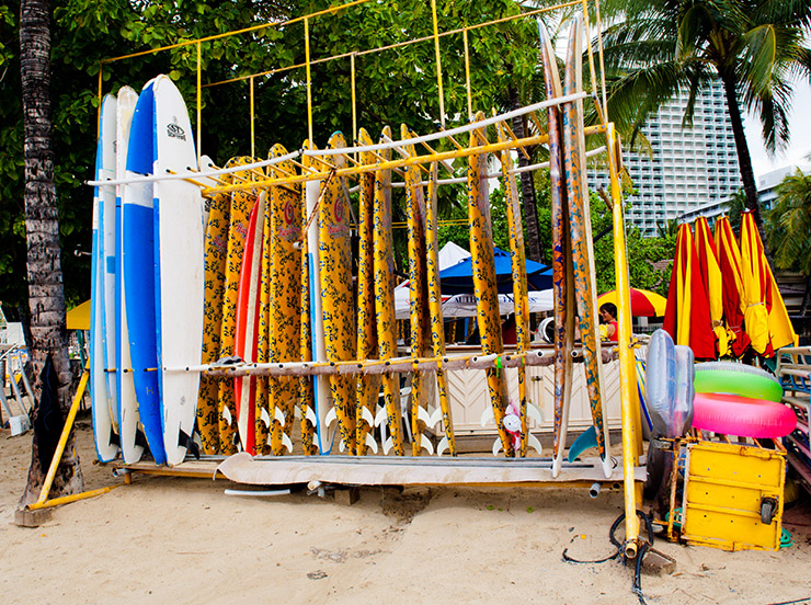
4199-C: The best correction by any of the retouchers.
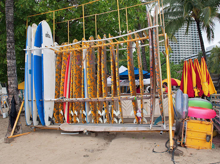
4199-PPW: It’s hard to say that this is any better than what the retoucher did.
I do not show the average, the “par” result. because a couple of retouchers dragged it down with poor efforts. So my version wins over par, but not over the version of retoucher C. No apparent advantage to PPW.
This came as no shock to me. The surf equipment features lots of bright colors, but they are already well differentiated. The MMM action is therefore not particularly helpful. It’s moved some yellows toward orange, which is not a big deal one way or the other. The colors are basically blobs, not needing much detail, which wipes out another PPW advantage. And although the bright colors are striking, they are well distributed throughout. Most of the image’s real estate is dull and not particularly important, just the thing that makes bright colors pop.
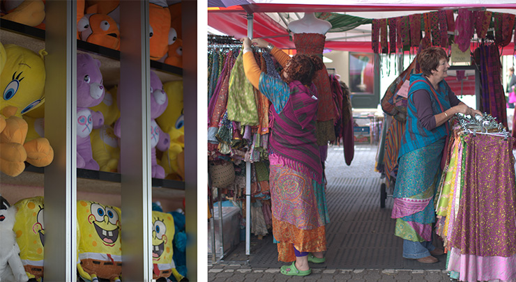
The lack of these factors is why PPW is better on the following image of stuffed animals. This time, the challenger is the par version, which, as it often does, beat all five of the individual retouchers.
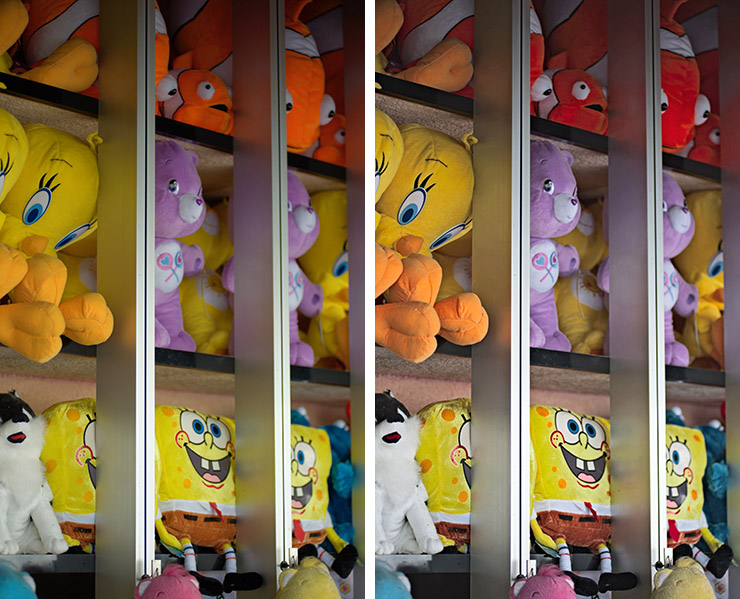
2083-par and 2083-PPW: The retouching team’s averaged version, left, brought out the bright colors that are surely needed. But the objects lack the shape found in the PPW version at right.
Even though the original image was underexposed and muddy, the retouching team had no difficulty establishing the desired strong colors. But these objects are larger. They need more shape, unlike the surfboards. And the reds, yellows, and oranges compete with one another, a problem that did not exist in the previous image. Plus, a much higher area of this image is devoted to brilliant colors than in the other. When everything is colorful, then nothing is colorful.
PPW’s shape-creating tools, channel blending plus the H-K and MMM actions, attack these problems directly and create a more attractive result.
This extra shape is usually available in bright-color scenes. In the surfboard shot it was of no value. In the stuffed animals it was critical. A third category is where the extra shape makes a big difference but the question is whether it’s desirable, and if so, how much. The following image can be interpreted in several ways, so I offer two alternatives to PPW.
4182-par: This image can be interpreted in various ways. Unsurprisingly, the averaged version is correct, but conservative.

4182-B: This retoucher favored a warmer look.
4182-PPW: The high-contrast look would be hard to duplicate without PPW. The question remains whether it is desirable.
If these were submitted to a jury I expect that all three entrants would get votes. Mine, incidentally, goes to retoucher B. My idea was to make the background very dark, hoping that this would make it seem that a spotlight was shining on the girl. It did that, and it would have been hard to duplicate this version outside of PPW.
Some might like this overdramatic treatment. Unlike the other two, which are bland enough, I can see someone actively disliking mine. It’s another reminder that when we get a good idea it is easy to fall in love with it and take it too far. Still, I expect that those who favor one of the other two versions would concede that each would be helped if it moved slightly in the direction of mine. Without PPW, that option was not open.
The final example reiterates what I said at the outset about the dangers of trying to force something to happen.
2834-par: Creating brightly colored clothing is not a problem.
2834-PPW: A misguided attempt to tone down all but the brightest colors, a move that worked well in the stuffed animals image.
My wretched performance on this exercise came because I decided it was analogous to the stuffed animals image, which was in danger of being overwhelmed by bright, featureless colors. The solution there was to darken and desaturate areas that were colorful yet not the most colorful things. The move added shape and made the strongly colored objects stand out more by comparison.
Trying the same approach in this clothing image was a poor idea. Although the bright colors dominate in terms of jumping to the eye, a large percentage of this image is not colorful at all. There was no point in toning those areas down. All that doing so accomplished was to make it tough for me to get to the attractive bright colors of the par version, colors that needed no help in being distinguished from one another.
We close on this painful note, hoping that it reminds us that when there is no reason to believe that the fancy way has an advantage, stick with the straightforward way.
{ 0 comments… add one now }