

Previous postings evaluating how the Picture Postcard Workflow did compared to the retouching team on the MIT dataset established the obvious, that neither PPW nor any other workflow is the perfect solution every time. The question is, how do identify when PPW shouldn’t be expected to be better?
Sometimes the image simply doesn’t have enough potential for improvement; sometimes it can be improved but the tools of the PPW offer no particular advantage; this typically is when an image has lots of natural color variation and no need to emphasize detailing in the brightest objects. I’ve shown examples of all three in previous posts in this series.
But these are predictable: I look at them, and expect nothing special out of PPW. The reverse is an image of a canyon or desert. These play into the hands of PPW’s ability to differentiate similar colors. I expect to do much better than the MIT retouchers when confronted with this type of image, and this was indeed the case, as shown here.
This post is about a learning experience: the type of image where I expected to win as easily as with a canyon shot, but it turned out otherwise. Sometimes that was due to sheer stupidity, which is an occupational hazard and examples of which are in other posts.. But in a few cases I was confident I would win and did not, even though I made no obvious mistakes. That category is what I’m about to discuss.
The first surprise had to do with size. PPW has a big advantage in portraits and other fleshtone images because it can create color variation without changing the overall perception. It can, for example, make lips and cheeks redder, compensated for by making certain areas cooler. This is a decisive advantage when the face dominates the image. I would have thought the advantage would persist at least somewhat in smaller sizes. But when the face was small because the subject was portrayed full-figure, if PPW had an advantage it was for other reasons. (The set contained no nudes, which probably would have been wins for PPW.)
The second involves a specific color. I expected no problem winning the competition on the following two originals.
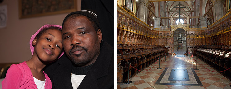
4987-default and 2764-default: I expected better results than I got from PPW on these two originals.
Both are dominated by various shades of a single color. PPW usually has a big advantage in such images because of its ability to drive colors apart. And indeed, PPW won easily in the other six portraits where the faces, as here, were large. But not here, and not in the picture of the church choir stalls, either. Maybe they could be called a tie, but certainly no clear superiority.
It is not a coincidence, in my opinion, that this was the only similarly-sized portrayal of dark-skinned African-Americans, For some reason, the color variation that PPW invoked was not as attractive as in other cases. Here’s the comparison.
4987-PPW: Plenty of snap, but perhaps too much hue contrast.
4987-par: The average of the retoucher versions. Too flat, but if we consider color only, this is possibly the better of the two in spite of being too yellow.
I don’t think the par version is very good. It’s flat compared to the PPW, and too yellow. Nevertheless, if I had to choose on the basis of color only, I would take it. I don’t see an obvious mistake in the PPW color but somehow it’s not attractive. Based on a similar result in the church image, I have to suggest that when the base color is more neutral we have less tolerance for color variation than when the color is more saturated.
Skin is basically red in every ethnicity, but light Caucasian skin is so saturated that a PPW routine can never yield anything that no longer is red. Certain parts of the face may get cooler, but that just makes them a duller pink, which we are inclined to accept. But when the skin is a deep brown these same parts of the face may become neutral or even green or blue.
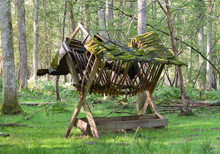
The third surprise was how seemingly irrelevant objects can affect the need for variation. Here’s another pair of originals:
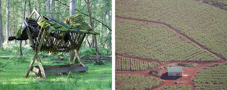
0017-default and 2796-default: two images that feature green. Will they handle the same way?
I again anticipated an easy win for PPW on both images because PPW thrives on large areas of green. That’s how it turned out on the first:
0017-PPW: the greens have plenty of detail and also hue variation.
0017-par: the average of the retouching team is not competitive.
I assumed that the other original would handle just like the above, but obviously I was mistaken. Here’s my version compared with the best result from the five retouchers:
2796-ppw: plenty of hue variation between the soil and the greenery, but who needs it?
2796-C: rich, sunny colors make for an attractive presentation.
My takeaway from this is the viewer is subconsciously attempting to differentiate the browns from the much larger areas of green, rather than finding more differentiation in the greens themselves. In the other example, although some browns exist, they are apparently not the priority. Another possibility: in the second image the greenery could be described as boring. In the first, it has interesting features that we are apt to want to investigate. And maybe more important: if the only question is how different are the browns from the greens, then PPW wins. But that’s not the only question, it’s not even an important question, because there’s plenty of differentiation in the original, no need to exaggerate it.
These theories may or may not be correct, but still, I learned a lot from these unpleasant surprises and hope that you may as well.
{ 3 comments… read them below or add one }
In this article you explain very well what I’ve found in many of my image that sometimes convinced me to leave the ppw: although the ppw workflow is correct the result are not very attractive like a normal workflow, also if the image have more color variations and contrast.
Well done as always. Thank you so much for the time and the idea that you give us for free.
Dan,
In your first two example images here, the image you’ve called out as #5054-default appears to be #2764 in the dataset. The caption there also calls the first image #4897-default but is correct in following examples as #4987.
Lance, Thanks. The post is now corrected.