

A recent post on the appliedcolortheory list, discussing my suggested procedure for making gross changes in the color of a product, noted that it used Filter: Blur>Average, which the poster said he never used under any other circumstances. I will now show a related use of it that can really help out certain product shots.
Just as we can change the color of a dress from orange to mauve, or a car from red to green, we can change the color of certain backgrounds, although sometimes their character would not permit it. This ability can be exploited if we choose a background color that flatters the product or whatever else is in the foreground. Or at least if we move in that direction. I will show a real-world example, but first let’s try a computer-generated graphic.
Assume, please, that we have two products as shown, one brown and one blue. We have a lot of flexibility as to the background color, but it cannot be made white, black, or anything close. The objective is to make one or both of the products really stand out.
Following are four examples. Please state the one you would pick if you are instructed:
1) That the brown product is much more important than the blue one.
2) That the blue one is much more important than the brown.
3) That the two are of equal importance.
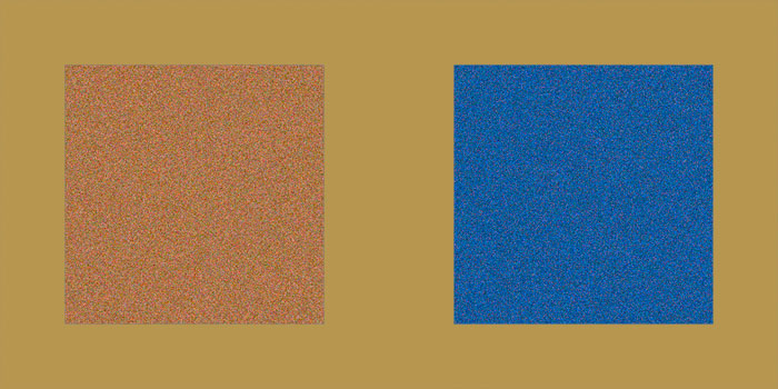
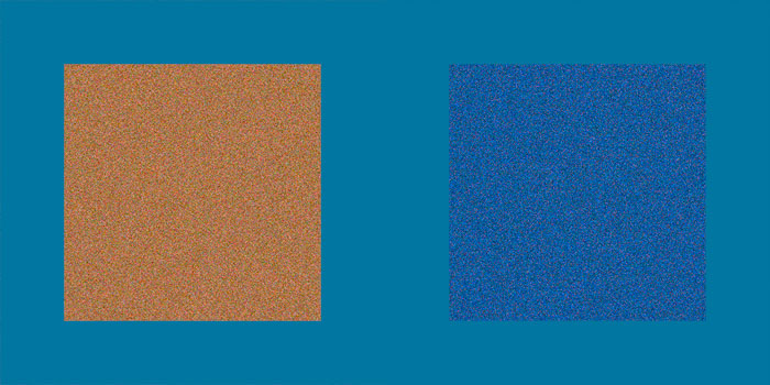
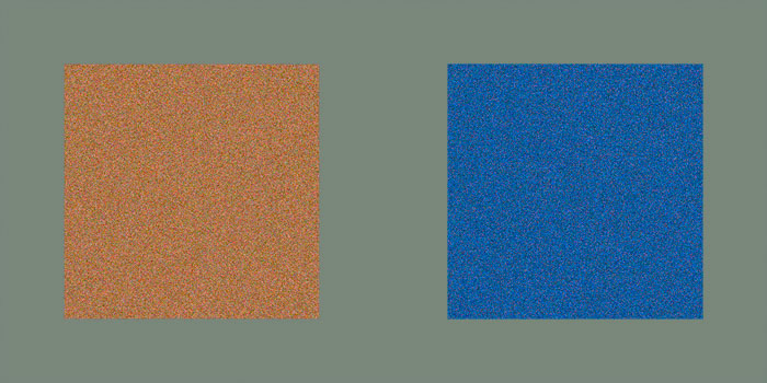
Version A. Which background is best suited to bring out the brown box on the left? The blue box on the right? And which if both are considered equally important?
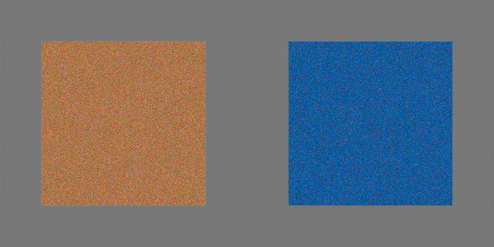
Version B.
Version C.
Version D.
My answers, which I assume are yours also, are that (A) is best for the blue object, (C) for the brown, and (D) if the two are considered of equal importance.
How were these backgrounds chosen? We know that the greatest contrast is found between a color and its complementary—its opposite, its opponent. There are various definitions of complementary floating around, but the most accurate for our purposes is to select the color in LAB and invert it. To test, you can put one color on top of the other at 50% opacity. If you really have complementaries, the result is always 50% gray. Note: if you are playing around with complementaries, much of the time you’ll have to use Color mode to avoid damaging detail.
How do we find the complementaries in this graphic? Just sampling the squares with the eyedropper won’t necessarily work, because they are textured. That’s where Filter: Blur>Average comes in. To make (A) I selected most of the blue square, and applied Average. The texture is now gone, as every pixel within the averaged area is identical. I find it is 36L(6)a(42)b, which I set as the Foreground Color. Then I cancel the averaging, select the background only, fill it with the Foreground Color, and Invert. This yields (approximately) 64L6a42b, a light yellow-brown. Just the thing to make the blue square pop, but it makes the brown square harder to see.
To get (C) I did the reverse, selecting and averaging a piece of the brown square and inverting it to get a blue strongly tending to cyan. Now we see the brown square perfectly, and the blue one not so well.
What if both these squares are important, but neither more so than the other? You might think that the best background would be a gray, as in (B). Not so. A concept known as Schönfelder’s Law suggests that the best background would be the complementary of the average of both colors. To find it is simple. Select a piece of the brown square, then Shift-select a piece of the blue one. Then, run Filter: Blur>Average, which can run through multiple selections.
The average of the brown and the blue is a grayish purple, 45L6a(6)b. Inverting it creates the greenish-yellow-gray of (D), which makes the two squares stand out better than the pure gray background of (B).
Now, let’s consider a real photograph. (E). I assume that the three varieties of grapes are the focus, and that each is as important as the others.
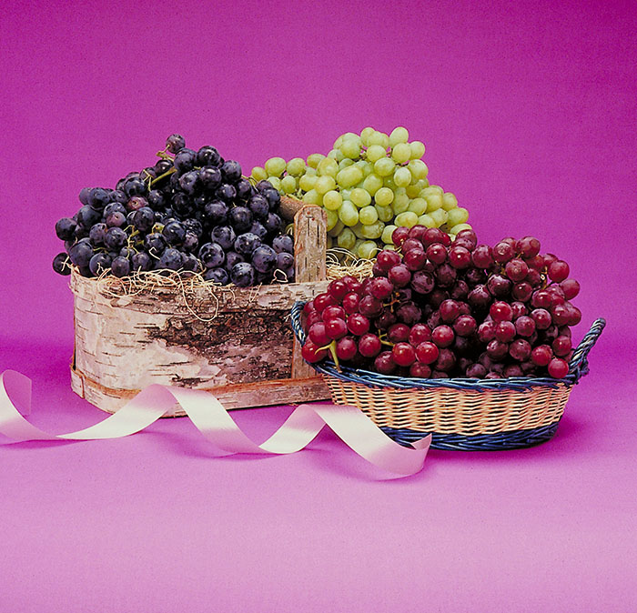
Version E. What background is most suitable to all three colors of grape?
I don’t know why the photographer chose this strong magenta-blue background. Perhaps he was looking for something that was totally different from any of the three types of grapes. However, it makes the light green ones stand out unduly, because they are the most dissimilar to the background.
Nothing in the composition prevents us from substituting a new background color. The procedure is:
On a layer that can be discarded, make roughly equal selections of each of the three grapes, then Filter: Blur>Average (F). This results in a yellowish brown, 38L8a15b. Inverting it produces a cyan-blue.
Version F. Squares of all three fruits are selected simultaneously, followed by Filter: Blur>Average to obtain the yellow-brown that is the average of the three grape colors.
This inverted value cannot be inserted as the new background without destroying the current texture. Instead, it goes on a layer set to Color mode, with whatever method you like to exclude the objects in the foreground. The result is (G). Note how much better defined all the fruit is.
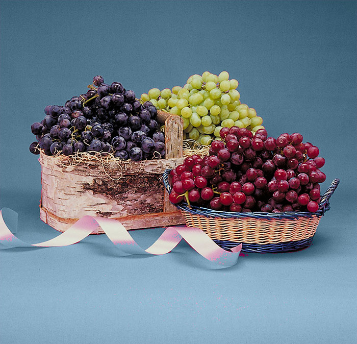
Version G. The averaged color found in (F) is inverted and substituted, in Color mode, for the background of (E).
In this particular image the background has nothing that identifies it as being of one color or another, so we can feel free to substitute whatever we like. This isn’t always possible, so it should be pointed out that even moving in the direction of the complementary will make an improvement. In (H) the move is only halfway toward the background color of (G) and still things are working out for the better.
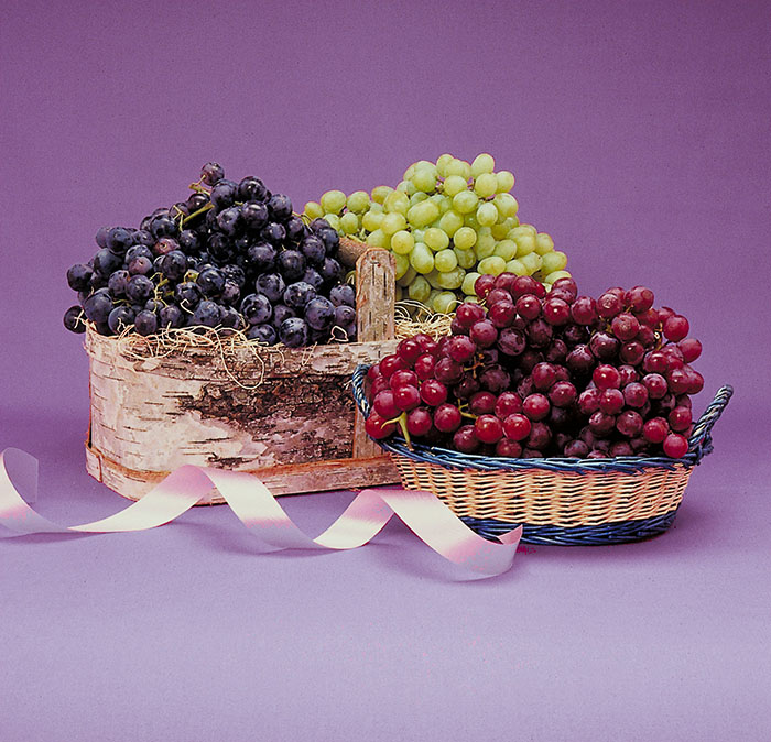
Version H. When it is not possible to move the background all the way to the complementary, a move in its direction may suffice. This version moves (E) halfway toward (G).
{ 8 comments… read them below or add one }
Dear Dan, i am very happy to see your newest archive here:)))) i am your fan in China, Could i please ask you some questions that make me so sad?
– If i wanna work only about color correction, what job shall i do?
– Or, in other words, which area can i find the job that is all about color correction or includes it? (such as photo provider company, printing house, press,……?)
– Is there a kind of job which is all about color correction in the US or in China?
THANK YOU VERY MUCH, Dan!i am a image retoucher in China. i buy two of you lastest books. i love them very much! And i find i love color correction deeply and i wanna do it all my life.
But i have a problem in China. i CAN NOT find any job only about color correction. i can only find the jobs that just include it. For example, Image retouching jobs include color correction, website designing jobs inlude it.
THANK YOU FROM THE BOTTOM OF MY HEART…
steve chen
Hi Dan,
Excellent article, very informative, but most of all very professional like everything else that you have shared with so many of us in the past thirty years. I’m still referring to your 1995 edition of “Professional Photoshop”. BTW when I purchased that book I thought that the picture on the cover was a picture of you… 😉
André
Steve,
Thank you for the very kind note. I don’t know very much about the current situation with respect to graphic arts employment in China, so I can only say that the more applications you know (in addition to Photoshop) the more attractive you will be to any employer.
China does have a strong printing industry which accepts work from all over the world. In many cases what the client supplies is not satisfactory and changes are requested. This is interesting work because you can never predict the type of picture you will be working on, or how good it will be, or how challenging the correction request will be.
Photo providers are not such a good choice because generally the photographer wishes to do this type of work himself.
I understand that the Chinese-language edition of Modern Photoshop Color Workflow will be published in just a few weeks.
André,
It is always good to hear from you. Yes, I think this is an interesting concept with a fair number of applications. I learned it from my friend Chevreul. You, of all people, should be interested to know that I have translated On the Law of Simultaneous Contrast completely. This was rather difficult, as Chevreul was a great theoretician but a horrible writer. What I will do with this product of too much free time on my part remains to be seen!
Dear Dan,
i am very, very happy to receive your warmly reply. It makes my path ahead much more clearly. No word could describe how exciting it is when I received it, and i spread this wonderful feeling to my family. Thank you very much!
i will try my best finding out my way to the jobs of color correction and following the way of color correction you are leading.
It won’t be all romantic, i know, but i will remember what you said in your book, no matter how difficult, how confused it will be, remember it is simple and clear what you wanna do at the very beginning: “make pictures better”, and I will keep going.
It’s great that the Chinese-language edition of Modern Photoshop Color Workflow will be published in just a few weeks! I cannot wait it any more.
Again, THANK YOU VERY MUCH…
Best wishes!
steve chen
I know this doesn’t belong here, but I’ve searched high and low for a way to communicate with you.
I just bought the 2016 LAB book, which seems to depend pretty strongly on PPW Panel (see p. 69 of LAB book). I finally got it installed by calling Adobe support.
My question is: I see a “Movie” button on the PPW Panel, but it takes me to a page which won’t show me the support videos. Do I have to buy yet another expensive book or something?
Thanks,
ge
George,
No, you don’t have to buy anything, but you do have to register. The videos were originally designed for the MPCW book, but anybody who wants to can view them. Just go to the Private Resources page (under Resources) of this site.
Thank you so much. I can’t believe how fast you’ve answered me both times I’ve posted questions here.
I’m now starting chapter 4 of your LAB book, 2nd edition. I’m getting more out of it than my first time using the first edition, which I bought because it was a lot cheaper. You’re correct that the PPW Panel makes it possible to keep on slogging along and to experiment. Again, thanks.