

The U.S. presidential campaign offers an interesting insight on opponent colors, and on how best to present data. The conventional way of doing it leaves much to be desired.
Residents of other countries have difficulty understanding the American system, where in effect the election is always decided by voters in a small minority of states. Every state carries a certain number of “electoral votes”, which are what actually elect the president. Almost all states, however, are winner-take-all: the candidate who wins the state, whether by one vote or ten million, gets all its electoral votes. And the majority of states are so strongly associated with one party or the other that the results are known long before the candidates are even chosen.
Given these rules, residents of the four largest U.S. cities, and eight out of the top ten, basically have no voice in the presidential election: they live in states where the outcome is a foregone conclusion. Neither party will spend much time or money in such a state. Both need to figure out which states could conceivably be swayed by an advertising push. Journalists also need to understand which states are the keys. Therefore, maps like the ones about to be shown are important.
Ideally we would like to represent the two parties by complementary colors: an orange party and a blue one, for example, or a green and a purple one. Unfortunately, this is not possible in the context of U.S. politics, where one party is always referred to as red and the other blue. We often speak of a “reliably red state” like Alabama, or a “definitely blue state” like California, to indicate that there is virtually no chance that the candidate of the other party could win.
I have prepared two competing versions of an electoral map. The numbers are based on nearly complete returns from the 2012 presidential elections. I have divided the states into 11 categories. The reddest and bluest ones are those in which one candidate led by a margin of at least 15 percent of the total vote. Less distinctly colored ones are those in which the winning margin was at least 3, 6, 9, or 12 percent. The eleventh category is for the two states (Florida and Ohio) in which neither candidate led by as much as three percent of the total vote.
Nine out of ten of the maps I’ve seen are along the lines of the top version. They start with the logical position that a state that the blue party is likely to win, yet not so overwhelmingly as in California, should be portrayed as less blue, and that an even closer state should be even less blue. Typically, they also make these questionable states lighter, because the blue used for California is rather dark.
Those familiar with the opponent-color structure of LAB know that “less blue” is synonymous with “more yellow.” In the context of these two political parties, however, “more yellow” is not a great idea. A state that is less blue is not more yellow—it is more red.
In the bottom version this issue has been corrected. States whose results are similar but not identical to those of its neighbors are not so misleadingly distinct as in the top graphic. Notice, also, that despite using the same data the top chart seems to show a “bluer” United States, while the bottom one seems redder to the casual observer. The reason: a full red is a more vivid color than a full blue. A neutral, or even a slightly pink neutral, seems closer to the blue than it does to the red.
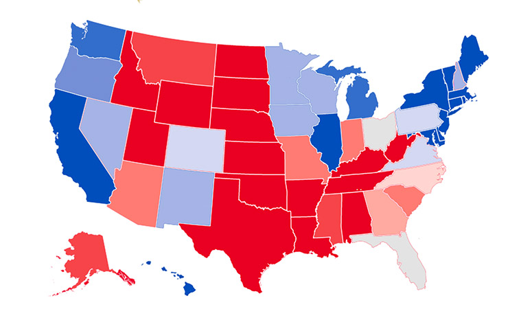
A representation of the outcome of the 2012 U.S. presidential election, prepared in the way that most such maps are today.
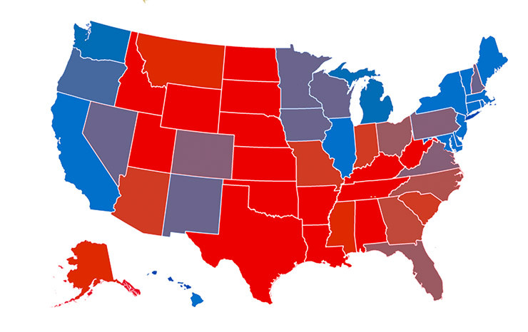
An alternate version that assumes that the colors of the two parties (red and blue) should be mixed when a state is up for grabs, as opposed to portraying the state as merely “less blue” or “less red.”
Three final notes. First, I pointed out earlier that it would be helpful to use colors more complementary than red and blue, but that political realities dictate otherwise. However, nobody dictates the kind of red and blue. There is no reason to woodenly select whatever red and blue your software suggests as a default. Making the red more orange moves it closer to being complementary to blue and making the blue more cyan makes it more complementary to red. Although they aren’t the same hues as in the top version, the choices for the bottom are surely “red” and “blue”, not some other color. But notice how Kentucky and Illinois are better differentiated, and how the states surrounding Illinois make more visual sense.
Second, the bottom version is easier to correct, if needed. For example, if you wish to show what would happen if three percent of the national vote shifted to one party or the other, it’s no sweat with the bottom version, but the top version is problematic.
Third, as elections often teach us, the past should not be forgotten. The idea of charts that use mixtures of the colors that are used to symbolize certain categories was original to my friend M. Chevreul, who published it in 1839. I wasn’t even aware that such color graphics were possible at that time, but he was a strong advocate of them as being ways to make data clear in ways that text cannot. Where is he now when we need him?
{ 3 comments… read them below or add one }
Hello Dan,
are you going to write an article about the most recent ACR version in the context of the LAB/MPPW workflow?
Best regards
Dirk
Dirk, Although the latest ACR appears to have some improvements none of them changes the relation with PPW. My recommendation for most people remains that contrast certainly, color intensity certainly, and color accuracy probably, is better handled by PPW. Currently, if working with a large number of raw images, I batch-acquire all of them in at least three different ways, one of which is the ACR default, one my standard flatter settings, and one flatter settings with highlight enhancement. After making a tentative correction on one of the others, I then make a second version starting with the ACR default, but I force myself to finish it in one minute or less. Often this produces an alternate version that is useful for adjusting the color of my first version. Sometimes it doesn’t, but then I’ve only lost one minute.
Thank you for your answer! I am really struggling on how to prepare RAW files for the PPW. From my research so far, this seems to be a problem for a lot of people, because everyone is starting with a RAW file these days.
Dirk